50 Beautiful Healthcare UX/UI Design Examples

At Koru UX Design, our healthcare UX expertise stems from over 13 years of designing 300+ products like EHRs, Telehealth, Patient Portals, Claims Management Systems, AI-driven Messengers, Home Health Solutions, etc. for companies such as eClinicalWorks, Roche, Biofire, Medbridge, Well Health, and more.
Designing a seamless and efficient experience for healthcare users requires an acute understanding of the target users, i.e., providers, caregivers, and/or patients in their everyday environment, while upholding standardized legal regulations such as HIPAA and HITECH, even recent ones such as EU AI Act and the proposed interest of the FDA in regulating the use of AI and ML in healthcare in the United States.
We're showcasing the length and breadth of our UI-UX design expertise in this comprehensive compilation of 50 healthcare UI examples. These examples are accompanied by tips and best practices to follow while designing for each product category.

50 UX/UI Design Examples & Tips to Design User-friendly B2B Healthcare Products
Category 1
Patient Look-up List

Patient Look-up Lists focus on functionalities that help users find and manage patient information with efficiency. Consider intuitive search bars, filtering options, and clear patient list displays to streamline workflows.
Key considerations
Designing an effective patient look-up list in a healthcare product requires balancing information access with a user-friendly experience. Prioritize displaying essential details for quick identification, alongside robust filtering, searching, and sorting options. The list should be scannable with clear visual cues and offer relevant actions next to each patient entry. Create a context-aware information display to enable quick and accurate access. Finally, ensure smooth integration with other parts of the product, fast loading times, and responsiveness across various devices.
- Ensure the capability to search for a record with a variety of keywords.
Use data points that would help differentiate between records with common first or last names easily.
For example, data points such as the age or the last few digits of the MRN.

- Advanced Search allows searching a patient using their name or MRN and provides the closest results.
- Filter options such as Care Program, Medical Condition, Appointment, and more help narrow down the search results.

- Searching for a patient can be done using their name or MRN.
- Entering a few characters of the name also yields relevant results through auto-suggestion - improving operational efficiency.

- The Advanced filter provides quick access to patients marked as ‘Favorites’ and ‘Assigned to the provider’.

- The enhanced Search function applies multiple categories based on a detailed list of keywords/search terms, including a patient’s name, their provider, insurance status, and more.

- This advanced version enables patient search by applying a wide range of criteria, such as age range, existing and/or previous locations, care programs entered into, and medical history.
- It also allows the addition and exclusion of certain criteria to deliver accurate results.
- The panel on the right displays the search history for reference.
Category 2
Patient Records
Patient records are a minefield of medical data. A good UX approach here prioritizes clear organization, easy access to relevant information, and secure storage, with information architecture and visual hierarchy playing a crucial role.
Key considerations
Designing a patient record system requires prioritizing completeness and organization for easy navigation of a patient’s history - keeping in mind the varied physical and mental capabilities of the patients. It should offer intuitive documentation tools like templates and dictation for efficient note-taking while ensuring strong audit trails and access controls for security.
- Support from the system to keep the data clean and updated.
This would help clarify patient data where incomplete or duplicate records exist. System-based prompt to easily update information or easier way to update health information which might change more frequently.
This would refer to vitals that need frequent periodic testing and updation such as blood pressure or blood glucose levels.

- Click on a patient’s name to access their profile. The detailed profile displays cards with relevant details such as their medical history, vitals, documents, and forms.
- The panel on the right lists details of recent visits.

- A comprehensive patient record that displays patient information overview on top, including their name, MRN, visit type, and reason for visit.
- The vital parameters can be added by clicking on respective tabs and remarks of the physical examination can be added below.
- Suggested medications can be added with a single click. Medications that are not on the list can be added.

- This patient profile provides relevant details at a glance for easy access. The horizontal panel displays detailed patient information, PCP’s name, and the Acuty Risk Levels are highlighted using colored pills.
- The Overview field displays open task cards and Patient Visit Details. The Active Medication and Enrollments are listed on the right .

- Easy access to the patient list, with classification categories including all, current, new, discharged, and high priority.
- The search list has classification categories of the patient’s name, reason for the visit, and the scheduled time and date.
- The patient profile displays personal IDs, visit information, and tab options for vitals, records, medications, test results, and more.

- The patient timeline panel on the left lists the visits based on the chosen year.
- The chart can be customized to display different categories of information.
Category 3
Appointment Scheduling
Appointment scheduling should be hassle-free and efficient for both, patients and healthcare providers. Effective UX in this category involves easy-to-navigate calendars, efficient display of time slots, and easy appointment confirmation and management.
Key considerations
An effective appointment scheduling system provides a clear visualization of provider availability across different locations and time slots to minimize scheduling conflicts. Ensuring the utmost flexibility to reschedule or cancel appointments easily is crucial.
The focus should be on offering flexibility towards showing information that would be critical consideration factors for a person picking an appointment.
For example, it could be the preferred language selected or the gender of the doctor if they choose to be specific. It also covers generic data points such as proximity to the hospital or acceptance of their insurance.
- On the administrative side, the focus should be on optimizing and fulfilling the slots booked for a provider as per their defined work hours and availability.
- On the patient’s side, there should be clarity on the slot picked. The system should have communication prompts to ensure that the patient shows up on time. (Examples of options can include rescheduling, asking a question, reminders of the appointment, etc.)
On the provider’s side, it is crucial to provide maximum context and information before the appointment.
Examples include patient records relevant to the visit, recently captured vitals, known conditions, and the chief reason for the visit.

- Search for a provider by using the location and specialization filters.
- Book the appointment and receive the confirmation, with options to download the receipt and save the appointment to a digital calendar.

- Smart search enables search for doctors by name, specialization, or medical issue based on the user's location.
- The Find function displays the list of available doctors based on the location and helps book appointments.
- The Map view displays nearby doctors and enables the options to book an appointment based on proximity.

- Smart search for doctors by name, specialization, or location.
- Receive a confirmation email comprising the time and date, contact details of the doctor, and options to add the appointment to the calendar or view the location on the map.

- The calendar’s notification icon shows upcoming appointment requests.
- There are options to accept or decline the requests in the dropdown list.

- Shift the appointment time with an easy dropdown list of time slots.
Category 4
Telemedicine
In optimal telemedicine experience is one that ensures clear video conferencing interfaces, user-friendly tools for sharing medical data, and a seamless experience for both doctors and patients.
Key considerations
A successful telemedicine platform prioritizes high-quality audio/video conferencing for clear communication. Easy patient access with minimal technical requirements is crucial for broad adoption. Seamless integration with the EHR ensures smooth data exchange between platforms.
- A telemedicine platform bridges the gaps of an in-person encounter. It has to compensate for the lack of ability to conduct a physical examination.
Patients need to feel like they are being heard, and simple advancements in technology can help with this.
For example, technology now allows for the eyes of the doctor to seem to be looking at the camera using AI even if they are looking down or making notes.
- Other crucial features include the ability to translate and transcribe on the fly, view subtitles, share screens, and bring up reports to be discussed. AI-powered Natural Language Processing (NLP) can be leveraged to ease documentation, along with simplified record keeping.

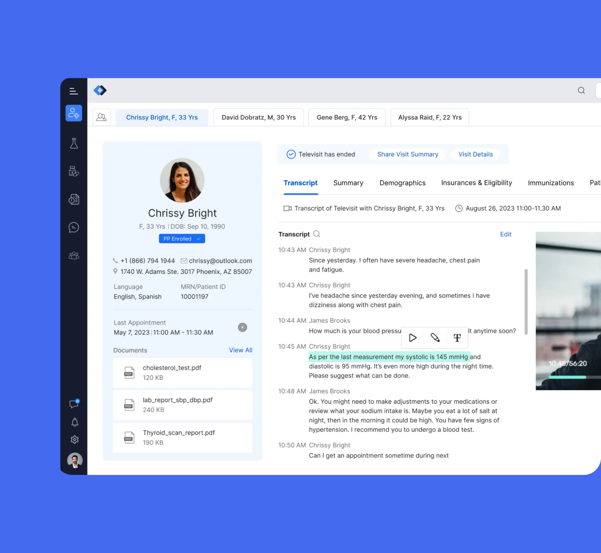
- A reminder pop-up appears, notifying the next appointment.
- The Provider can get the context of the appointment by viewing the patient’s responses to the pre-visit questionnaire.
- Once the telehealth call begins, the conversation is transcripted in real-time.
- The Provider can access the lab test results during the call on the same interface.
- The Provider can highlight important vitals or risk factors in the transcript for later reference while the conversation is on.

- The patient list flags high acuity cases in a distinct column.
- Click on the ‘Reason behind the alert’ to view the complete details of the patient and view the call transcript.

- Patients can view their past and upcoming consultations in the mobile app.
- Click on ‘View more’ to view the record of the consultation, including the date and time, doctor’s details, summary, prescriptions, and test reports.
- Click on the doctor’s link to view their profile and available slots for the next appointment.

- Discover multiple ways for a provider to get in touch with the patient. Connect via an audio call, video call, send a secure text message or start a chat in a few clicks.

- Connect on a video call with the caregiver in a pop-up window.
Category 5
Care Plan
Care plans should prioritize clarity of treatment options, easy access for patients and providers, and progress-tracking functionalities to enhance patient engagement.
Key considerations
A well-designed care plan facilitates collaboration and task delegation among healthcare team members. Imagine a system where team members can create shared care plans with specific goals, assign tasks to nurses or specialists, and track progress over time. Integration with patient education resources empowers patients and improves engagement.
For the administrator or the person creating Care Plans, having access to clear care journeys is important. Therefore, the focus should be on ensuring -
- The ease in creating condition and scenario-sensitive care plans that can guide the patients.
- Ease of assigning and monitoring the adaption from the patients.
- Guidelines about what leads to higher adaptation as opposed to what makes patients fall off a defined plan.

- Create a customized care plan using AI-driven suggestions based on the background provided.
- Drag and drop options from the Journey Template to get started.
- Customize the flow as required, adding message text and time delay.

- View the complete timeline of communication with a discharged patient.
- The timeline provides a brief summary of the patient’s visits and documents chats and states any alarming details.

- There are multiple types of alerts in red, grey, and white, denoting the severity of action.
- The pop-up lists the action items in the care plan as per the priority.

- This Care Plan follows a Problem-Objective-Goal-Intervention system for patients.
- Each goal has a start and end date with a percentile progress tracker to ensure that it is realized on time.

- This shows the detailed view of a patient’s care plan. It shows the start date and the target completion date for the selected ailment.
- The care plan is further split into multiple goals, listed as per the priority with timelines and expectations added for the actions and strategies.
Category 6
Vital Signs and Measurements
Effective UI design for vital signs and measurements should use clear visualizations, easy data entry, and timely alerts for abnormal readings of signs like temperature, blood sugar level, heart rate, or blood pressure.
Key considerations
Standardized data entry through pre-defined formats ensures consistent and accurate recording of vital signs. Visualization tools like graphs and charts help identify trends and potential issues. Customizable alerts for abnormal readings allow for timely interventions.
- Ensure that the measurement units are depicted clearly, and additional notes and information about the situation in which the vitals were collected.
- Ease in documenting it. Especially establishing information that would modified frequently vs less frequently. For those that would be updated frequently, place convenient triggers to update them from multiple sources.
- Ease in differentiating data entered by humans vs wearable technology.

- The wearable device captures the vitals, which are uploaded.
- Click on the respective organ tile to view the current vitals.
- Options for booking appointments with consultant doctors are available.

- The patient’s contact details and disorders are listed on the panel on top.
- All vital signs for the selected body part are listed on the left panel, with other important and relevant vitals listed on the right.

- This overview uses the body chart to mark afflicted areas.
- The severity of the afflicted areas is categorized by color, depicting mild, moderate, or severe pain.

- All vital signs are listed on cards, with the source of the data (Apple Health, Google Fit, iHealth, etc.) mentioned.
- The time of the latest recording of vitals can be accessed by hovering over the card.

- This pain scale is designed to keep records of the pain levels felt by the user during movements/exercises.
- There is also the option to record the difficulty level experienced during certain exercises.
Category 7
Healthcare Dashboard
Effective Dashboards provide a comprehensive overview of patient health data, prioritizing clear visualizations of key metrics, customizable layouts for individual needs, and real-time data updates.
Key considerations
An effective healthcare dashboard is customizable, allowing users to personalize the layout with relevant data points based on their role. Actionable insights presented facilitate clinical decision-making and highlight areas requiring attention. Real-time data updates ensure healthcare professionals have access to the most current patient information.
When designing a dashboard, focus on understanding the nature in which your persona would utilize the information. Consider the following -
- Depict a clear overview of how things are running. Highlight scenarios where an intervention may be required.
- Prioritize the display of trends, and provide conclusive information that would ease decision making.
- A dashboard should be a quick summary indicating health with an easy way to probe further and access other parts of the system.

- This dashboard displays a comprehensive overview of the patient assessment, their status, month-wise assessment status, completion percentile, and number of eligible patients.
- Each category’s graph is designed to provide further information and track progress at a glance.

- The dashboard provides multiple filters for RUB distribution.
- The panel on the left provides the option to pick the morbidity marker.
- Clicking on the pointer next to a patient’s name provides details of ACG and HCC risk scores.

- This analytics dashboard provides an overview of the pre-selected widgets.
- Users can select or drag and drop a widget of their choice to be displayed in the overview.

- View the detailed expense allotment breakup of a healthcare center, with a department-wise filter.

- This dashboard provides an overview of the main parameters - patients admitted, active staff, and operational costs at the top.
- This is followed by the next priority item, i.e., the date-wise list of admitted patients.
- The bed occupancy graph is color-coded and can be viewed in a detailed mode.
Category 8
Patient Communication
Communication tools allow secure interaction between patients and healthcare providers. Therefore, the emphasis needs to be on intuitive messaging interfaces, secure file-sharing options, and smart notification systems.
Key considerations
Secure messaging allows two-way communication for non-urgent messages and document sharing. Offering multiple communication channels like video chat or phone integration provides flexibility. Utilize automated tools for appointment reminders, medication refills, and preventative care notifications.
- Patient communication should be considerate of the scenario and situation of the patient and use a clear and sensitive tone. Consider implementing technologies such as AI-powered voice interfaces or NLP that allow easy translations and modifications in the tone.
- In multiple scenarios, the patients are subscribed to multiple cadences which could lead to spamming - make sure to avoid that.
- Make provisions to segment the target audience carefully so that the communication remains relevant.
- Establish a clear mechanism while delivering time-sensitive or critical information.

- This support center displays the open and recent chats on a panel on the left.
- Click on a patient’s name to open their chat in a window in the center.
- The panel on the right displays the selected patient’s brief profile, the shared documents, and their vitals for easy access during the chat.

- Connect on a call and chat with multiple doctors at one go.
- The panel on the left lists the patients and providers, and highlights the unread chat messages.

- The lab test results can be obtained by logging into the app using a secure sign-up link.
- The patient’s number can be used as an ID to log in. It is authenticated using an OTP sent to the entered number.
- Once verified, the test results are displayed. The patient can access the various parameters by tapping on the options listed below their profile.

- Select multiple recipients for sending an email.
- Add the email content and set it up to be sent at a later date and time of choice.
- Once set, a pop-up provides an option to undo the setup or view the content.

- This health bot is designed to monitor post-discharge patients and guide them to take action when required.
- The bot assesses the patient’s health status with a series of questions and guides them to take the next steps based on their response.
Category 9
Patient Outreach
Outreach programs aim to educate or remind patients about preventive care or treatment adherence. Their UI design should prioritize clear messaging, targeted content delivery, and easy access to additional resources.
Key considerations
Effective patient outreach involves targeted campaigns based on specific criteria to deliver relevant messages and educational materials. Utilize a multi-channel approach (email, SMS, patient portal) to reach patients effectively. Track campaign performance and adjust strategies to optimize patient engagement.
- Ensure that the outreach materials are accessible to all patients, including those with disabilities. Use clear, concise language and provide alternative formats such as braille, large print, or audio versions.
- Tailor the outreach messages to each patient's needs and preferences whenever possible. Personalization can increase engagement and effectiveness by making patients feel valued and understood.
- Utilize a variety of communication channels such as email, phone calls, SMS, social media, and physical mail to reach patients effectively. Offering multiple touchpoints increases the chances of reaching patients at the right time and in the right context.
- Provide clear instructions and actionable information in the outreach materials. Patients should understand what steps they need to take next, whether it's scheduling an appointment, accessing resources, or following up with healthcare providers.
- Include a feedback mechanism to gather input from patients about their experience with the outreach campaign. Feedback can help identify areas for improvement and ensure that future campaigns are more effective and user-friendly.

- The campaign overview displays a list of all campaigns, with a toggle to display only the active ones.
- When a campaign is selected, it displays the various performance metrics and a preview of the content.

- The campaign form builder helps build a form-based survey to be run within a campaign.
- Users can select from a list of pre-defined responses from the options and set up the survey with ease.

- This survey is for screening a patient prior to their appointment. The survey can be taken through a link sent as a message.
- The patient has to fill out their personal details, or tap on pills for pre-designated responses.
- There is a search bar for patients to make it easy to use the right terms while reporting their symptoms.
- The patient receives a notification upon successful submission immediately and via email.

- Set up a survey with various response types. A collapsible panel displays the mobile view of the survey.

- The post-discharge follow-up workflow highlights the cases where the communication attempts have failed or gone unanswered.
- The list also displays the reason for admission and the discharge date for easy reference.
- The top panel displays the duration of the post-discharge engagement, the number of active and completed patient counts, and the overall engagement score.
Category 10
Patient Portals
Patient portals empower patients to manage their health information. Intuitive navigation, secure login, and easy access to lab results, appointment history, and other relevant data are crucial in determining its user experience.
Key considerations
A well-designed care plan facilitates collaboration and task delegation among A user-friendly and accessible patient portal empowers patients to manage their health information. Present health data clearly and provide tools for patients to track progress and manage their conditions. Ensure robust security measures to protect patient data and comply with requisite regulations.
- Design the patient portal with a user-friendly interface that is easy to navigate and understand. Use clear labeling, logical layout, and intuitive navigation menus to help patients find the information they need quickly and efficiently.
- Allow patients to personalize their portal experience by setting preferences, customizing notifications, and accessing personalized health information such as lab results and appointment reminders. Personalization enhances user engagement and satisfaction.
- Prioritize the security and privacy of patient data by implementing robust encryption protocols, authentication mechanisms, and access controls. Clearly communicate the security measures in place to reassure patients about the safety of their health information.
- Ensure that the patient portal is optimized for mobile devices, allowing patients to access their health information and perform tasks conveniently on smartphones and tablets. Mobile responsiveness improves accessibility and convenience for patients on the go.
- Provide educational resources within the patient portal to empower patients with knowledge about their health conditions, treatment options, and preventive care. Access to reliable health information can help patients make informed decisions and actively participate in their healthcare journey.

- Book a purchase from the prescribed pharmacy. A pop-up shows the drug’s name, its cost, duration, and the amount due.
- The savings in purchase costs is highlighted in the order confirmation.

- Book an appointment using the patient portal app in a few easy steps.
- Sign in to the portal using a Google ID and view a comprehensive list of consultation options.
- Pick a consultation type and choose the date and time from the calendar. Pick a reminder to ensure that the upcoming and future appointments aren’t missed.

- A list of amounts due is displayed for every member.
- The invoice contains an itemized list of each drug and its cost.
- The total bill can be paid with a single swipe, following which the payment acknowledgment is generated.

- The health record app provides a comprehensive overview of the patient’s profile.
- They can access their health records and view the lab tests based on the date or the name of the test.

- Medications can be ordered with ease in 3 simple steps, beginning with uploading the prescription or photo of the medication.
- Selecting the days of consumption, and the start-end date.
Table of Content
User-Centric, Scalable Solutions
That Are Secure & Compliant
Telehealth Integration in EHR to Assist Overburdened Providers
Improved patient care by merging safety, communication, and real-time tools for providers:appointment alerts, pre-visit patient review, and live translation/transcription.

Ready to Build a Scalable UX Practice?
Our embedded team model empowers you to transition from tactical UX fixes to a fully scalable, strategic UX practice - aligned with your business goals and built for healthcare's unique challenges.


QUICK LINKS
VERTICALS
FIND US AT
INDIA
6/8, Kumar City, Kalyaninagar, Pune 411014

© 2024 Koru UX Design LLP