There happen to be a multitude of dimensions that fall under the functions of a designer, from making cake toppers to building bridges, and from securing your bank’s app to deciding the precise shade of Thanos’ purple visage.
All things said and done, it’s safe to say that their work involves tremendous people-pleasing maneuvers. And considering that our world is teeming with people, it can’t be a cushy feeling to be a designer.
But if we had to round it off, there are certain superpowers that are sine qua non if you’re any kind of designer – graphic, product, fashion, industrial, experience, or infra. Let us begin with the first and perhaps the most essential in terms of capabilities – meticulousness.
Renowned German industrial designer, Dieter Rams’ eighth principle of good design tells us that “Good design is thorough down to the last detail.”
Needless to say, sloppiness has no space whatsoever in design. In terms of what we do here at Koru – design applications for a varied roster of enterprise clients – there’s always that pressing need to go beyond the obvious. The obvious here being zero margin for error. At Koru, we’ve worked on creating a smooth, pleasurable work experiences for enterprise users in the healthcare, telecom, and finance domain. Software applications used in these sectors have been known to be old school in terms of functionality and aesthetics, with a tremendous need of a modern upgrade. Thus, the challenge for us lies in
a) ensuring an in-depth understanding of the domain,
b) Studying the users and their needs in detail, and
c) melding those needs with the expectations of the management to come up with a solution that makes work pleasurable and profitable.
Working on EMR, CRM, or HRMS applications in enterprise domains demands minute attention to details at all times, given that we’re constantly dealing with highly confidential and sensitive data. Our team of UX designers and developers have to be on a perpetual vigil with regards to security, while at the same time designing a seamless, user-friendly interface that ticks all the boxes of user requirements and goals. Zero margin for error, thus, gets reduced to an understatement.
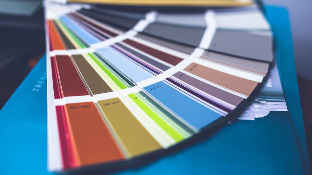
Next up we’ve got by far the toughest of the lot –making choices. Being a designer means being fronted with a lot of choices at every stage; each one more challenging than the last. Remember how the blue sweater in that iconic scene of the movie ‘The Devil wears Prada’ was not turquoise, not lapis, but actually cerulean? And in the backdrop of the fashion industry, that particular tint represented millions of dollars and countless jobs.

For once, this movie scene was actually as dramatic as things are for a designer – the choices they make in terms of color, lighting, placement, or even what they choose to delete/ hide/ withhold, each has its own earth-shattering consequences. In fact, choosing what not to keep is a trial by fire itself in this age of in-you-face design, and so is pixel paranoia – should the ‘OK’ button on the screen be 2 pixels to the right? To the left? Or to the right? Real world, real-time problems, people!
The responsibility of the designer is not only to provide an appropriate solution but also create one which will be quickly understood or accepted by the user. Should the design be created assuming the user to be a simpleton or a smart alec? Less is more in most instances, but is that so every time? This is one tightrope walk that designers have to perform, regardless of their specialization.
Third on our list is patience. Endless reserves of patience. Any designer with a few years of grind behind him will know what’s being referred to. This is a stellar quality that has attained meme-worthy status in the designer community. If there’s one phrase that scares the bejesus out of a designer at the end of a long working day is – “the client has asked for another change”. In a normal world, we’d confidently say that change is good; not so for a designer. Never so for a designer.
And yet, the designer falls back on his endless reserve of patience cultivated through years of teeth-gnashing, hair-pulling frustration through renditions of “the client has the last word”. Because the client always does have the last word.
Finally, we’ve arrived at what’s always assumed to be the number one superpower for a designer. But it’s been so oft-repeated, we thought of signing off with its mention. The superpower we’re referring to is Empathy, of course!
Empathy is embedded within the fiber of every designer’s being. This profession’s only demand is for the aspirant to be empathetic – and everything else follows. To begin with, a designer studies user psychology in order to understand techniques of conducting research, designing experiments, and observing people. These skills help in collating information about people in structured ways. Just as singers rehearse or writers draft concepts, designers prototype to understand what actually works.
Enter, empathy. Being empathetic gives designers a first-hand insight of what users actually need as against what they should/ ought to need. While psychology may follow logic, empathy follows emotions and together, these qualities build what we call the designer’s intuition – a trait honed by many through years of practice.
Armed with superpowers like these, it’s easy to imagine yourself to be an invincible force of nature – with the talent and capability to reform your way into making the world a better place. That is, until the client calls to make more changes to the already twice-finalized design. Sink back into your seat. The world can wait.
An interesting website to see current vacancies across the world is Jooble. You can check relevant jobs for UI UX designers there.


