Enterprise-scale B2B systems are being widely talked about for their poor User Experience in recent times. They are being bombarded with demands to enhance their UX to be at par with high standard consumer-grade UX.
The challenge however for B2B Enterprise Solution providers is much greater. Enterprises in sectors such as governance, finance, infrastructure, education require highly specialized tools to perform efficiently. The complexity of their needs from an Enterprise Scale Solution is not easy to meet.
Large chunks of data and intensive workflows are required to turn the cogs behind the scenes to complete even the simplest of tasks.
In order to thrive and make the most out of the information age, businesses are now on the hunt to find solutions that would merge seamlessly with their employee’s skills; and help them increase their bottom line with the confidence that the solution they employ would be strong and reliable enough to support their complex structures, process a variety of data and sync with the organizational goals and needs.
On the other hand, exposure to great UX has enabled the end-users to demand their employers for systems and solutions that complement their fine learnings and advanced domain knowledge to push the limits of their productivity. Enterprises too are eager to get rid of the rigid solutions that they currently employ.
Over-engineered and poorly designed systems are no longer the norm. Complex systems are expected to work keeping their users in mind and not the other way around.
This has given way and inspired many B2B solution providers to rise to the occasion and address this mammoth challenge. We went ahead to review some solutions that are leading this race and setting new standards for Enterprise Level B2B solutions.
1. Slack + Slack Enterprise Grid
Overview:
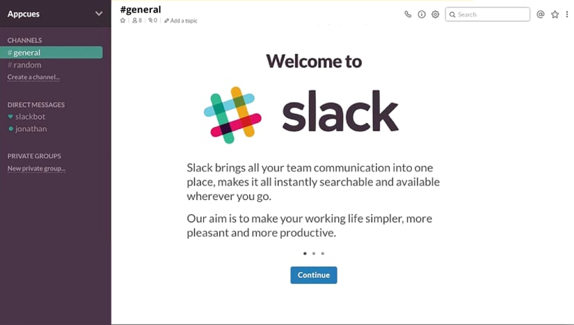
Slack is officially the fastest-growing workplace app ever. They went far to understand the expectations associated with an Enterprise Scale communication tool and that is clearly reflected in the product. They have blended their learnings into a sleek UI that delivers a pleasant and promising experience for all its users.
Up’s:
- Unparalleled’ onboarding experience enhanced by their Slack Bot, which walks the user through the Set-Up Process. This subtly also acts as a tutorial. Simply put, it’s a plug-and-play experience.
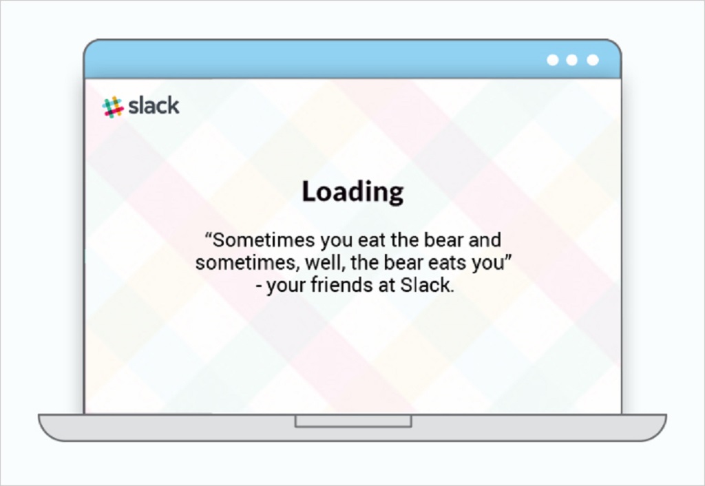
- Interesting affirmations show up which is simply delightful for daily users who don’t have to stare at a boring loader while the app sync’s up.
- The ability to start new threads from an individual message ensures that relevant people are involved in the discussion. It restricts spamming which is a common phenomenon observed in large group-level discussions.
- leave-state synchronization’ works seamlessly across devices and lets you stay connected and in context while you are on the go.
- File sharing supports a quick preview for all mainstream formats. This makes it easy for people to review quickly and take decisions.
- A whole new level of functionality has been leveraged via slash commands that let you perform an array of actions right from the chat line.
- Ability to add reactions, custom emoticons, time zone alert, etc reflect the app’s sensitivity towards complex enterprise structures leading to a delightful UX.
A single layer of Slack Enterprise Grid brings all parts of business communication together through search, direct messaging, announcements, team collaborations, and much more. The data is encrypted which takes care of security and compliance-related issues.
Down’s:
- To initiate a new conversation with a user you have not spoken with recently, one has to trigger a search that brings up a snapshot of their profile and then select the ‘message’ button. This makes the process slightly longer with a few extra clicks.
- In context with the above, the profile snapshot opens as a right panel in the user’s current chat window which often leads them to accidentally text the wrong person. This in specific could cause a lot of confusion in already complex Enterprise Set Up’s.
Verdict:
A single layer of Slack Enterprise Grid brings all parts of business communication together through search, direct messaging, announcements, team collaborations and much more. The data is encrypted which takes care of security and compliance related issues.
2. Trello
Overview:
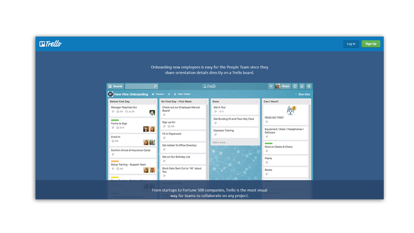
Trello – now a hot favorite among start-ups as well as Fortune 500s like Adobe, Google, Pixar- was created to fill the gap of project management among distributed teams. Trello let’s it’s users stay on top of their game.
Up’s:
- A quick and concise Sign-Up form lets you get started almost immediately.
- A high level of customization options allows the user to organize their boards as they like and fill them with components that would allow them to dynamically manage their todo’s.
- The cards behave like real world post it notes and only make them better with the ability to dig into it. Animations like card flips make the process fun.
- Trello lets you color code, add attachments, create sub tasks. This allows the user to choose what works best for them than to compel them to learn a specific process.
- The clean and immaculate UI helps users flick through their priority items at a glance.
Down’s:
- The walkthrough doesn’t exactly have a starting point. Trello presents all its components with their use and written upfront. This may come across as a little too overwhelming and in stark contrast to the quick Sign Up form
- The boards could lead to a deep hierarchy that could make navigation a challenge.
Verdict:
Trello is a super handy cross-platform app that let’s you stay productive at all times. The clean UI, gamified interaction and easy drag and drop functionality makes it a great choice for large organizations. This could be specifically helpful for people who need to take a quick glance to understand where things are.
3. Toggl
Overview:
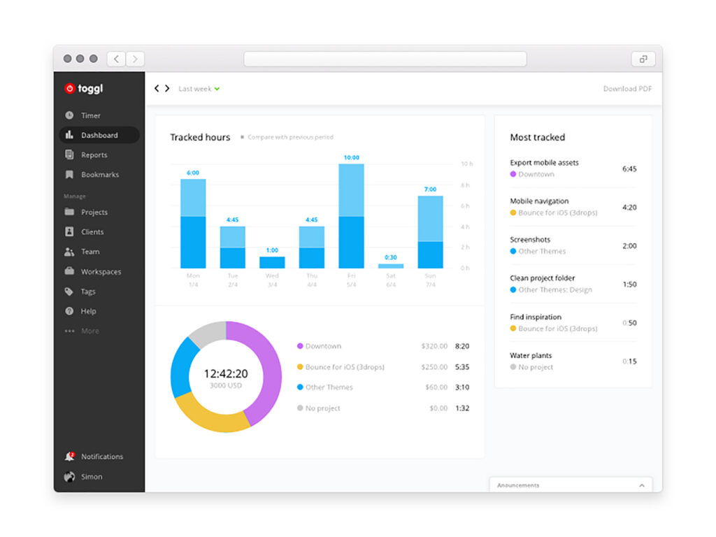
Toggl – cross platform time tracking app is exactly what it says- Insanely simple time tracking tool. It is one of the very few stabilized options available in it’s space.
Up’s:
- Simple and contextual navigation makes way finding easy. The time tracking widget and previous logs are at the very forefront as you log in.
- The tracking widget is easy to use and its components can be easily customized by the admin to adapt to the organization’s preferences.
- Added third party integration allows the user to connect all entries with their relevant todo’s on the user’s preferred project management tool, it easily integrates with all prominent PC, mobile platforms and browsers.
- Toggl comes with a reporting feature as well that let’s you break data down and assess productivity.
- It also keeps up with you while you are on the move. You can simply start the timer on one device and stop it on the other.It drastically reduces the pains associated with tracking and documentation and works hard to seamlessly integrate itself into your work style.
Down’s:
- While Toggl has released some beta updates for reporting, they might not yet be ready to allow their users to extract a deep value from the data.
- The data can’t be sorted within the app which may make it difficult for admins to work with it. They could surely extend more features to the admin that would allow them to use data more effectively.
Verdict:
Toggl is feature rich yet simple and promises a delightful UX. Cross-platform compatibility, easy integration with other platforms, and user focus make Toggl a truly top-notch enterprise app. With a few more enhancements focused on reporting, this app is sure to be the first choice for time tracking.
As discussed in the beginning, a good Enterprise-scale B2B solution with a delightful UX is difficult to build. However, the above mentioned applications are paving the way for more and more companies to contribute towards this effort. A good UX at the enterprise level today will unleash possibilities and allow us to truly leverage the power of data and information to build for the future. We will not be able to exit the current state of innovation until good UX seeps deep into our systems and processes.
There are several other B2B apps that have recognized the importance of good user experience and are setting foot inside this territory.


