3D animations, gamification, multidirectional navigation – mobile app design holds tremendous potential to dazzle users. But, all of these ideas come to a grinding halt at the mention of ‘enterprise mobile applications’.
You see, enterprise applications are quite like the inside of an airplane’s cockpit. An intimidating array of buttons, levers, controls, and screens as far as the eye can see, which can only be operated by people qualified to do it. Where one small mistake can be catastrophic. Now, can you ever imagine a mobile app to run a setup such as this one? Enterprise applications are inherently complex, with multiple features and workflows to navigate. As a result, it often ends up being cluttered and difficult, creating frustration in users.
Take the case of any B2C food delivery mobile app, for instance. It has the singular goal of efficient deliveries, which is why it can expend considerable design expertise to enhance the user experience for its customers. From using 3D visuals to bold gradients, everything’s game. On the other side of the spectrum are enterprise apps that are used by thousands of employees in varied ways to accomplish their unique goals. So, it does not make business sense for them to jump on the UI trend bandwagon before measuring its value based on the final user experience.
So, here are some examples of new mobile UI trends that can be adopted to enhance the UX of an enterprise application.
Mobile UI Trends to Watch Out
Micro animations

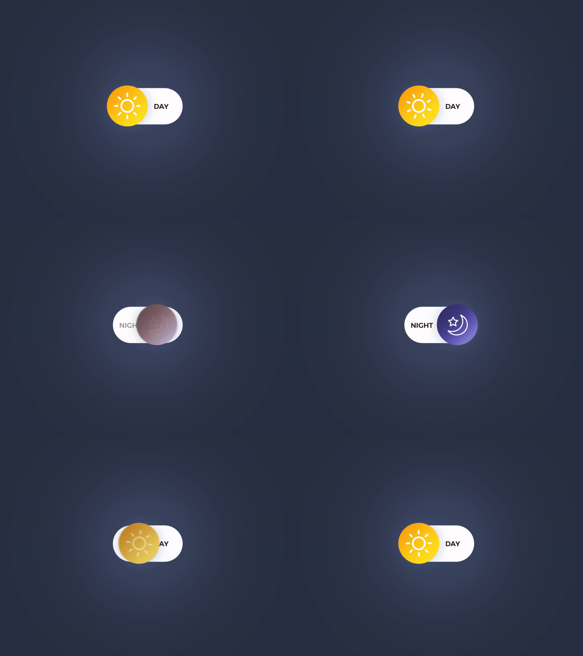
Micro animations have been stealing the show for quite some time now, and they are one of the top new design trends to look forward to. Micro animations are basically interactive versions of metaphors turned into icons. They go a long way in attracting the user’s attention at the required moment. When executed in the right manner, they can be a great source of delight for the users.
In other words, micro animations are helpful in making the mobile UI seem more interactive and accessible. We often see delightful and memorable micro animations in the form of saves, send, delete, or any other actions in the form of triggers, feedback, and loops. They are a UI component to represent easy navigation, extra features, and clarify communication.
Micro animations do so much to amplify human interaction in a minimal manner. Where enterprise applications are often seen as cold and lifeless, micro animations are the perfect way to bring it to life, without hampering the user experience. For example, when a correct action is rewarded with a star or a clap, it delights even the most hardened of users. Additionally, micro animations can also be useful in setting the desired tone, drawing attention to important actions or features, and providing a positive overall experience.
Layered sheer screens

Among the current mobile UI trends, adding a glow or drop shadow is a fantastic way to highlight or separate an element from the background. It can be used to get the user to focus on a particular area. Drop shadows can also be used to prevent the element from blending into the background image.
Think of how a subtle glow added to subtitles in movies or TV shows makes the text way easier to read. In the same way, this effect can be added to text elements to draw the user’s attention. This effect is also used elsewhere, such as subtitling. Thus, strokes, overlays, and blur effects are not to be seen as a ‘trend’ in the true sense of the word, but rather as a mobile UI UX best practice that boosts readability and usability.
Functional 3D graphics

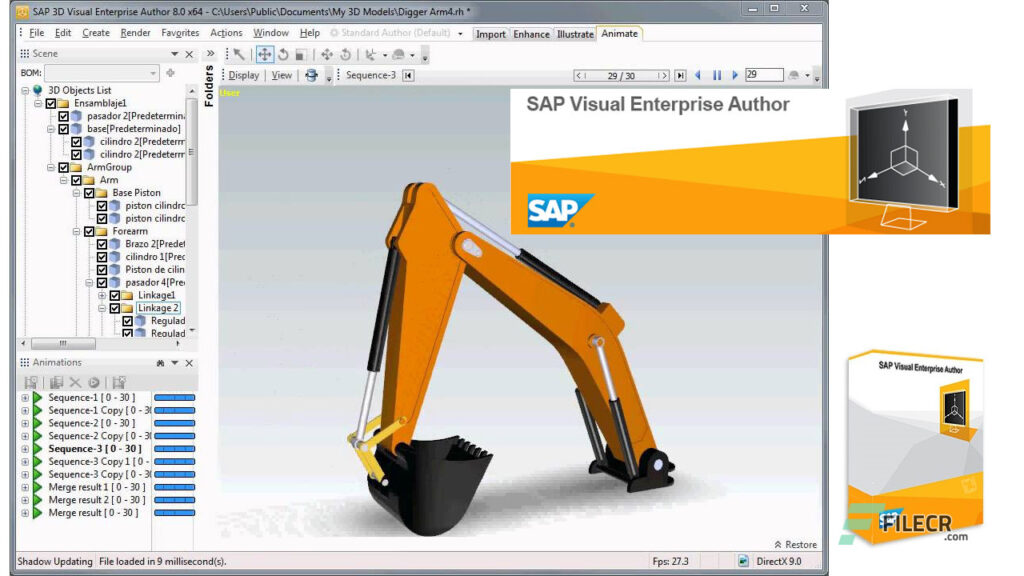
Source: SAP
The 3D graphics trend has been going strong in mobile UI design for the past couple of years and is bound to continue in 2022 as well. While its usage has been doing wonders for e-commerce applications (think home decor or apparel), it is also making a mark in the enterprise domains. strong, particularly in e-commerce. SAP’s Visual Enterprise suite, for instance, helps in creating 3D animations that render rich visual content into common desktop documents, file formats, and business applications for secure downstream use. It can also translate 3D CAD files into lighter versions to support engineering and manufacturing processes.
From the enterprise context, the usage of 3D graphics is more to enhance productivity and output as against using it to wow users. Thus, it is not about merely letting the user view a product from all sides but instead helping them to customize the settings for working with a 3D image. In 2022, the usage of 3D graphics will only become more functional.
Creative data visualizations

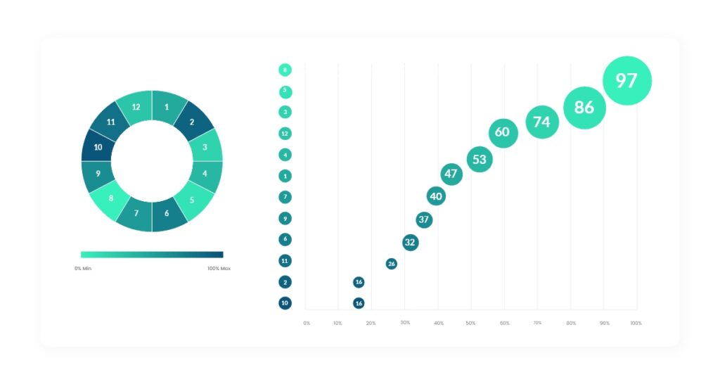
Data Visualization Implementation
A significant part of enterprise mobile UI UX design is about transforming complex data into easily simplified and comprehensible graphs and diagrams. Therefore, creative data visualizations will continue to be evergreen among dashboard design trends.
UI UX designers will continue to find creative ways to present data in a more accessible manner to accommodate the needs of users with situational, temporary, or permanent disabilities. This ensures that the product becomes more feasible for users. For example, patterned representations in graphs make it easier to interpret for people with color blindness. Similarly, users with poor vision can be assisted by creating UI elements with vibration feedback and acoustic signals.
High-contrast color combinations, captions in audio or video content, transcripts, accessible audio or video elements, stable navigation, completely responsive layout, voice input, and gesture recognition technologies are ways to ensure that the user interface is accessible to all.
Enterprise users have had to make do with sub-par UX on their products for a long time. But that has changed since mobiles enabled exposure to a user-first kind of technology. Now, all enterprise applications want the easy banter of Slack and collaborative abilities of Google Docs into their enterprise behemoths. In the end, it is good to see that enterprise stakeholders are ready to invest in UI UX design practices to boost productivity, increase retention rates, and outperform the competition.


