I recently came across the fascinating design work of Tomohiro Okazaki, a Tokyo-based designer. One of his works includes a series of animations with matchsticks as a subject made into infinite configurations.
He took multiple other objects, such as paper and paint, to create visionary spatial interactions using stop-motion animation. See for yourself
At first, each study may seem childlike, but in a larger context, his design philosophy has multiple hidden design lessons.” Speaking about his work, Okazaki says:
“Design provides an opportunity to interact with worlds that I have never known before.”
This brings me to my point:
Design connects products and users — it enables discovering and assembling new ways of understanding how users interact with a product or service.
This philosophy directly translates to the concept of interaction design, which we’ll plummet into in this blog.
What Is The Meaning Of Interaction Design?
Interaction design refers to creating meaningful dialogues between a person and a product, system, or service they use. It is a part of the UX design concepts and is one of the most crucial UX disciplines. It is all about creating meaningful conversations between users and products/services. It plays a massive role in creating great user experiences.
The UI interaction design goal is to create products that enable users to achieve their objective(s) swiftly and without hassle. Well-executed interaction design in UX is indisputably one of the fundamentals of UX design principles. Mess up the interaction design, and your UX goes kaput. Getting interaction design right gets you on your way to a much better user experience. Even if the aesthetics fall short, the product will have a much better chance of meeting users’ needs.
What Do Interaction Designers Do?
An interaction designer focuses on user data, research, etc. when a user interacts with the product. Their goal is to generate concepts that enable seamless and relevant experiences when users make a move. They work to improve the interactive experience of the user.
5 Dimensions of Interaction Design
1D: Words
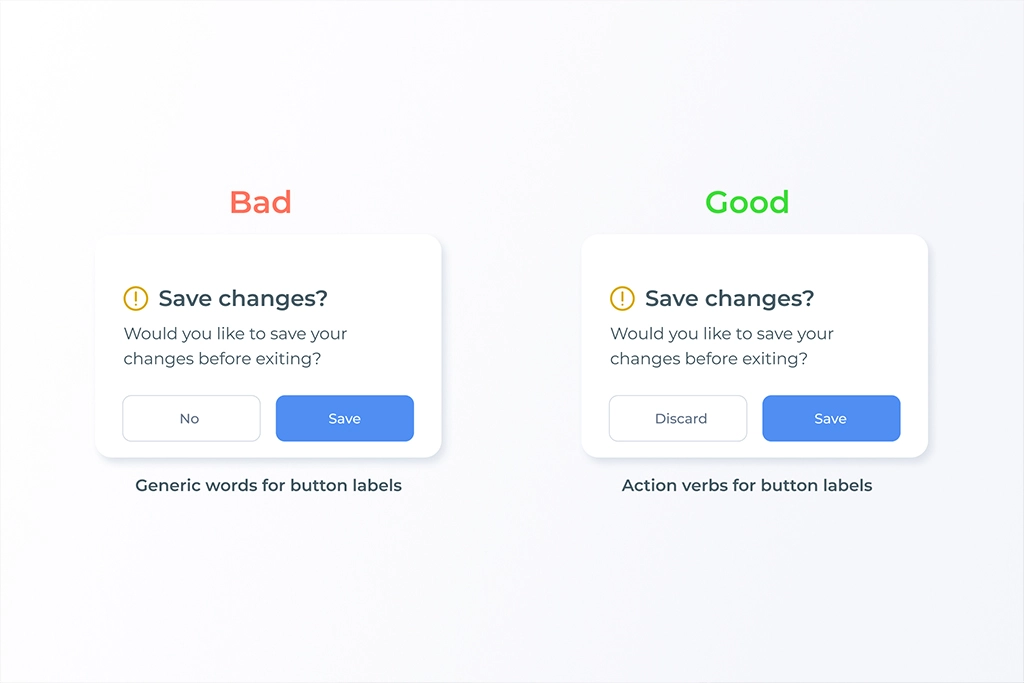
Words, especially those used in UI interactions, play a huge role in defining the context. They should be meaningful and simple to understand. A perfectly used word can be as powerful as a sword. Hence, providing the right word in the right place would make the UI interaction smoother.
2D: Visual Representation
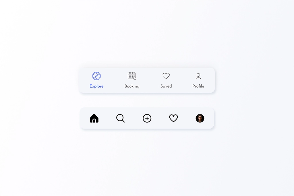
Visual representation is all about the graphical elements like images, typography, and icons that users interact with. You can use imagery, iconography, and graphical representation for better communication. You can also use typographical treatment for better visual hierarchy.
3D: Object Or Space
The third dimension includes the medium through which users interact with the product. It is usually through physical objects such as a laptop’s mouse, touchpad, or smartphone. Understanding the medium and designing things as per the medium will help designers create more simplified UI interactions.
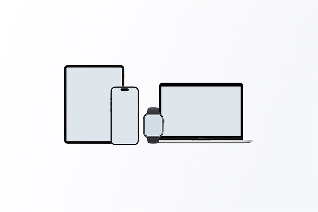
Interaction design example: When a user is working on a task using the mouse, you can show a hover action to give a clickable feel, but when it comes to the touch screen, the same won’t work. You need to find solutions like ‘touch to hover’ or hint to the users where the hoverable areas are when the screen first loads to make it look clickable.
4D: Timing
This dimension refers to the media that changes with time (animation, videos, sounds). These elements help users engage with the product in an exciting way.
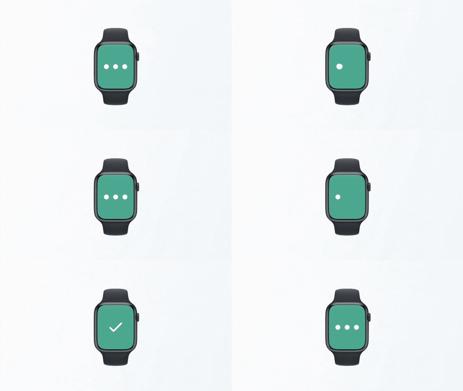
For example, think about adding some sound or haptics to animations when a user completes a particular task. It gives the users a pleasant feeling about that action. Another best use of time is the progress bar animation, where you can see and track the progress of a particular task or process.
5D: Behavior
Cluttered UIs with multiple options and possibilities might perplex users and create usability issues. Aim that your UI interaction design constrains the users’ actions and guides them through the application or product efficiently.
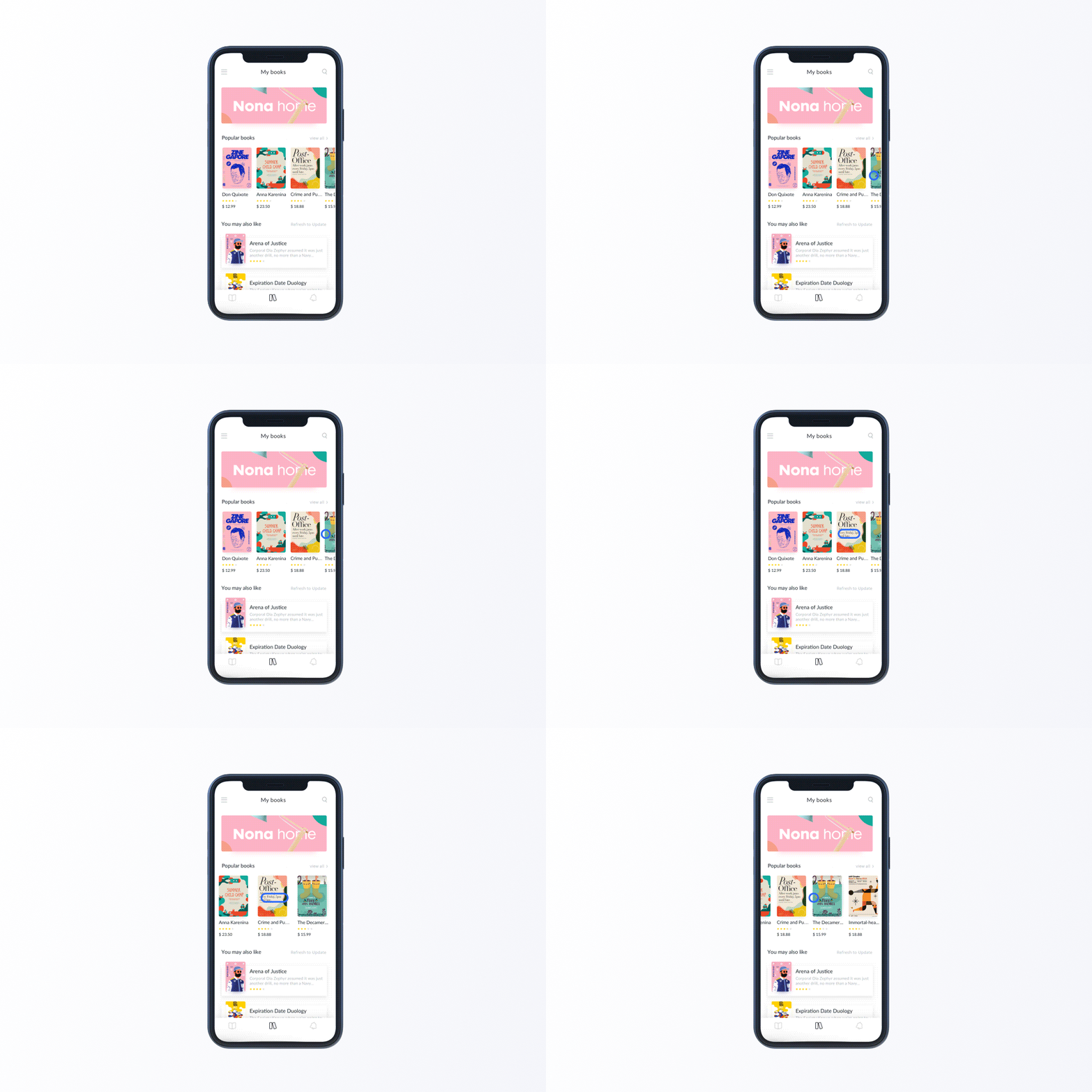
For example, providing too many navigation options and links on the landing page might create an urge to leave the page. Therefore keeping the landing page minimal to just a CTA or two CTAs is crucial.
Interaction Design Principles: What Should A Good Interface Design Incorporate?
Here are seven basic interaction design principles to boost the UX design. You must abide by these to ensure intuitive experiences.
Visibility
Prioritize the visibility of significant design elements based on user needs and business goals. The more visible your designs are, the more likely a user sees and interacts with them. For example, ensure that your most important navigation links are visible on the mobile app bar.
Feedback
Feedback refers to how a product communicates with the users. Designers can reiterate this feedback in multiple ways, including animation, audio, copy, etc.
Constraints
You can also adopt an open-source library to increase consistency and use repetitive UI patterns.
Mapping
Build clear relationships between controls and their effect on your products. It needs to be intuitive and natural to everyday practices so users can adapt it without hassle.
For example, the upper button of your phone increases the audio volume while the lower one decreases it. Users do not have to think or learn about this functionality — it’s intuitive to them. You must strive to create such experiences through your UI interaction designs. The easier your products are, the more delightful the users’ experiences will be.
Consistency
Inconsistent experiences might confuse the users and create usability loopholes. Consider the consistency across different screen sizes.It includes the mechanism of a product:
- How do users perform actions on a product?
- How do users operate the product in real time?
In other words, it’s how the previous dimensions define the UI interactions of a product. It includes the actions, reactions, operations, and presentations, for instance, emotional responses or feedback of users. It could be showing a success message with a summary, swipe actions, or anything else. Designers need to understand that they need to create a behavior, adaptable and understandable to the users.
Affordance
This aspect tells users how to perform an action or complete tasks using various UI elements. For instance, a submit button in a disabled state signifies that users must complete a form’s required fields before submitting. Therefore make sure you incorporate such practices in your designs.
Cognition
Understanding cognitive psychology helps designers design experiences that don’t feel like an overload to users. There are multiple interface design principles at play here. Make sure you’re aware of all of these:
- Von Restorff effect: In a group of objects, the one different from the rest is most likely to be remembered.
- Hick’s Law: More choices are not always good. The more choices you give users, the more time they will need to decide.
- The Serial Positioning Effect: The human mind is most likely to remember the first and last items in a list, sentence, or piece of content.
- The Principle of Perpetual Habit: Humans encourage familiarity. Therefore, designers should use universal interaction design patterns.
- Fitts’s Law: The time needed to move to a target area depends on the distance and the target size.
Interactive Prototypes: Why Create One?
Interactive prototypes are working models designers create to allow target users to interact with a test of your application. It helps you get valuable feedback about how your products look and feel to the users.
Benefits of Interactive Prototype
Breathes Life In Your Designs
Prototypes on paper won’t work. The whole point of prototyping is that it breathes life into your design ideas. Making a clickable prototype is a logical step to finding how users react to your product designs.
Communicate Ideas
Interactive prototyping helps users communicate with the product or understand it more clearly. It helps understand what all features will be there once the application gets developed.
Reference Tools For Developers
Prototypes can illustrate functionality that is more practical as compared to screen specifications. For example, if the developers need to understand how a specific widget is intended to work, they can use the prototype to answer this functionality question.
Feedback
One of the most crucial benefits of Interactive prototypes is that you can easily install the tracking tools and analyze trends. You can later incorporate this feedback into your designs to optimize your products.
Delight Users
Adding elements that complement user actions helps create delightful experiences and create a mark on users’ minds.
Interactions Design Anatomy
Let’s get into the structure of interaction designs
Responses
Responses are what would cause or trigger the interaction, like mouse over, tap, scroll, swipe, page load, etc.
Interaction Trigger
Interactions trigger defines what happens to the elements once triggered by any particular action (through responses like click, scroll, etc.). It could trigger actions like moving, flipping, decreasing the opacity, changing its color, growing, shrinking, etc.
Timing
Timing defines the duration and delay of your interactions. Duration refers to how long the interaction occurs. Whereas delay refers to how long it takes after the trigger for the animation to begin.
Multiple research discovered that the optimal speed for interface animation is between 200 and 500 milliseconds. Animations shorter than 100 ms are instantaneous and won’t be recognized in the users’ minds. However, animations longer than 1 second convey a delay and can lead to users feeling bored.
Size Of Devices Vs. Duration Of The Animation
Modern-day users are accustomed to the instant opening of web pages and applications. They expect to transit between different states quickly. So, the duration of these transitions must be two times shorter than that of mobile devices, i.e., around 150-300 ms. If it takes more than that, users might think that their computer has frozen or they’re having trouble with the internet connection.
On the other hand, many designers create a decorative animation that catches users’ attention so that even if the transition time is longer, their experience doesn’t get hampered.
Easing
Easing refers to how smoothly the transition takes place. The transitions shouldn’t be too sudden or too slow — they should be the right amount that is pleasing to users’ eyes. Let’s look at some easing presets in Figma, a popular interaction design software:
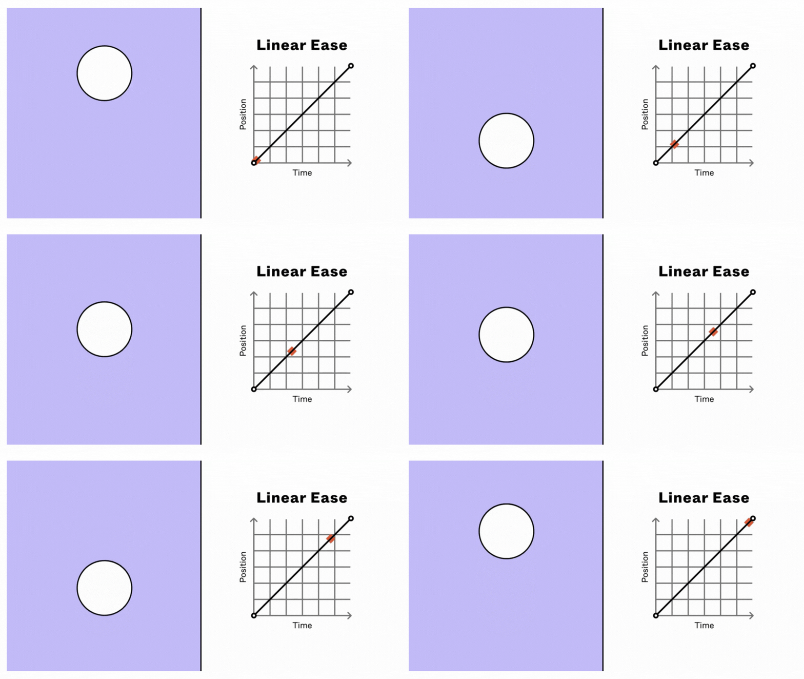
Linear Ease
It is the default acceleration and is applied in a straight line. As objects in nature rarely move at a constant speed, linear curves can look unnatural or robotic.
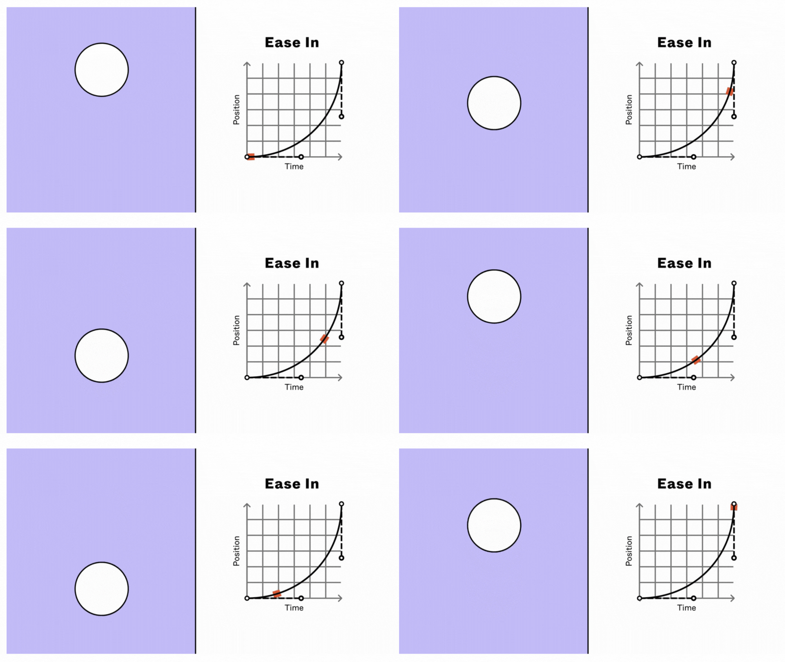
Ease In
This preset creates an animation that starts slowly and accelerates as it reaches the end. It works well for transitioning objects out of view. It can, however, feel sluggish at times.
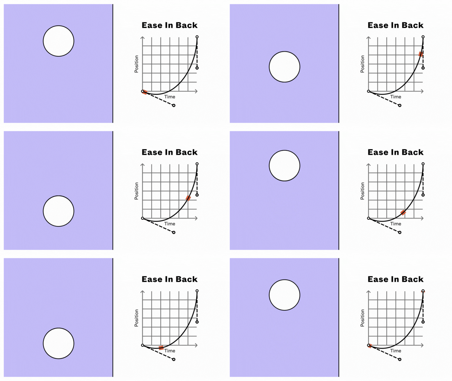
Ease In Back
It is when the animation goes past the initial keyframe’s value and then accelerates toward the end. It creates a bounce that serves as an anticipatory action, preparing the users for the main action. It works well in transitioning objects out of view.
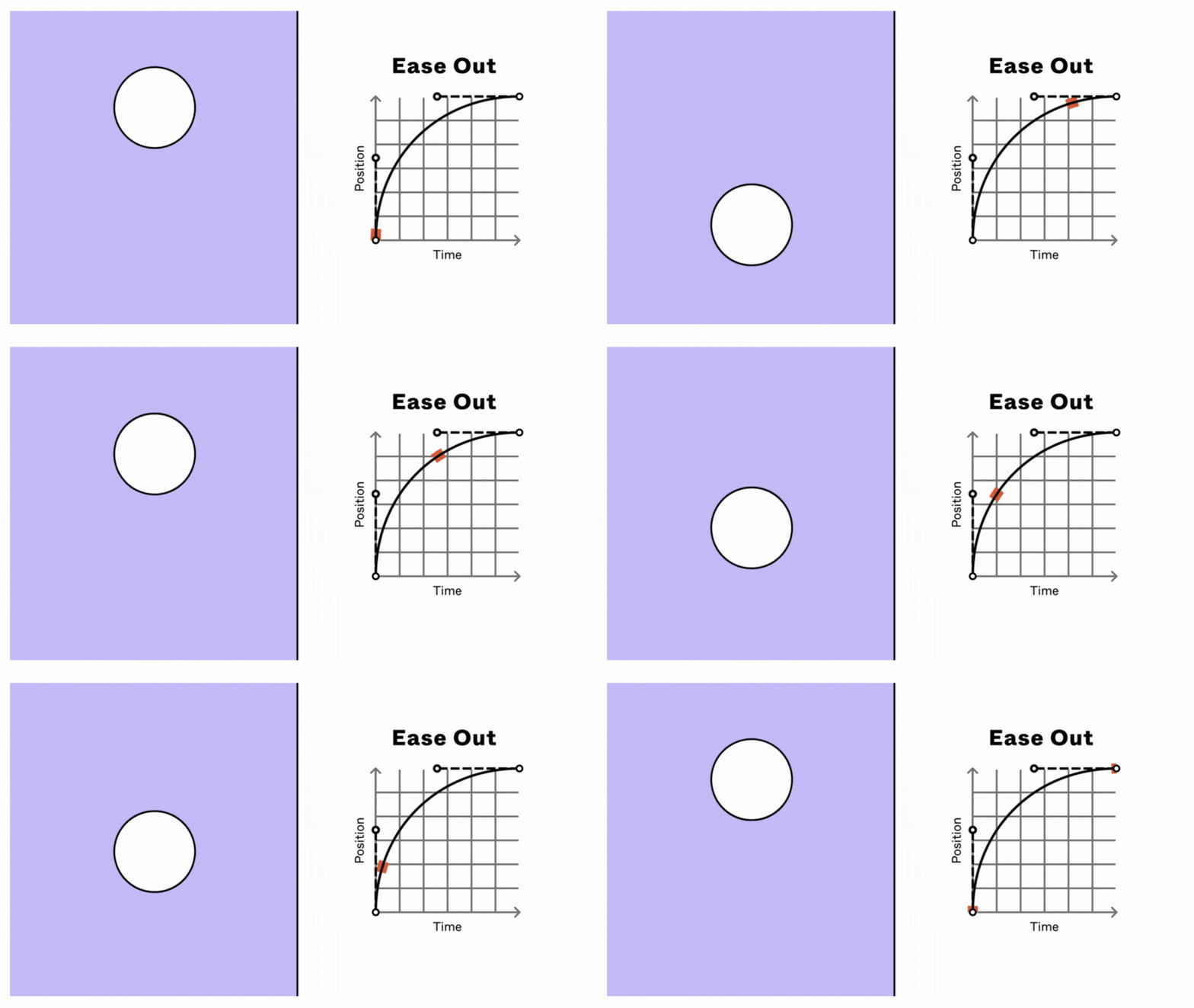
Ease Out
It is opposite the Ease In curve, where the animation starts fast and slows down towards the end. It works well for moving objects into view and reinforcing crucial visual information.
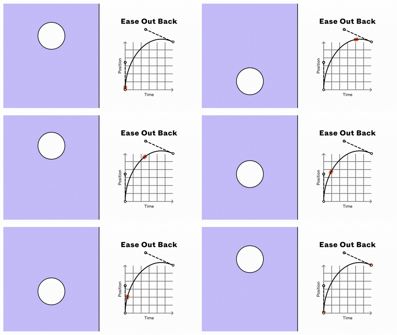
Ease Out Back
It is the opposite of Ease In Back. The animation starts fast, then slows, and goes past the ending keyframe’s value. It creates a smooth ending transition for the main action.
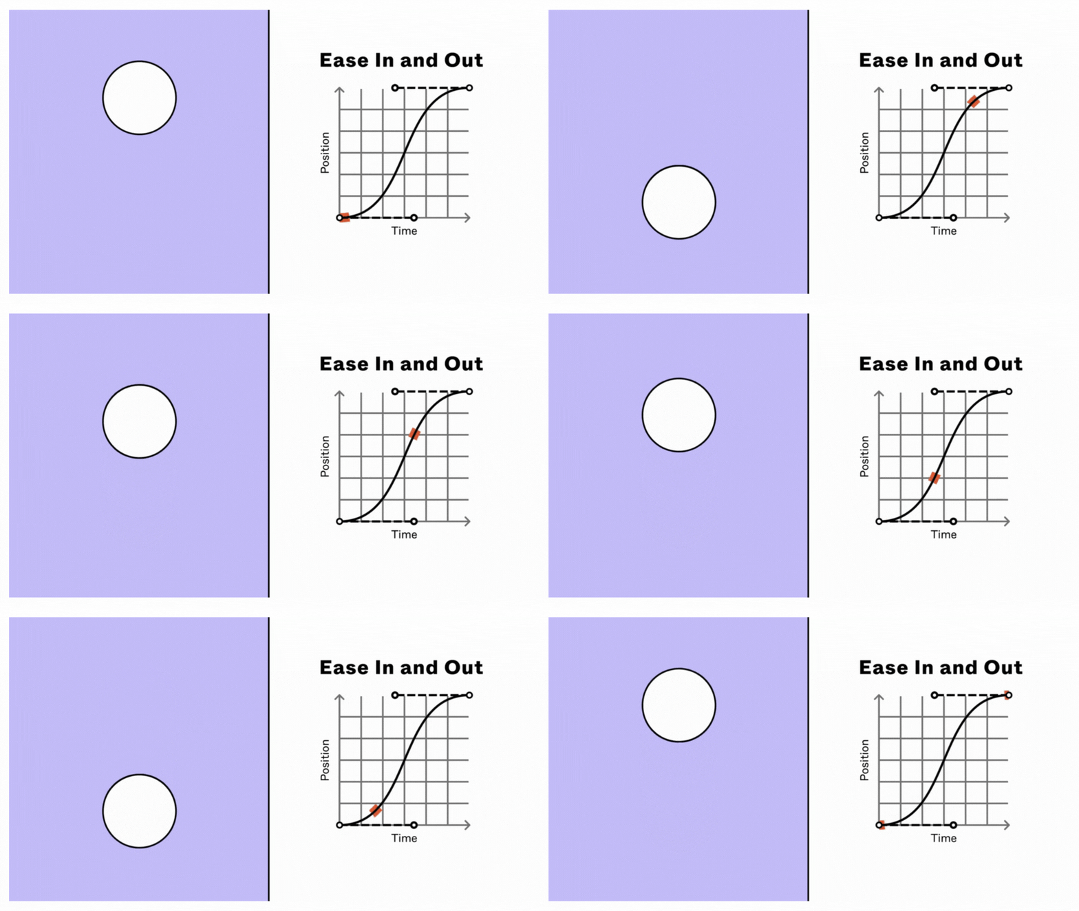
Ease In And Out
This preset starts the animation slowly in the middle and slows at the end of the duration. It feels smooth and responsive for most transitions, but sometimes it can feel unnatural.
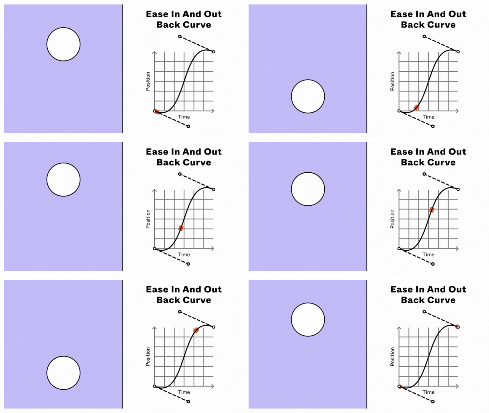
Ease In Ease Out Back
It starts the animation slowly as it overshoots the initial keyframe’s value, then accelerates before it slows and overshoots the value of the ending keyframe. It creates an anticipatory bounce at the start, a quick motion, with a rebounding motion before the final state.
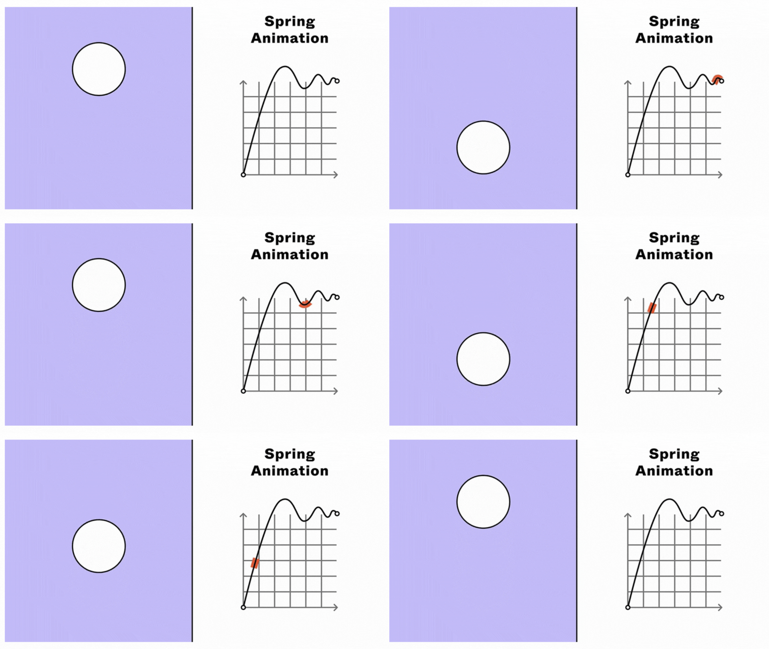
Spring (Elastic) Animation
The Spring (Elastic) easing makes the animation mimic the motion of stretching a rubber band and releasing it. Other than these, Figma also has four predefined easings: Gentle, Quick, Bouncy, and Slow.
Best Practices For Interactive Prototyping
There are several ways through which a team can prototype a system of interaction design. So, while you create your interactive prototype, make sure you follow these best practices:
1. Add appropriate labels or text on interactive elements to give users an idea about potential behavior before they take action. You can use multiple labeling methods — correct labeling, using different colors for links, etc.
2. Cover all interactions of an element strategically and define use cases for each.
3. Simplify user interfaces using familiar patterns and minimizing tasks with higher cognitive load.
4. Avoid unwanted interactions by anticipating potential errors.
5. Use a cover slide with an appropriate description.
6. Break the workflow into parts if needed.
7. Simplify system feedback and response time. Clearly define what happens when the user completes an action and how soon feedback appears.
The Future of Interaction Design
As we advance into the digital era, there will be more possibilities and ways for digital interaction. Interaction designs will keep evolving and provide diverse input controls and feedback. The interfaces and common medium for interactions may change in the future. There’s a buzz about gestural interaction technology that lets you use 3D spaces to interact with VR spaces already. We may soon have to bid goodbye to the mouse, trackpad, etc. Similarly, conversational UIs may change the input methods from keyboard to voice. We’re way too far from perfecting these technologies, but we’re headed in that direction.
Nevertheless, there will always be a need for immediate and continuous feedback in one form or the other. So, the fundamental interaction design principles will still play a crucial role in the future.


