Before we discuss interaction design, UX design guru Don Norman defines ‘usability’ to as a combination of 5 quality components –
- Learnability – the level of ease with which users accomplish basic tasks the first time they encounter the design.
- Efficiency – the speed with which users adapt to the new design.
- Memorability – the ease with which users reestablish proficiency following a gap in usage.
- Errors – the number of errors made, their severity, and the process of recovery.
- Satisfaction – the over pleasantness experiences while using the design.
It was important to go over this definition of usability before we dived into the interaction design dos and don’ts. As UI designers, we often find ourselves guilty of forgetting these components of usability – especially when our creative streak takes over.
While creativity forms the bedrock of our profession, there are times when it takes us away from the brief and the research findings, and down the rabbit hole of beautiful-yet-useless designs.
So, keeping the usability factor at the forefront, let’s take a look at some classic interaction design mistakes we often commit, and what to do instead.
Interaction Design: What works and what doesn’t
Form Layout – Stick to single columns
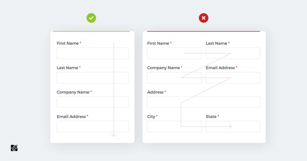
From a strictly visual point of view, multiple columns tend to disrupt a user’s vertical momentum. Therefore, it always makes sense to lay out the labels in a single column. Another rookie mistake designers often commit is not spacing and grouping the elements on forms, which leads to added confusion among users.
Hamburger menu v. Visible navigation
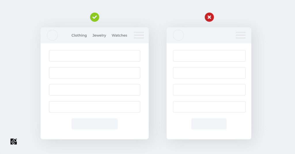
As neat and tidy as the hamburger menu looks, it is wrong to assume that your user feels the same. Who knows what those 3 nondescript little lines mean? Is it a design element? Will it take me to the next page? The hamburger menu leaves too much scope for the users’ imagination to run wild. Why not, instead, keep all the most important functions laid out in a neat row where they’re always visible? The lesser-used functions, if need be, can then be tucked away in the corner.
Keep number of fields minimal
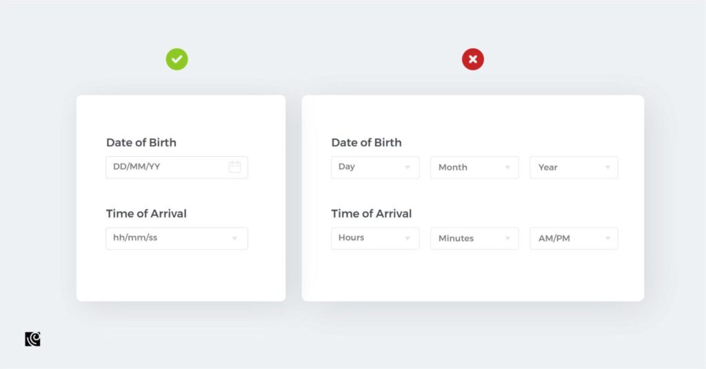
It isn’t justified to make the users perform multiple clicks for what shouldn’t take more than a few. By using multiple fields you’re only making the process more dreary and long-drawn than it should be.
Icons should be accompanied by labels
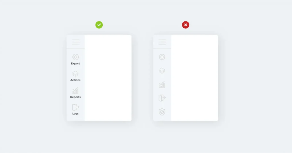
A picture is worth a thousand words. In case of icons, this can translate into the users’ worst nightmare. While designers may think of some symbols as universal – and they’re not wrong – but assumptions carry a lot of risks. There’s just too much potential to go wrong here, and that’s not how interactions should be designed. So, just label those icons.
There’s always a way to display information more clearly
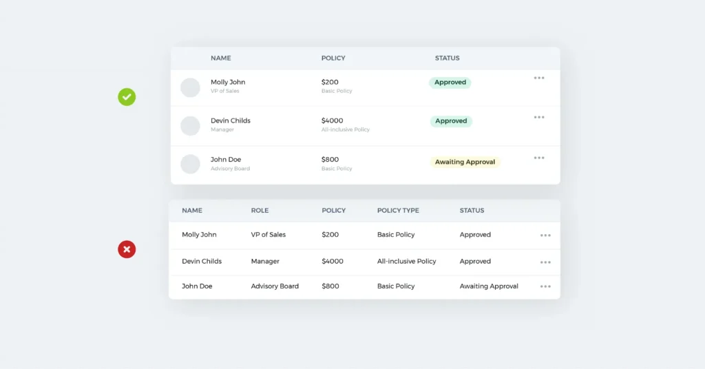
One of the leading voices on data visualization, Edward R Tufte has said, “Confusion and clutter are the failure of design, not the attributes of information.”
Succinct presentation of information means that the message is delivered to the user at a single glance. This aspect is especially important while designing enterprise applications – there’s such a lot of information to convey, and it needs to be done to perfection. Therefore, subtleties such as highlighting the most important information ensure that the user sees it upfront.
The field of UI design is complex and deep. At the same time, it also offers opportunities to max out our creative capacities. Finer nuances in execution can unknowingly result in usability mistakes such as non-intuitive buttons, jarring contrasts or complex layouts. Volumes of information are available out there that can help you become a better interaction designer.
However, I’d like to sum it all up in these few words of wisdom –
Don’t let your creative instincts overtake user needs.
Loads of information to convey? Try to make it visual.
Refrain from making use of frictional elements to user actions.
Think your idea is super cool? Better get it tested from the users.


