At Koru UX, we define User Experience to be the value provided to the user when they are using a product. Furthermore, User Experience Design is the process of increasing user satisfaction by improving the usability, accessibility, and delight provided in the product interaction.
With design thinking increasingly permeating industries, the complexity of modern businesses are also advancing rapidly. This complexity manifests variably, for instance, raising the intuitiveness of a content management system or an HRMS. Without venturing into the specifics, a common thread binding these organizations is that the people working there need assistance in simplifying them. They deserve that their everyday interactions with operation systems to be simple, efficient, and also delightful.
We believe that the determining factor of success lies in the fact that we keep the user in the center of the design process. It is this approach which leads us to create designs that are clutter-free, easy, intuitive, scalable and engaging and provides a fabulous experience to your users.
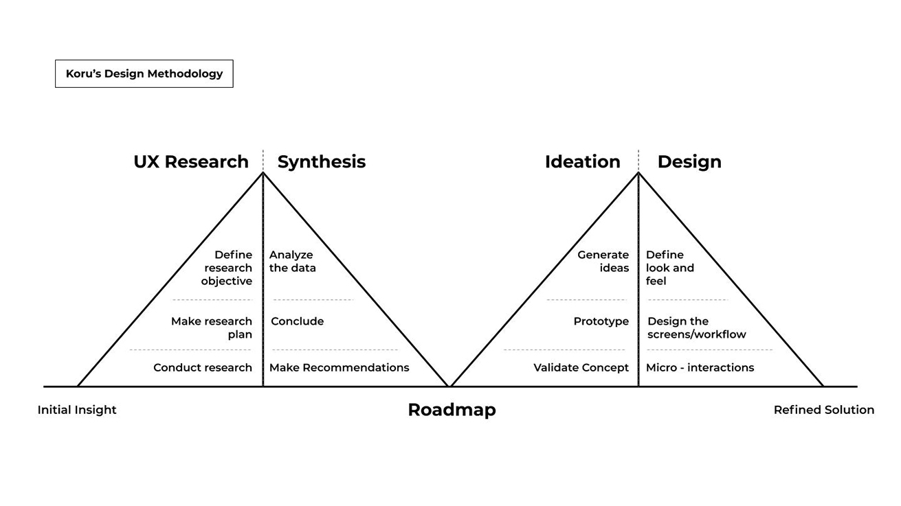
The 4 phases explained below define the design methodology at Koru UX: Research, Synthesis, Ideation, and Design. Each phase is flexible, and a permutation of these forms a roadmap that allows us to build robust solutions collaboratively. For good measure, we’ve also thrown in some pearls of wisdom that propel our creative juices in the right direction.

Diagram details of Koru UX Design Methodology
Research
Define the problem
- Rip the brief
- Define research methods
- Build research reports
Synthesis
Prioritize the problems
- Recommend solutions
- Prioritize
- Make a plan
Ideation
Explore effective solutions
- Create parallel concepts
- Gather feedback
- Iterate and add details of feedback
- Validate with users
Design
Design the solution
- Define theme
- Design screens
- Micro-interactions
- Prepare handoff
Research
The human-centered design process starts with a good understanding of people and the needs that the design is intended to meet.”
– Don Norman
In this first stage, we flex our abilities towards understanding the scope of what is to be achieved, including the determination of the terms of the project such as timelines and budget. A UX Manager is designated to be in the thick of action takes the lead and deconstructs the brief. With the team alongside, they collaborate along with the team, they identify the missing gaps in understanding and the UX methods/exercises that can help in completing the picture. This phase begins depicting a clear picture of user needs and goals, and answers questions like: Who are the personas we’re designing for? What are their behaviors, needs, and goals?
UX methods engaged include –
- Contextual inquiry
- User study
- Persona definition
- Usability testing
- Process Mapping
Synthesis
“Get rid of everything that is not essential to making a point.”
– Christoph Niemann
This phase sees the results of the testing phase being compiled and assembled into reports. These are then inspected to identify behavioral trends and opportunity areas and potential sites of action. Once identified, the team gets down to the task of prioritizing the problems to be solved and establish the approach and line of action to be undertaken to solve the problem. The team builds a live Product Requirement Document that captures the same holistically.
Ideation
“No. I don’t think the Empire had Wookies in mind when they designed it, Chewie.”
– Han Solo to Chewbacca referring to the Tydirium shuttle.
Clearly the most exciting phase of the design process, our ideation stage covers the creation of possible solutions that will meet business needs and user needs (and Wookie needs), zeroing in on the ones which would be viable on all grounds. This is when the UX team splits itself into smaller groups, working in their own silos. They brainstorm and build concepts that would address the identified user problems and could add value to the overall brief. These concepts are built as paper sketches or simple drawings on the whiteboard and are discussed internally and compiled into 2 to 3 specific directions. Once done, there are times when this phase slips into the cyclic mode, as there are always things to be improved. In doing so, the creative quotient of the solution gets maximized, and individual approaches end up being completely unique in their own ways.
Design
“The most profound technologies are those that disappear. They weave themselves into the fabric of everyday life until they are indistinguishable from it.”
– Mark Weiser
Stepping into the design phase, invisibility is what we aim at. From the functional viewpoint, as the solution starts to get validated, the wireframes and prototypes are transformed into actual images with themes, components, and styles applied to them. The focus, mind you, is still centered on understanding on the user and workflows and building the best-suited interaction for them that is seamless and quietly efficient.
The outcomes of the design phase are jpeg mock-ups built using photoshop. Preparing and sharing of design specifications (principles, guidelines, colors, typography, iconography) with the development team is also part of this stage.
At Koru UX, we pursue the right design direction by rallying together and collaborating, thus building a shared understanding of the problem and solution. For us, the entire process of creation is based on the people we’re designing for, and the people we’re designing with.


