“As we’ve moved to virtual work, we haven’t just coped, we’ve actually thrived. We are making quicker decisions and acting. Meetings are now more inclusive of people regardless of location, level, or other differences. We have great momentum and need to figure out how to carry it forward.” – Suresh Kumar, Global CTO, Walmart.
Remote work is now thriving, as rightly said, a far cry from what it used to be a year ago. The move from conference rooms to living rooms has been shaky, to say the least. However, with time, people have managed to bridge that chasm of awkwardness and embrace the new normal. But if we were to single out an interaction that quite hasn’t made a smooth switch to the remote mode, it would have to be design reviews.
Having worked with several teams, product owners, and managers over the past year, we have managed to glean numerous ways to navigate the choppy waters that can be a remote UX design review.
To start off, here are the challenges faced by remote UX designers –
- Putting across the complex decision-making process in a way that stakeholders comprehend.
- Airing their views effectively and offering pushback without being misinterpreted.
- Managing a scenario where several design directions are explored without making it overwhelming.
- Ensuring the conversation stays true to the agenda and does not veer off-track.
We, at Koru UX Design, have been acing the remote way of functioning even before it became the necessity it is today. Over the years, we’ve had healthy exchanges with stakeholders with minimal or misguided knowledge about UX design, or those with just a few minutes to spare/make-it-quick variety. Therefore, our experiences have enabled us to become efficient at navigating design walkthroughs and making them engaging and result-oriented.
Here’s what we’ve learned over the years.
Before the UX Design Review
Pick the right tools

A greater part of how successful your remote UX design review will be hinges upon the technology you pick. With an array of quality video conferencing tools, it can be difficult to make the right decisions. But there are criteria you can apply that lead you to the solution.
For instance, Slack or Figma can work very well when you have a smaller, internal group. But when you have several people joining in externally, Google Meet or Zoom work better. Seek out tools that allow real-time commenting, can record sessions for later references, and are accessible through a web browser rather than required to be downloaded. While Figma and Slack work well in terms of gathering feedback right in the tool itself, these are still subscription-based.
No matter which tool you use, it is important to thoroughly understand its functions and glitches as well, so make sure you do a trial run before the real thing. As a UX specialist, pay attention to the user experience of the tool from the perspectives of both, yours (the design team) and theirs (the stakeholders). It goes a long way in ironing out any potential bugs.
Preset an agenda

It is important that all the participants clearly understand the purpose and goals of the meeting, how they’re expected to contribute, and the value they bring to it. Consider what your audience is expecting from this agenda. Does your audience comprise developers or stakeholders? This will help you outline your goals more clearly and determine your areas of focus.
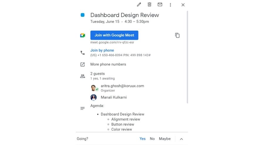
Here’s what a basic yet focused agenda can cover –
- Goal/Intention of the meeting.
- The purpose of this goal.
- Brief description of the designs to be reviewed.
- What is needed from the stakeholders and why.
Make a bulleted list of these items using brief, actionable phrases. This will ensure that the expectations for the meeting are clearly laid out before it commences. You should share it a day or two before the review, giving the recipients time to reflect. Your review meeting should commence with a recap of the agenda so that it sets the tone for things to follow.
Having a template such as this one will set good documentation standards. Be mindful that all of your remote reviews won’t be smooth sailing, so having a standard format of contextualizing, laying down expectations, and annotating your design solutions will help you in the long run. Good documentation helps bridge the gaps when meeting in person or even over video is not always convenient.
During the Review
Begin with setting the context

Once you’ve set the expectations through a revision of the agenda, move on to giving them an overview of the project. This will help you lay a common ground for the review, ensuring that each person is on the same page in their understanding of the project’s current status and the decisions that led to this point.
Here are the points you can cover to set the context –
- Project’s background in brief.
- Tasks outlined to be accomplished in the previous meeting.
- Progress from the previous meeting.
This introductory context helps the audience be clear about what they’re about to review and the areas of focus in the prototype they’re going to see. Launching headfirst into the design screens can overwhelm or confuse some people, especially if they’ve missed the agenda you’d sent to them the day before. Although this would seem like a wasteful repetition, it will be useful for them to quickly comprehend your design directions and decision-making.
Keep the prototypes ready

Technical glitches can result in loading delays or uncomfortable transitions as you go about displaying your designs, seeking feedback. So, ensure that an unstable connection on your side does minimal damage. Have your Figma files loaded in the desktop application, in case you’re using a web-based prototype tool, keep it open in the browser, or have your PDFs preloaded in Acrobat.
Extract the right feedback

Upon receiving feedback from a stakeholder, make sure to repeat your interpretation out loud, either immediately or after taking brief notes. This helps in reinforcing the right message and negates any miscommunication. When you’re repeating the brief, you can also include any issues that should be highlighted, edge cases, or any solutions that spring to your mind. This helps in clearing ambiguity, if any, and makes for efficient communication. Also, ask questions. Each element in the design has a specific purpose to fulfill. Ask out loud what can be added or removed to make things better and simpler for the users.
Let’s face it, design reviews are a lot of work. Communication is the topmost challenge when it comes to designing remotely. A diverse group of cross-functional stakeholders along with their own priorities and limited familiarity with the process of design reviews make it a complex mix. Being prepared is what can make the process smooth, at least to an extent that the objectives of the review stand fulfilled. Do you have any tried-and-tested techniques that have helped you ace remote design reviews? Share them in the comments below!
Being prepared is the only thing that makes design reviews smooth, at least to an extent that the objectives of the review stand fulfilled.


