Product leaders, Hello, Bonjour, Hola, 你好, नमस्ते, Guten Tag, こんにちは, Привет, Merhaba, Jó Napot, Здраво!
Every SaaS brand dreams of sky-high adoption rates and users turning into raving fans. But what if that dream falters at the starting line? Most of your users will sidestep a product that doesn’t communicate in their vernacular.
According to Nimdzi, 9 out of 10 users are more likely to engage and adopt products that cater to their language and cultural preferences.
Imagine a European user, keen on GDPR-compliant finance tools, stumbling upon an app that’s solely dollar-centric with a 12-hour clock format. Dissonance, right?
This is where internationalization and localization become a game-changer. Products that feel native and relevant to the users drive maximum adoption. We’re not just discussing swapping languages—we’re talking about a lot of aspects like demographics, culture, user preferences, and even regulatory nuances.
SaaS localization and internationalization help product leaders like you shatter cultural and usability walls.
It helps companies protect and increase their market share while fending off competition and ensures that users not only download but actively use your product. In this blog, we’ll talk about why internationalization and localization is a strategic cornerstones for any SaaS product aiming for global resonance.
Defining Internationalization and Localization: From A UX Lens for the B2B Space
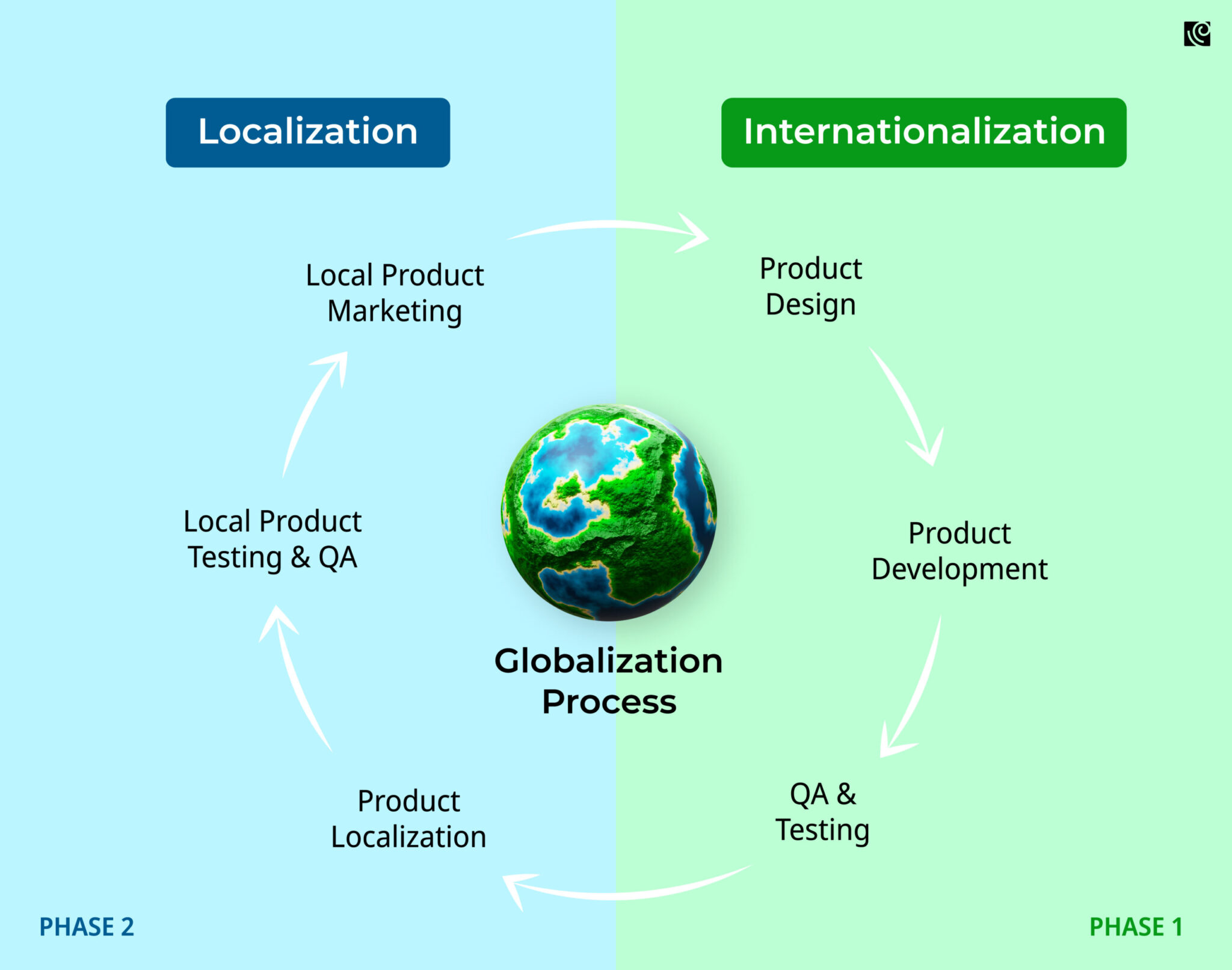
Internationalization (i18n) is the bedrock of a globally resilient product. At its core, it is about designing a software application so it can be effortlessly adapted to various languages and regions without major changes.
For B2B solutions, this means constructing platforms that, for instance, can handle different business regulatory standards or seamlessly integrate with diverse financial systems. It ensures the foundation of your software remains consistent while allowing room for specific regional adjustments.
Once a product is internationalized, SaaS localization (l10n) comes into play to specifically adapt the software for a particular audience based on linguistic, cultural, and other local requirements.
In B2B, this could translate to modifying a CRM tool to reflect regional sales methodologies or adjusting an analytics dashboard to present data as per local business hours.
Why is this critical for B2B leaders?
Because in 2023, product leaders cannot afford surface-level internationalization. A mere English interface might alienate up to 60% of non-native speakers. But when you go deeper, it is about:
- Trust Building: Localized products foster trust. When a platform respects regional nuances, clients believe you truly understand their market.
- Market Expansion: To penetrate new regions effectively, it’s essential to tailor software to meet specific local demands, not just linguistic ones.
- User Retention: B2B users, when met with familiar interfaces and processes, are less likely to switch platforms, leading to better retention.
- Compliance and Regulation: Different regions have unique regulatory requirements. Localized platforms ensure adherence, preventing costly oversights.
- Enhanced Collaboration: Global teams work better when tools cater to everyone’s local preferences, fostering smoother cross-border collaboration.
SaaS Localization And Internationalization Best Practices in UX
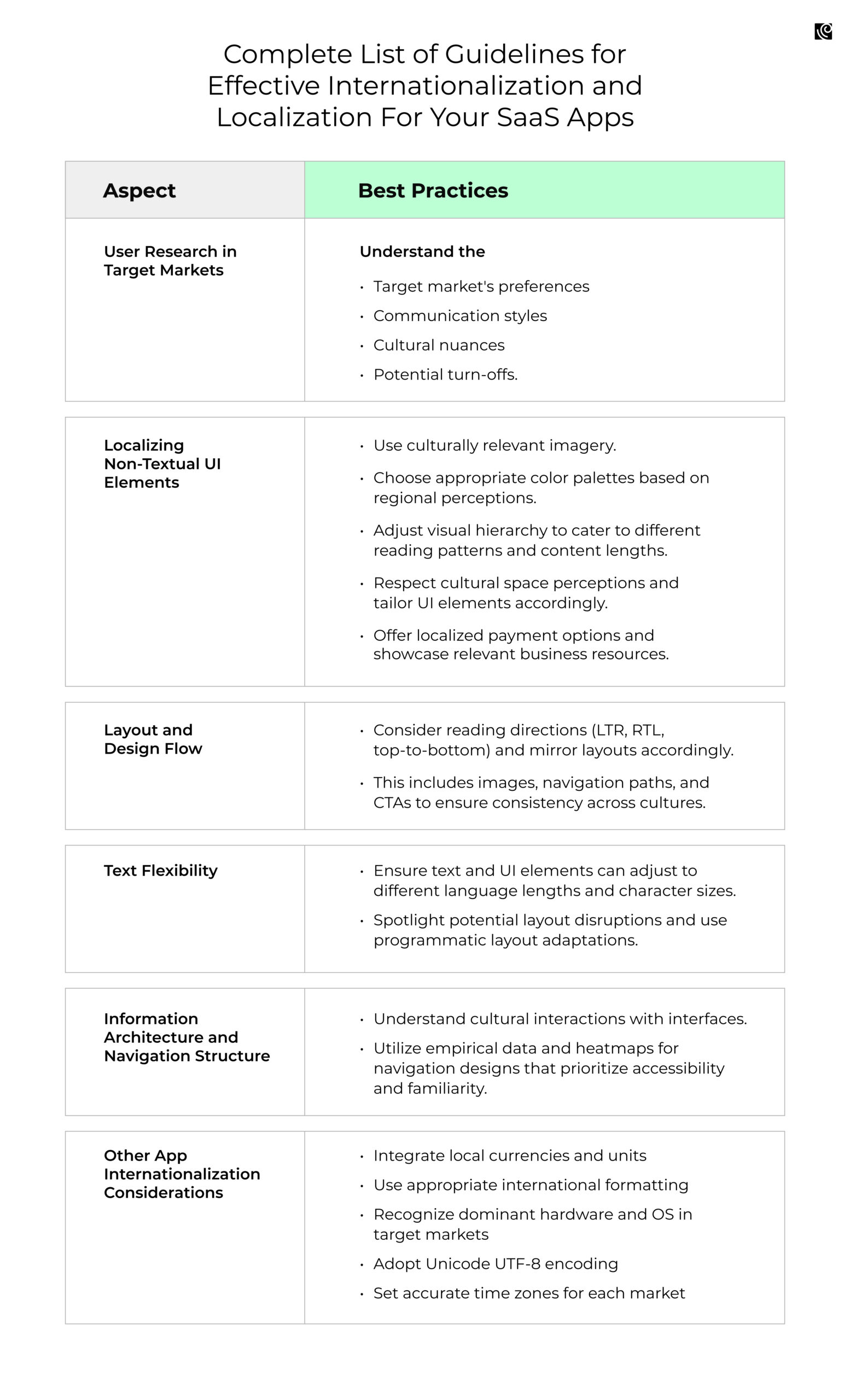
User Research in Target Markets
The first step in the SaaS localization strategy is to research your target market.
Ask:
- Who are they?
- Where are they?
- How do they prefer to communicate?
And, crucially, what’s meaningful or possibly off-putting in their culture? Overlooking these cultural nuances can quickly turn a well-intended move into a misstep, pushing potential customers away. Always remember, it’s not just about translating; it’s about resonating with the local users.
For example, when Apple eyed Japan, they knew better than to bring their Mac VS PC campaign along. Why? In Japan, taking jabs at competitors isn’t just bad form—it’s bad business.
Here are some user interface challenges that you must consider to create a product that feels native:
- Names: In the US, forms typically request first and last names. But in Spain, expect to include fields for both paternal and maternal surnames. In many Asian contexts, the family name precedes the given name. A misaligned name structure can confuse users, making them question the reliability of your software.
- Address Formats: The US goes from street to city to state. Japan starts with the postal code. Get this wrong, and not only do you risk delivery or service errors, but you also signal to users that you don’t care enough to research their norms.
- Date Formats: While Americans note dates as month-day-year, Europeans typically use day-month-year, and China prefers year-month-day. Misinterpreting dates can lead to scheduling mishaps, frustrating users, and causing potential business setbacks.
- Payment Preferences: While credit cards reign in many regions, countries have local favorites, like iDEAL in the Netherlands. Overlooking local payment methods can create transaction barriers, reducing potential conversions.
Localizing Non-Textual UI Elements
When designing cross-cultural products, designers not only have to contend with different languages, dialects, and dimensions of national culture, but also cultural differences in color psychology and mental models.
I. Culturally Relevant Imagery
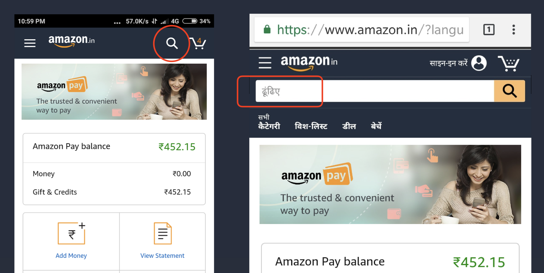
Visual cues are often rooted in culture, and what’s universally recognized in one region can be baffling in another. Take Amazon’s venture into India. Their magnifying glass, universally recognized as ‘search’ in many regions, was mistaken for a ping-pong paddle by many Indian users.
It wasn’t just a miss; it was a cultural oversight. As a remedy, they retained the magnifying glass but supplemented it with a Hindi text label.
II. Color Palette Considerations
Colors speak, but they don’t say the same thing everywhere.
According to research, perceptions of color vary from region to region, and a single color may have different, even contrasting meanings around the world.
For example:
- In Western cultures, red is often associated with danger
- In China, it is associated with good luck and prosperity.
- In India, red stands for purity and is a prominent hue.
- For Latin American nations, the pairing of red and white holds religious implications.
- Meanwhile, the Middle East sees red as a warning or cautionary color.
Recognizing these nuances and designing accordingly can be the key to successful SaaS localization.
III. White Space and UI Elements
Design respecting cultural space perceptions enhance user comfort and clarity. For instance, while a Western B2B portal may prize spacious designs with ample white space for clarity, its Chinese counterpart might lean towards a densely packed UI, reflecting their appreciation for multi-functionality in apps.
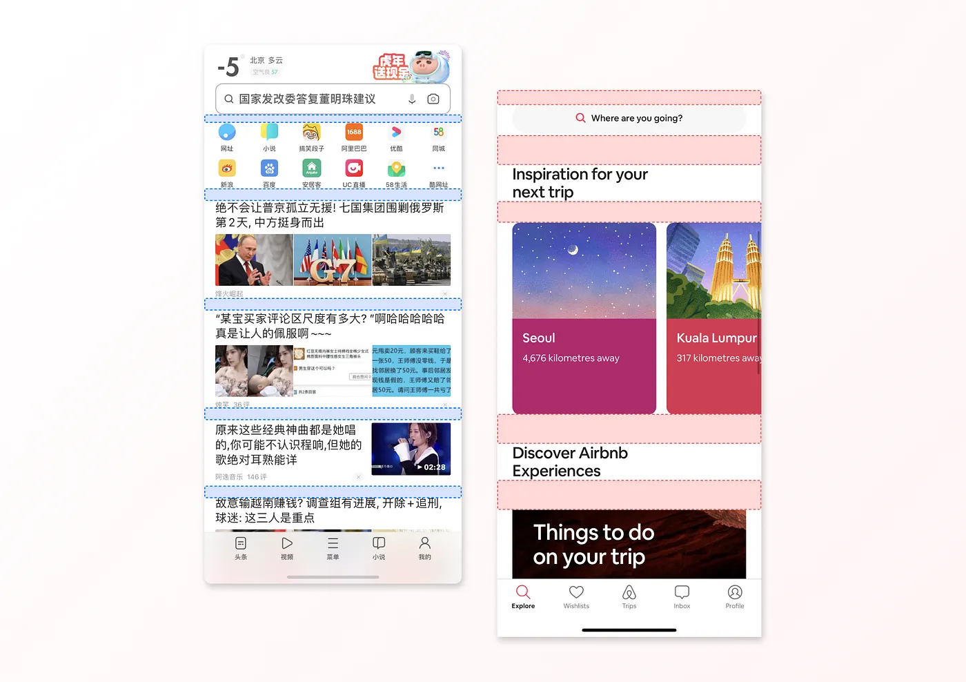
Consider the rise of super apps like WeChat, which house an array of services from messaging to booking tickets. Contrast this with the West, where dedicated apps like Postmates or Lyft serve singular tasks. Hence product leaders must ensure that their UI is tailored to respecting regional preferences. They must ensure that every user feels at home while navigating your product.
IV. Relevant Links and Payment Methods
Seamless transactions and relevant resources enhance user confidence and loyalty. Your European partners might prefer SEPA transfers, while your Japanese partners lean towards credit card payments.
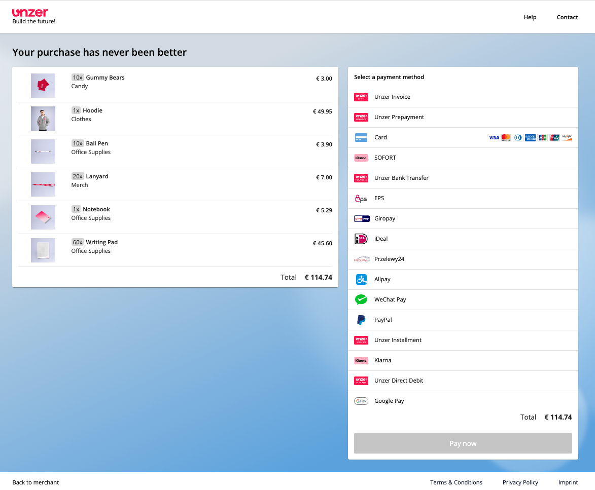
By prioritizing localized payment options and showcasing pertinent business resources tailored for them, you create a harmonized transaction experience. And this isn’t a mere gesture—it’s foundational for a smooth international UX. The currency symbols, the choice of payment gateways, and the frequency of in-app purchase prompts should be thoughtfully localized.
Layout and Design Flow
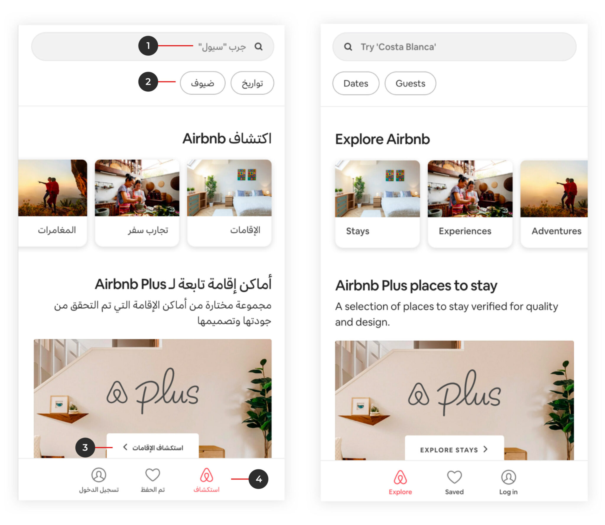
Cultural nuances in the reading direction add a layer of intricacy to the design. Whether it’s left-to-right (LTR), right-to-left (RTL), or top-to-bottom, each demands a unique design approach. For languages switching between LTR and RTL, designers must mirror their layouts. This isn’t just about flipping text; it encompasses images, navigation paths, and even calls to action. Tailoring design elements ensures a consistent and intuitive user experience across all cultures. Here’s a snippet of the Airbnb app:
Text Flexibility
Text fluidity is pivotal in UX design, especially when targeting diverse markets. Language length and character size vary significantly.
For instance, a product dashboard streamlined for English users can appear cluttered when translated into German, known for its longer phrases. Going from English to Italian phrases will at times cause text expansion of around 300%!
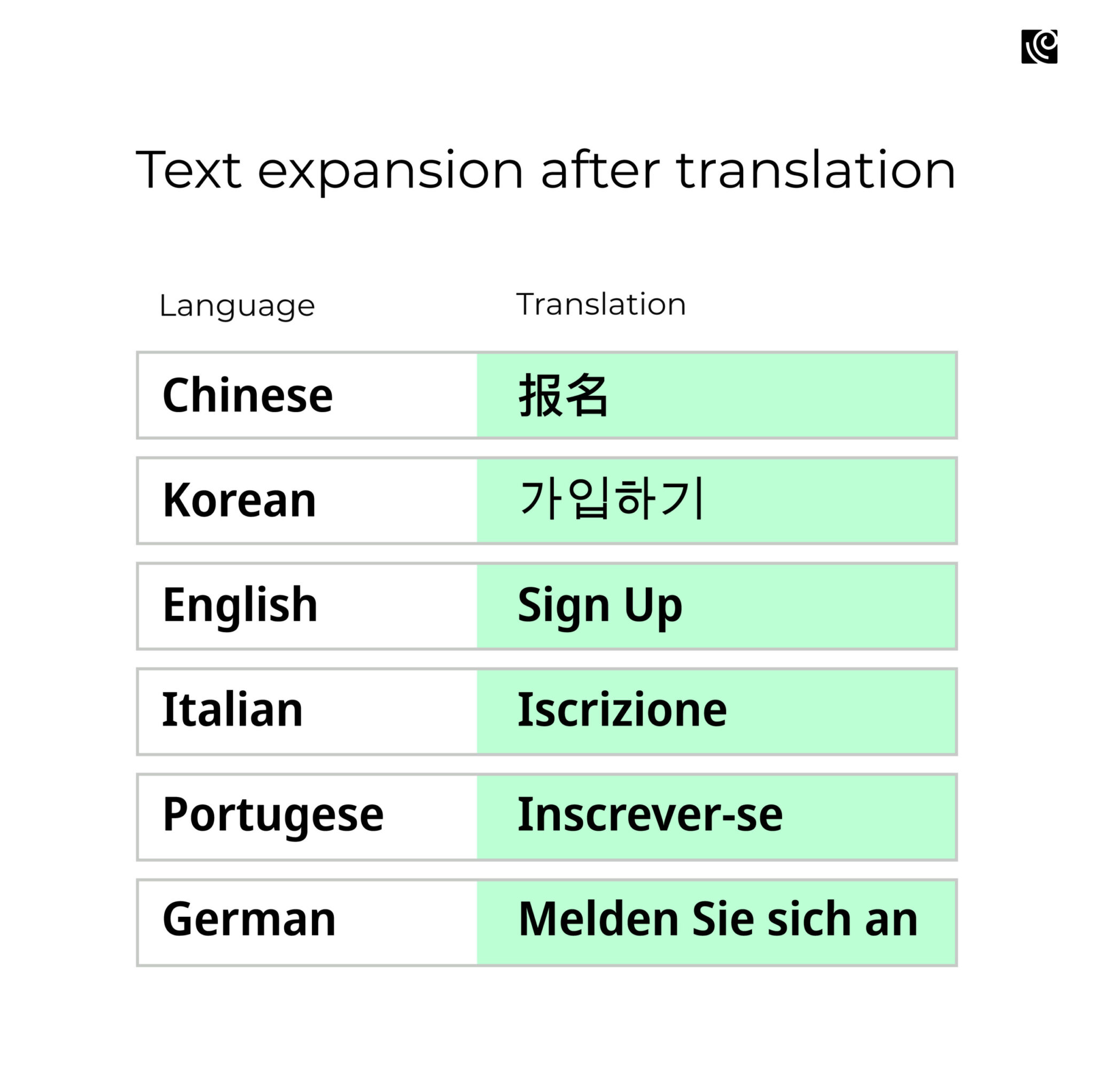
Misalignment isn’t just an aesthetic concern; it impedes clarity and function. Consider a B2B software platform: if a dashboard button says “Analytics” in English, its translation into another language might not fit the designated space.
The solution?
- Implement dropdown menus to manage varying text lengths, though it might increase clicks.
- Use dynamic layouts, allowing longer texts to span two lines, which might appear inconsistent across locales.
- Opt for programmatic layout adjustments based on the specific language or locale to cater to different naming conventions.
Information Architecture And Navigation Structure
Cultural nuances dictate how users interact with interfaces. For instance, while Western businesses might appreciate broad navigation, Eastern partners might lean towards deep, detailed structures.
Empirical data reveals task completion rates vary across cultures based on these navigation patterns. For B2B platforms, understanding and adapting to these cultural preferences in information architecture is paramount. It’s not just about ensuring accessibility; it’s about ensuring familiarity and trust.
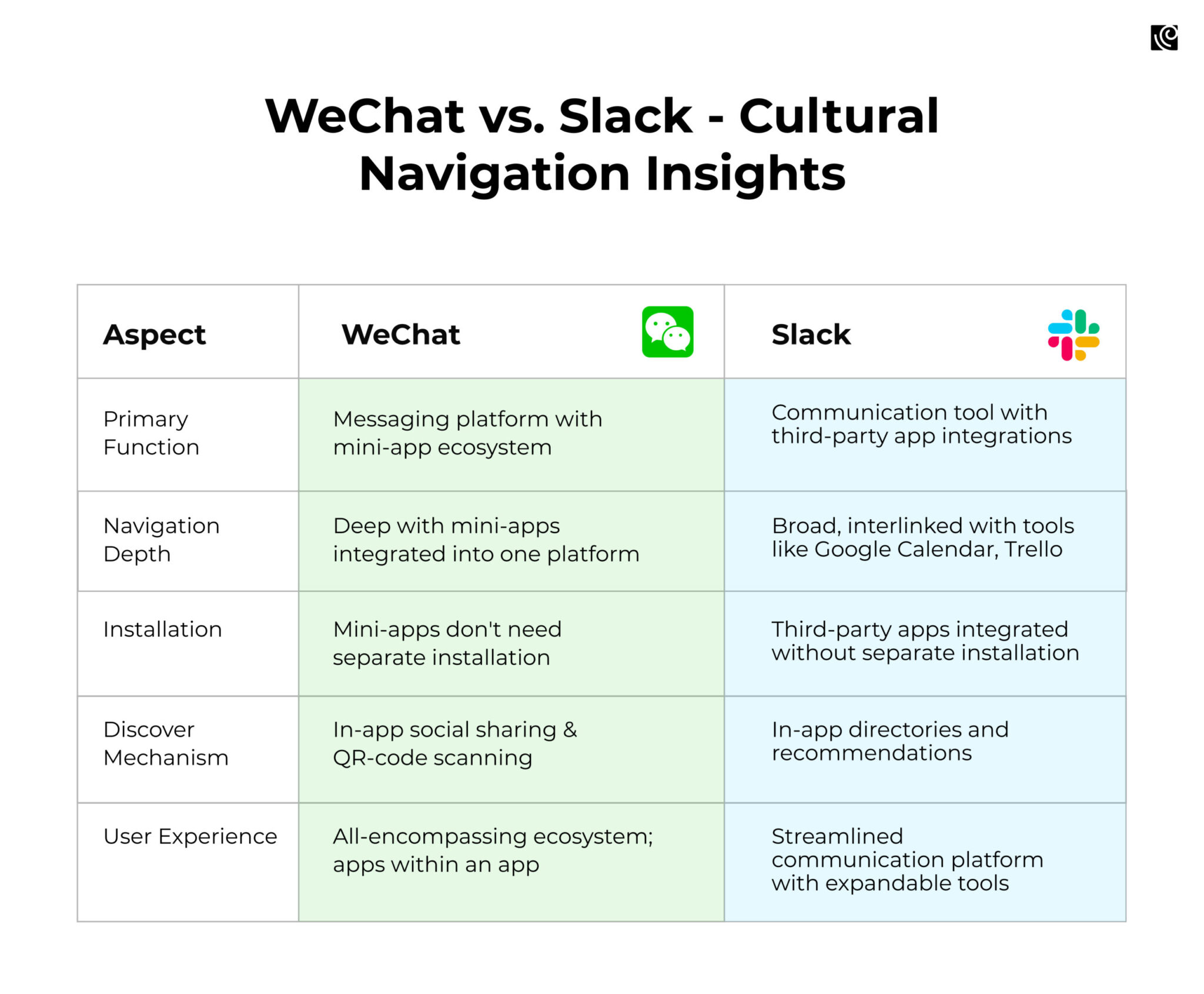
Case in Point: WeChat vs. Slack
In China, WeChat’s mini-programs exemplify deep, integrated navigation. It’s a multi-layered digital marketplace tucked inside a messaging app. The architecture is deep, with multiple layers of functionalities, catering to users who are accustomed to having multiple features packed into one platform.
On the other hand, Slack, popular in Western businesses, integrates third-party applications without overwhelming the core communication experience. Channels, direct messages, and apps/integrations are delineated. It’s made for streamlined communication, with a focus on simplicity and ease of use.
Other App Internationalization Considerations
Taking your product global means more than just translating content; it’s about tailoring every element to resonate with varied user expectations. Here’s what to consider for seamless internationalization:
- Local Currencies and Units: Facilitate smooth transactions by integrating local currencies and units. For example, businesses launching in the UK should display prices in GBP and measure distances in miles, not kilometers.
- International Formatting: Pay attention to phone numbers and calendars. In some regions, the date format starts with the day, while others lead with the month. The structure of phone numbers can also vary significantly.
- Dominant Hardware and OS: Recognize the prevalent devices and systems in your target market. If a majority in a region uses Android over iOS, tailor your app’s UI to fit those nuances.
- Encoding Standards: Adopt Unicode UTF-8 encoding. This ensures the app can display a diverse set of characters and symbols, essential for languages with unique scripts.
- Time Zones: Set accurate time zones for every market, ensuring scheduled functions or notifications don’t disrupt users at odd hours.
Design for Internationalization And Localization Needs Special Attention
As B2B companies venture globally, they’ll face the challenge of navigating diverse markets, sociopolitical landscapes, and cultural nuances.
It’s tempting for global leaders to hit the fast-forward button and launch products swiftly. But for a truly standout user experience, the design process needs a thoughtful pause. Genuine UX magic lies in understanding the cultural backdrop – sometimes, that means slowing down and soaking it in.
UX research isn’t just a box to tick; it’s the heart of human-centric design. It helps explore what people say, think, do, and feel to uncover fresh insights that help design human-centered solutions. The road to crafting a truly resonant digital product might have its twists, but with a keen grasp of cultural nuances and the right tools, you’re not just navigating the journey—you’re mastering it.


