Picture this: You’re a new client of a company, excited to implement their advanced project management tool across your organization. The onboarding process begins with a promising start:
- The sales team provides a broad overview of the software’s capabilities.
- You’re then directed to the account setup team, where your users receive a barrage of technical emails for user account configuration.
- Next, you’re handed over to the customer success team for training. However, this team uses a different communication platform, requiring your users to adapt to a new interface. On top of that, the training provided is generic, and not tailored to your specific needs or industry.
- For advanced features or integrations, you must navigate yet another hurdle: reaching out to a separate technical support team via a different ticketing system.
That’s a lot of new platforms and interfaces to catch up to.
Plus, each of their team operates in isolation, unaware of your interactions with other departments, hence leading to repeated explanations and fragmented guidance.
This is a cumbersome and confusing onboarding experience. And this is what every SaaS user out there wants to escape.

Poor Onboarding: What Does It Mean For Your SaaS App
Poor onboarding ranks as the third leading cause of user churn, surpassed only by issues related to product fit and lack of engagement.
A seamless user-focused onboarding is key to increasing a SaaS customer’s lifetime value. This is particularly vital in today’s market, where an abundance of competing tools exists, and companies are quick to switch if a tool fails to meet their needs effectively.
In this blog, we’re going to talk about user-focused onboarding, examples, strategies, and best practices that every SaaS product leader must know. Let’s get started.
Why Do The First 7 Minutes of Onboarding Matter?
Because:
- The initial seven minutes establish the user’s perception and engagement trajectory.
- Users rapidly assess the product’s value, influencing their ongoing interest and usage.
- It reduces early drop-offs and is also key for understanding user behavior, preferences, and potential friction points.
63% of customers think onboarding is key to deciding to subscribe to a product. 74% of potential customers will switch to other solutions if the onboarding process is complicated.
A prime example of this is Deputy, a cloud-based management and scheduling platform. Despite attracting thousands of trials and content downloads monthly, they faced a high drop-off rate, with 60% of users not returning for a second session.
To address this, they focused on refining their onboarding process, zeroing in on the duration of the first user session. The key was to design an onboarding experience, ideally under seven minutes, to captivate prospects and reduce drop-off rates.
What Does Great User Onboarding Encompass
“The best onboarding experiences are a combination of simplicity, guidance, and user-focused design.”
– Julie Zhuo, former VP of Product Design at Facebook.
Great user onboarding is essential in transforming new users into proficient ones, achieving three key objectives:
- It significantly reduces the time for new users to realize the value of your product
- Guides them towards their ‘aha moment’ efficiently
- Accelerates their journey to activation
You might be aware of the Product-Led Growth Flywheel framework:
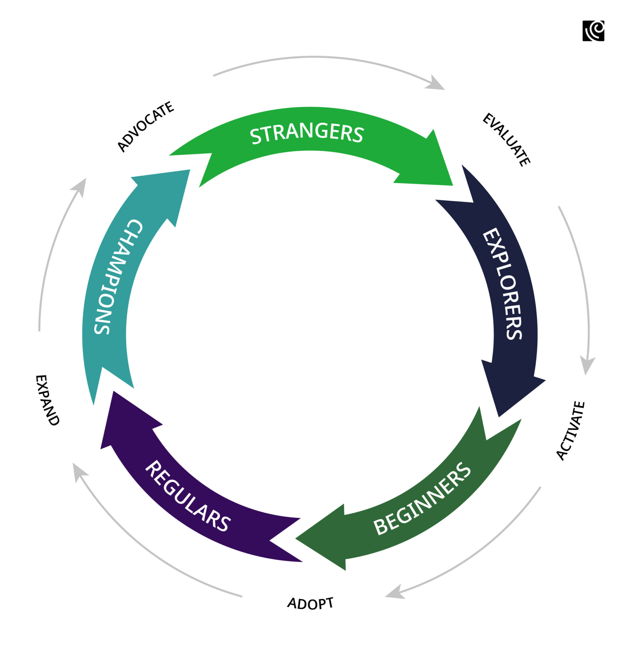
Onboarding is a crucial lever in this flywheel. It converts ‘Strangers’ into ‘Explorers’, then progresses them through stages of ‘Beginners’, ‘Regulars’, and ultimately ‘Champions’.
This process begins by convincing Evaluators, who are on the fence, that your product is worth their commitment. As these Evaluators become Beginners, they are systematically educated on the features and benefits of your product. This understanding fosters their transition into Regulars and eventually Champions, who actively advocate for your solution.
User-focused onboarding is the catalyst for this transformation.
It sparks a momentum in the growth flywheel that leads to sustainable and escalating growth over time. The key lies in delivering an onboarding experience that not only educates but also inspires commitment by swiftly demonstrating the promised value of your solution.
8 great user onboarding UX and UI patterns
Continuously reinventing the onboarding process without a solid template is inefficient and prevents learning from past experiences. The key lies in templatizing key onboarding milestones, and systematically incorporating feedback from each onboarding cycle to enhance the process.
This not only streamlines user onboarding but also ensures scalability and consistency, helping to avoid the repetition of past mistakes. Having said that, there are a few effective UI/UX patterns that are integral to crafting a great onboarding experience.
Welcome Message
A welcome message sets the tone for a user’s experience. It’s a brief, friendly introduction to the product, easing users into the environment and often giving a glimpse of the brand’s personality.
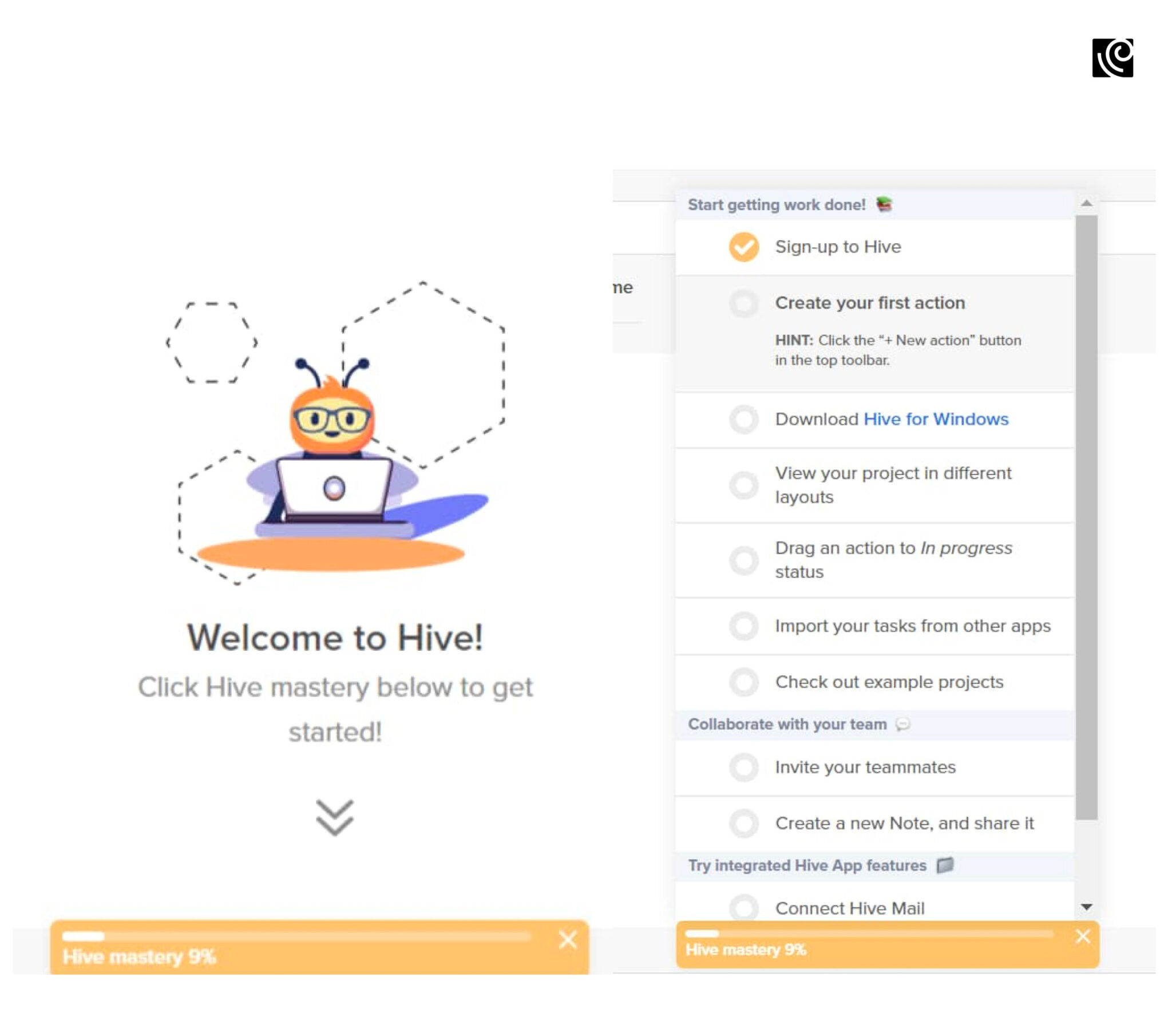
Example: Hive utilizes gamification techniques in its welcome page, making the onboarding experience more engaging and interactive. The page invites users to begin their journey with “Hive Mastery,” using game-like elements to motivate and guide them. This approach not only welcomes users but also encourages them to explore and learn the platform’s features in an enjoyable and self-driven manner.
Product Tours
Product tours are guided walkthroughs highlighting key features and functionalities. These tours are tailored to demonstrate the most valuable aspects of the product, ensuring users quickly understand its core benefits.
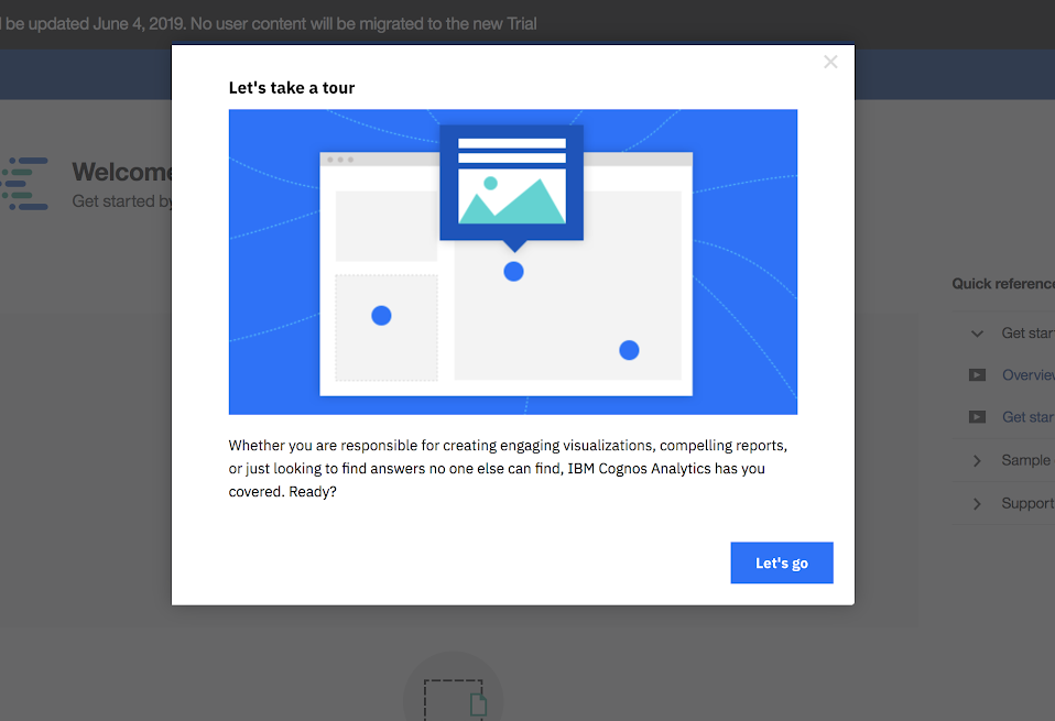
Example: IBM’s Cognos Analytics effectively uses product tours to simplify its sophisticated enterprise product, making it more accessible to new users.
Progress Bars
Progress bars visually indicate the completion status of the onboarding process. This clarity helps manage user expectations, showing them how much more they need to do before they’re fully onboarded.
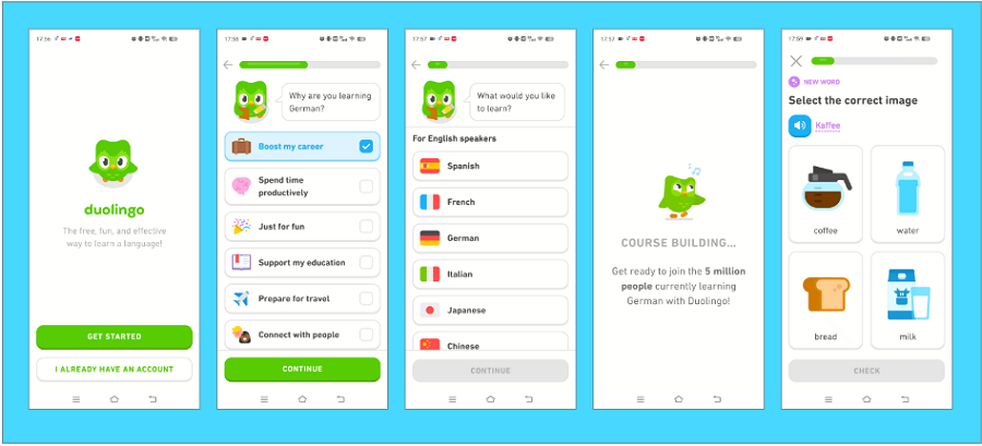
Example: During onboarding, Duolingo introduces progress bars that visually indicate how far users have come in setting up their account and selecting their learning path, effectively motivating them to complete the initial setup process.
Checklists
Checklists present users with a clear set of tasks to complete during onboarding. This methodical approach helps users feel accomplished as they tick off each task, ensuring they engage with key features.
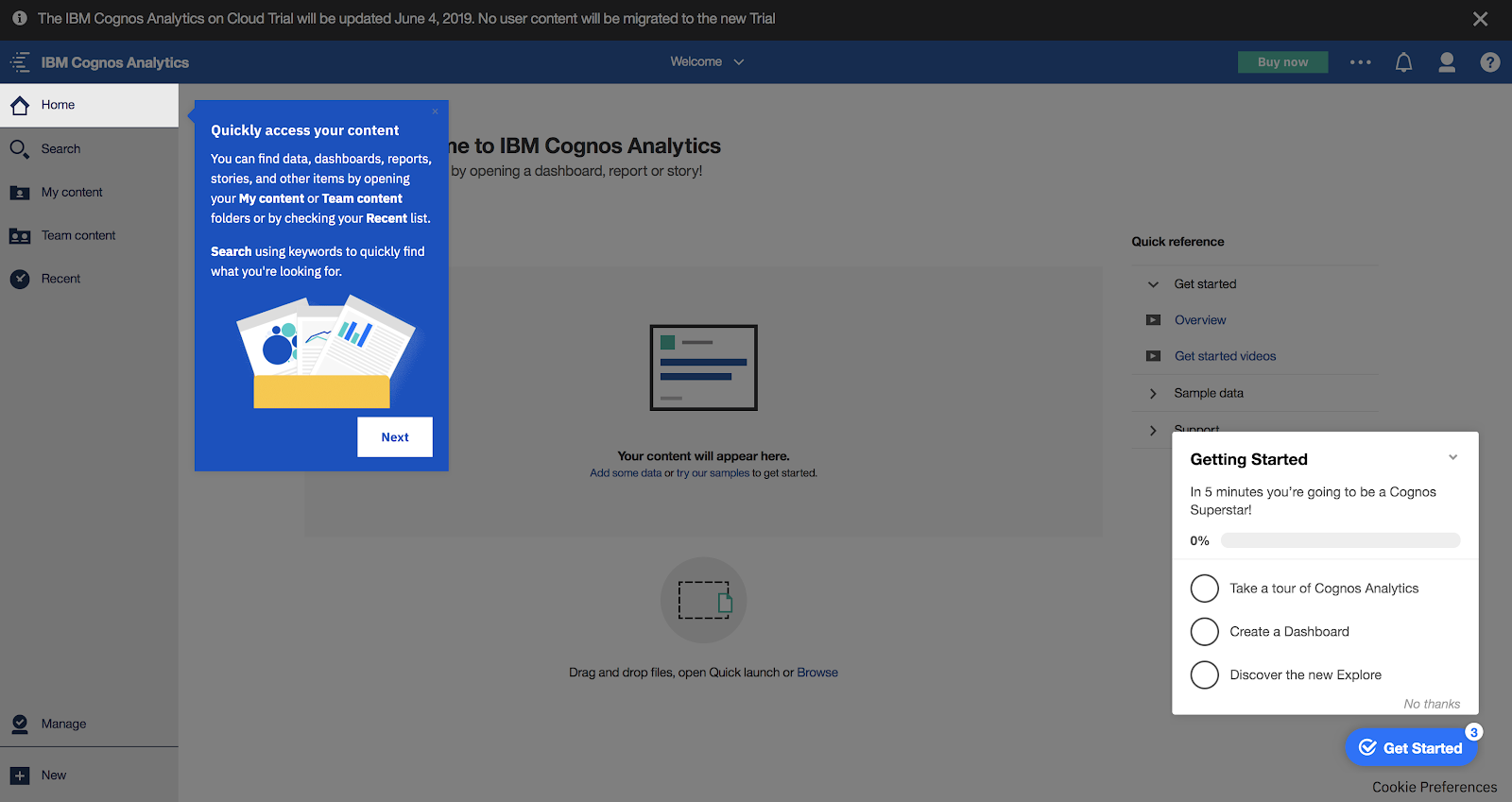
Example: IBM’s Cognos Analytics integrates a concise onboarding checklist, ideal for navigating its feature-rich AI-driven business intelligence tool. This approach effectively guides new users, avoiding overwhelm by focusing on key functionalities rather than an exhaustive feature list. Users are welcomed with a choice-driven modal, leading them through essential features or directly into specific tasks, tailored to their needs.
Hotspots
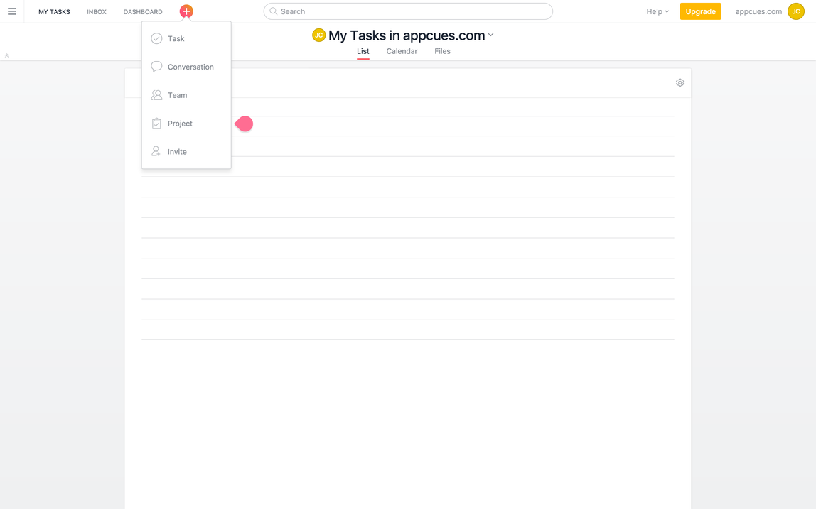
Hotspots are subtle indicators that draw attention to specific features without disrupting the user’s workflow. They’re an unintrusive way to highlight new or complex functionalities.
Example: For instance, when new users log into the project management tool Asana, they are greeted with a highlighted hotspot on their dashboard, drawing attention to the “Add New” button. Upon clicking this button, a New Item menu appears, accompanied by a tooltip that clearly explains the steps to create a new project.
Action-Driven Tooltips
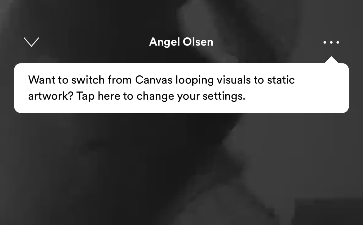
These are contextual pop-ups that appear when a user performs a specific action. They offer timely guidance, making the learning process more intuitive and less overwhelming.
Example: Tooltips serve as handy reminders of lesser-known features too. They highlight functionalities that users might not be immediately aware of. Check out this helpful tooltip by Spotify:
Deferred Account Creation
This pattern allows users to explore the product without the initial barrier of account creation, reducing friction and encouraging immediate engagement.
Example: TikTok defers signup until users want to like or comment. This way, users can choose to sign up when they are ready, and TikTok has time to convince people on the fence to take the plunge.
Persona-Based Onboarding
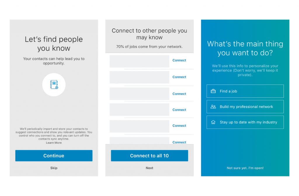
This approach tailors the onboarding experience based on user responses to initial survey questions. It ensures that the product feels relevant and personalized to each user.
Example: When users first sign up for LinkedIn learning, they are prompted to choose their areas of interest and learning objectives. This information is then used to tailor the course recommendations and learning paths, ensuring a personalized and relevant onboarding experience that aligns with the user’s unique goals and preferences.
How To Create A Great Onboarding Experience: 5 Strategies For Saas Leaders
86% of the users say they will remain loyal if onboarding and continuous education are provided.
This underscores the pivotal role of onboarding in fostering user loyalty and retention. Let’s explore five essential strategies that SaaS leaders can employ to craft an onboarding experience that not only educates but also engages.
Personalized User Journey Mapping
Personalized journey mapping helps you move beyond generic flows to create tailored experiences that resonate with individual user needs.
SaaS platforms can segment users into distinct personas based on their roles, goals, and use cases. You can do this by leveraging initial micro surveys from the welcome screen.
This segmentation enables the design of customized onboarding paths, each meticulously crafted to meet the specific requirements of different user types.
Tumblr’s Approach to Personalized User Onboarding
At the heart of Tumblr’s strategy is persona-based onboarding, where the visual design and microcopy are uniquely tailored to each user. This personalized approach enhances user engagement and fosters a sense of connection with the platform.
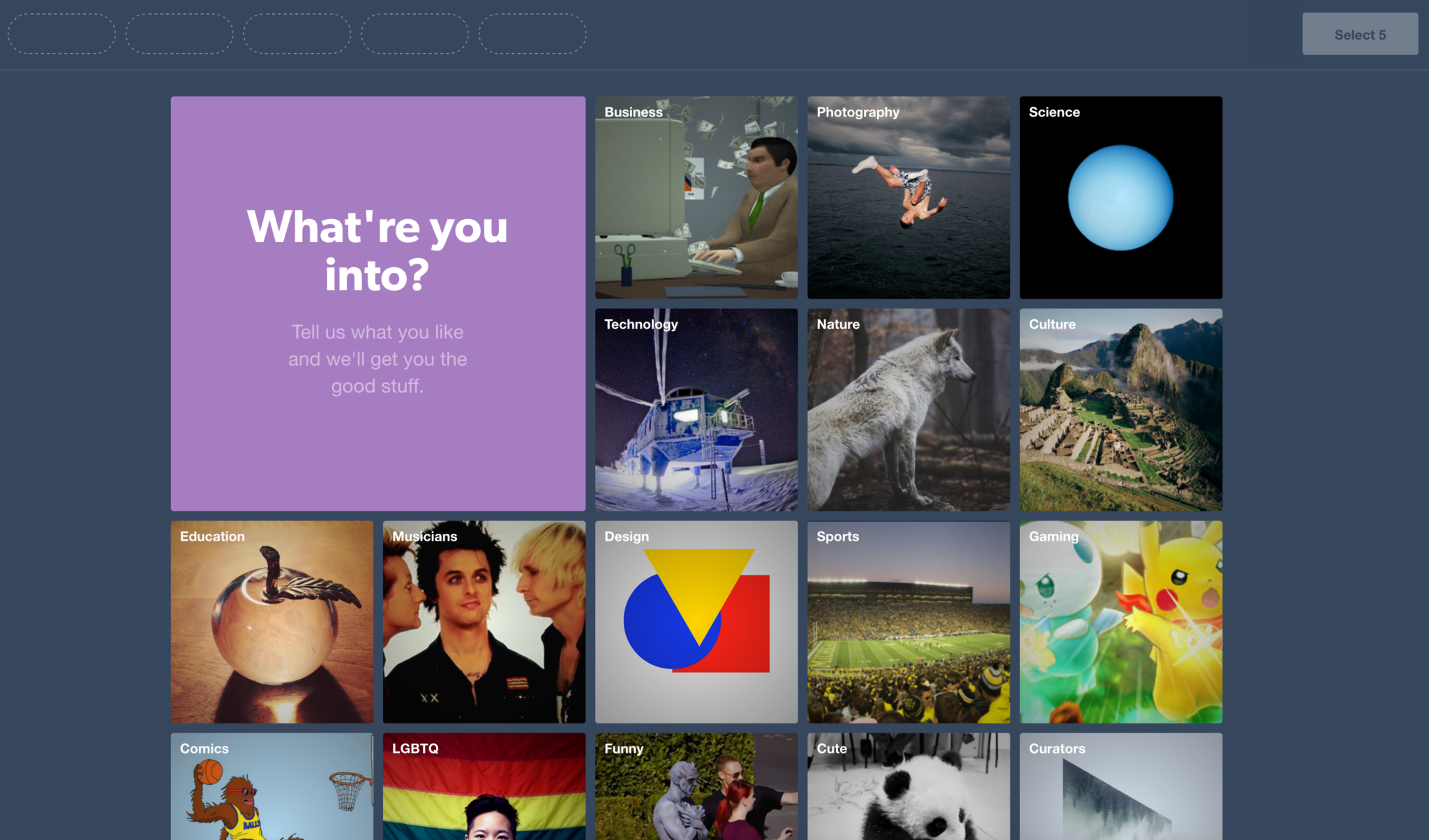
Key aspects of Tumblr’s onboarding include:
- Engaging Signup Page: The signup interface displays user content, engaging new users with clever, witty copy that echoes Tumblr’s unique brand voice.
- Personalized Interests Selection: Post-signup, users are prompted to select their interests, which achieves two objectives. Firstly, it personalizes the user’s future feed, enhancing the relevance and value of the content they encounter. Secondly, this process instills a sense of ownership, leveraging the endowment effect, where users ascribe greater value to what they perceive as personally theirs.
- Intuitive Walkthrough: Tumblr’s onboarding walkthrough is strategically designed to highlight essential UI elements. By teaching users how to interact with the platform, Tumblr guides users to their first ‘aha moment’ and fosters the growth of its network effects.
Interactive Walkthroughs and Tooltips
Interactive walkthroughs and tooltips are crucial in crafting an informative user onboarding experience. This strategy involves designing intuitive, in-app guidance systems that strike a balance between delivering information and encouraging user interactivity.
“Make it simple. Make it memorable. Make it inviting to look at. Make it fun to read”
Ad writer, Leo Burnett
How HubSpot Allows Users To Learn At Their Own Pace
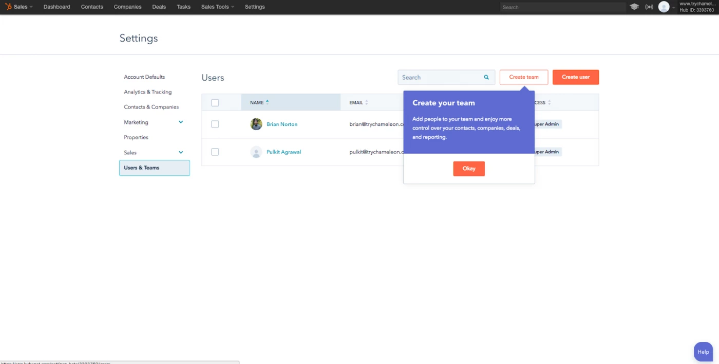
Recognizing the complexity of its numerous functions, HubSpot cleverly segments its product tour into multiple, manageable segments with natural stopping points. The onboarding begins with the basics – starting and stopping the tracker and naming activities. Each step is effectively communicated through clear, user-friendly tooltips.
64% of the companies use in-app videos in the onboarding flow, 47% of them offer interactive walkthroughs to guide users, and 38% of them prefer product tours to interactive walkthroughs.
Key aspects of Hubspot’s onboarding experience include:
- User Autonomy: Users are always in the driver’s seat, with clear instructions on what each step entails, how many steps remain, and options to pause the tutorial.
- Thoughtful Tooltips: Each tooltip is carefully designed for readability, brand consistency, and informing users about their progress in the onboarding sequence. The flexibility to skip steps or exit the tutorial empowers users to tailor the onboarding to their specific needs and time constraints.
Simplified Account Setup Processes
When the account setup process is complex or overloaded with information, it significantly increases the cognitive load on the user. This can lead to confusion, frustration, and ultimately, a poor onboarding experience.
“A 2023 User Experience Professionals Association study found that reducing cognitive load can increase user satisfaction by up to 20%.”
A high cognitive load can deter users from continuing with the setup, as they may feel overwhelmed by the amount of information or the number of decisions they need to make in a short period.
To counteract this, employing UX principles to streamline the process is key. This involves:
- Simplifying forms
- Reducing the number of steps required
- Providing clear, concise instructions
This makes the process more approachable and less daunting for new users. An intuitive onboarding process that minimizes cognitive load helps in quickly showing users the value of the product.
How Avo Makes signup easy and worry-free
Avo understands that account signup can be a tedious and off-putting step for new users. To counter this, Avo has designed its signup process to be as seamless and painless as possible.
Here’s a look at how they make it easy for new users to get started:
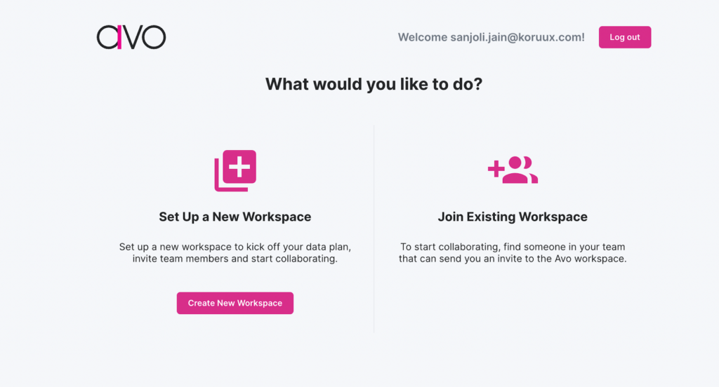
Next, Avo asks users to describe their job role selecting one of the major categories.
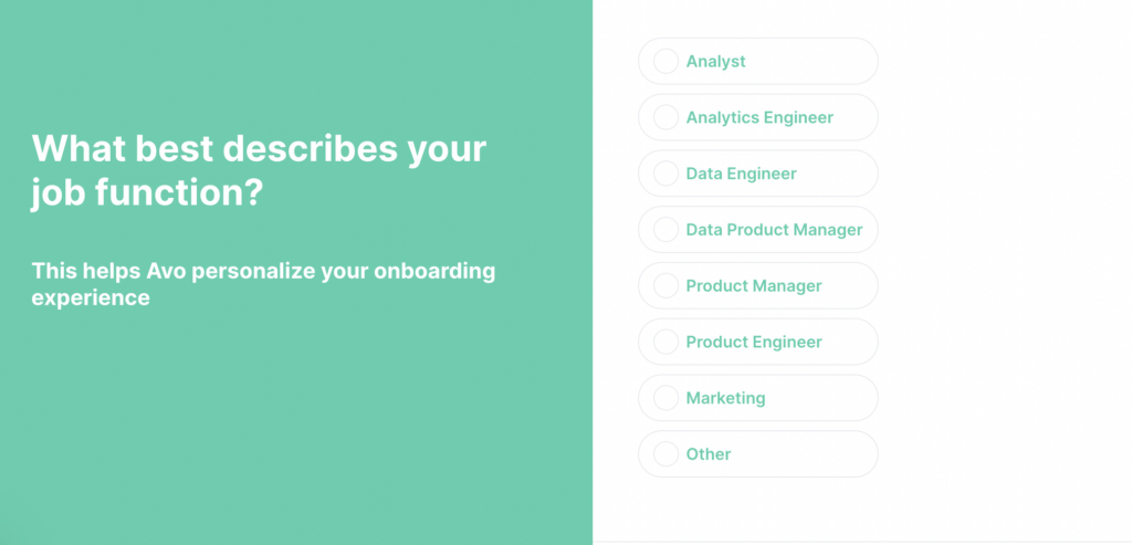
The following two steps of the signup process ask users about the sources of and the destinations for their data.
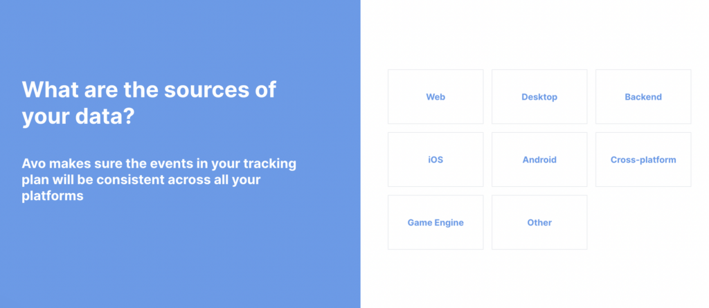
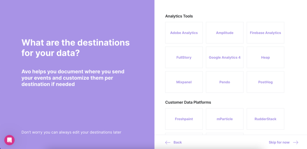
Avo’s approach to onboarding demonstrates several key principles:
- Simplicity in Copy: The language used is straightforward, and devoid of jargon, making the process approachable and easier for users to navigate.
- First Impression: Avo’s clean design, smooth transitions, and clear copy collectively leave a strong first impression, signaling that the tool is user-friendly, easy to use, and professional. This initial experience is crucial in setting the tone for the user’s journey with the product.
Progressive Disclosure Techniques
Progressive disclosure is a vital technique in user onboarding, focusing on revealing information and features gradually to prevent overwhelming new users.
The key to successful progressive disclosure lies in carefully timing the introduction of features and information. Initially, users are presented with only the most essential elements needed to get started. As they become more comfortable and proficient with the basic aspects of the product, additional features, and more complex information are introduced.
Evernote’s Progressive Onboarding
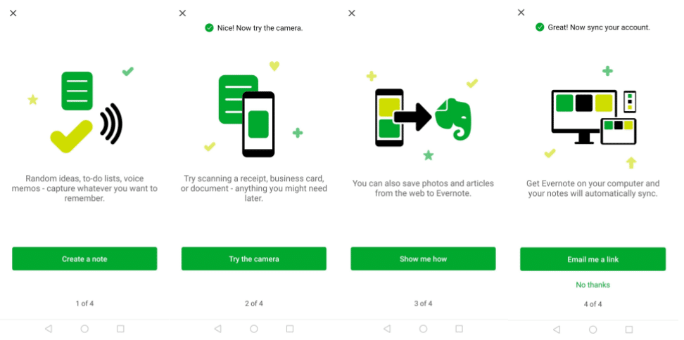
Evernote’s onboarding UI excellently demonstrates the art of making a great first impression with an application. In this process, users are gradually introduced to various features, each designed for note-taking and idea recording. As users experiment with these features, their familiarity with the app increases. They invest more time in organizing and designing their notes, effectively unlocking the value they have been seeking, and effectively resolving their note-taking challenges.
Behavior-Driven Onboarding Flows
Imagine using a social media scheduling tool and struggling to find inspiration for upcoming posts. If the tool recognizes your behavior—like repeatedly typing and deleting in the editor without scheduled posts—it can intelligently offer a helping hand.
A well-timed tooltip can direct you to a ready-made post calendar with content templates, providing the assistance you need at the right moment. This contextual onboarding approach outshines traditional linear methods by utilizing subtle in-app experiences like native tooltips, hotspots, and banners, triggered by specific user actions and custom events.
These triggers can activate real-time responses to the user’s in-app activities, greatly reducing the time to value and allowing for the creation of personalized onboarding flows.
It’s time to let your onboarding flow
That’s a wrap – hopefully, you’ve got some cracking user onboarding strategies to take on the road with you. From the landing page to the final stages of user engagement, every step of the onboarding process is a chance to showcase your product’s value and build a lasting relationship with your users. Let’s quickly look at the key explorations of successful SaaS onboarding strategies:
- Develop personalized onboarding paths that resonate with different user personas.
- Implement user-friendly UI/UX patterns such as welcome messages, interactive tutorials, tooltips, and progress bars to guide users intuitively through the onboarding process.
- Simplify the account setup process to minimize cognitive overload, making it easier and more accessible for new users.
- Gradually introduce app features and information using progressive disclosure techniques to prevent user overwhelm.
- Leverage behavior-driven onboarding flows that activate personalized, context-specific experiences based on user interactions.
Remember, a great onboarding experience is more than just a series of steps; it’s an ongoing conversation between your product and its users. By focusing on user needs, and feedback, you can create an onboarding experience that not only educates but also delights, setting the stage for long-term user retention and success.


