Picture this, you have an amazing app with great aesthetics. It looks good and works even better but it’s all written in Klingon.
Did you picture it? Did you feel dissatisfaction there? A good copy is supposed to bridge the gap between reading and experience. Let’s look at a more relatable UX writing example. Ever encountered a passive-aggressive pop-up when visiting a website? Something like this, wherein you are left with negative feelings about subscribing?

This is a typical bad UX writing example. A seamless UX copy is supposed to guide the user to make an informed decision rather than manipulating or shaming them into signups.
Well-thought-out microcopy will get you better usability and bring you more users who are satisfied with their experience.

Source – Flicker
Basecamp here gives us a nice UX writing example that’s simple and just works well. It is not only informative but also clearly states the users’ options to them without overloading them with information.
The scope of experience goes way beyond a single blog, website or application. With the steady growth and universal adoption of UX, the case for experiential copy has never been stronger.
What is UX Copy?
forms, pop-ups, buttons, tips, etc. The microcopy is what informs and helps users as they go about using the system.
Good UX writing examples hold the key to communicating any new or additional technology to your users. It is used to assist the user in navigating the product and familiarize himself with its functionality to a point where he experiences absolute comfort while using it. Various examples of good UX writing, such as effective microcopy in error messages, empty-state content, and call-to-action buttons, highlight its importance in enhancing user interactions with digital products.
The UX team at Adobe explains it as, “…from the words that comprise a call to action, to the disclaimers that assure users that their email address won’t be shared or stored.” Just validates how microcopy is the key to building trust with users. Inclusive UX writing goes beyond simply motivating users; it aims to create accessible content that welcomes a diverse range of users, including different genders, ages, abilities, and backgrounds.
Effective UX writing:
- Is simple, succinct, and easy to follow
- Represents the voice and persona of the brand
- Is a perfect visual fit within the design
- Fulfills needs and answers questions
Definition and Importance of UX Writing
UX writing, also known as microcopy, refers to the words and phrases used in user interfaces (UI) to guide and assist users as they interact with a product. It focuses on creating clear, concise, and engaging copy to enhance the overall user experience. Good UX writing is crucial because it helps users understand the product’s functionality, navigate the interface easily, and accomplish their goals effectively. It also helps in creating a positive and seamless user experience, leading to higher user satisfaction and conversion rates.
Imagine trying to use an app where the instructions are vague or overly complex. Frustrating, right? That’s where good UX writing comes in. It bridges the gap between the user and the product, ensuring that every interaction is smooth and intuitive. By providing clear guidance and helpful information, UX writing makes the entire user experience more enjoyable and efficient.
Role of a UX Writer in Product Development
A UX writer plays a crucial role in the product development process by collaborating with designers, product managers, and developers to ensure that the copy aligns with the overall user experience goals and communicates the brand’s personality effectively. They are responsible for creating and maintaining the written content within a product’s interface, including error messages, instructions, and microcopy.
Effective UX writing requires a deep understanding of the user’s needs and behaviors, as well as the ability to communicate complex information in a simple and concise manner. A UX writer’s job is not just about writing; it’s about crafting an experience that feels intuitive and engaging. They ensure that every piece of written content, from error messages to tooltips, contributes to a seamless and positive user experience.
7 Tips for Designers to Ace UX Writing
Now, writing is a skill that takes time to hone, but writing true-to-intent text for your system isn’t rocket science. The next time you’re about to reach for Lorem Ipsum, go through these tips and try to complement your designs with a meaningful copy. Incorporating positive language can also enhance the user experience by making interactions more engaging and user-friendly.
1. Clarity & Utility Are Above All Else

The foremost thing to keep in mind while beginning to draft a UX copy is to keep it absolutely clear and truly useful. However, doing so in the actual is easier said than done. Something that’s clearly written isn’t necessarily useful, whereas a useful command could potentially be depicted in a complicated manner.
A great example of effective UX writing can be seen in how companies like Slack and Kraken simplify complex information or inject personality into their microcopy.
According to NN, concise text, objective language, and scannable copy improve usability by 124%.
As a UX writer, sometimes you have to take that judgment call to be more descriptive while explaining a process or its consequences, however, utility and clarity are always non-negotiable. Be very critical when it comes to reviewing and editing your work, and rely heavily on user feedback to come up with your best copy. But, more on that later.
2. Give it a Personal Touch with Positive Language

There’s a reason why products like Mailchimp and Slack made the kind of impact they did. They established a heartfelt connection with their users based on – you guessed it right – their charming and clever wordplay. So, here’s lesson number one – using personal pronouns such as ‘you’ or addressing the user by their name lends the user a feeling of belonging and familiarity.
To encourage users, consider strategies like creating short onboarding processes, utilizing clever microcopy, and fostering a sense of community through personalized notifications and supportive messages.
Make use of the active voice while addressing users, which is also a useful way to create an effective microcopy that serves the purpose and is memorable (in a good way). Write conversationally. Maintain a professional tone, and make use of familiar, simple words that do not intimidate the users.
3. Focus on the ‘Action’

“Buy it now!”
“Click here to unlock rewards”
We talked about using the active voice in the previous point, which is a great tip for UX writing for beginners. In addition to that, placing a verb (an action word) at the beginning of the sentence can help you draft clear, unmissable instructions. Added bonus – starting with an action word can help you put your message across more effectively using minimal words.
Collaborating with a UX designer can further enhance the effectiveness of your UX writing by ensuring it aligns seamlessly with the overall design.
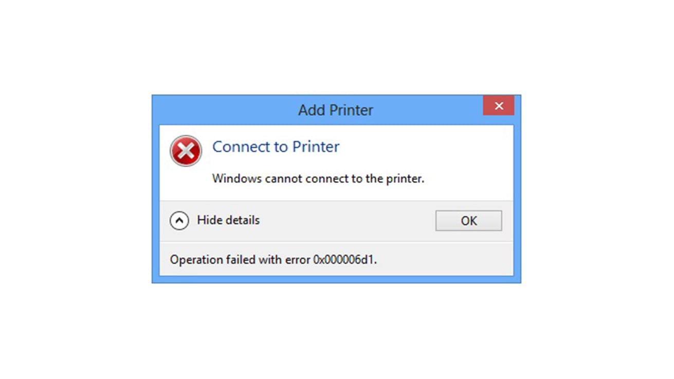
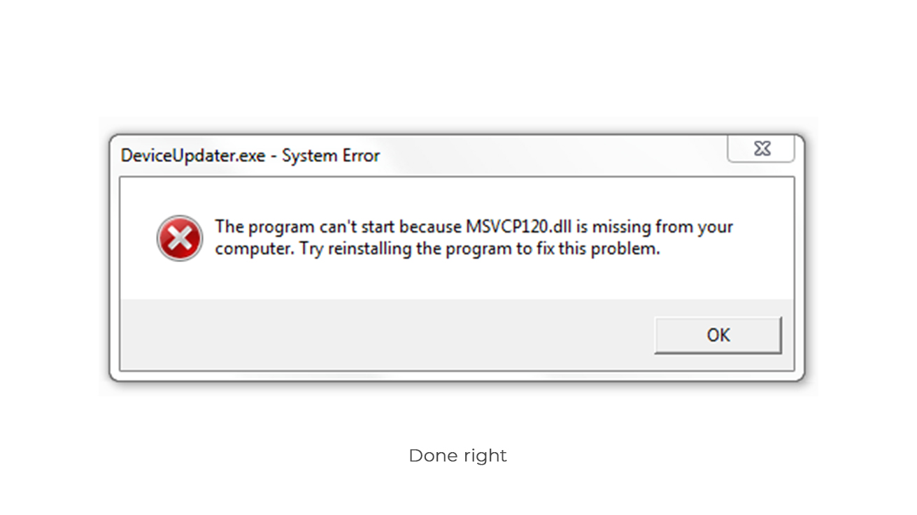
4. Remember to Consider Error Messages and System Failures


We tend to design keeping the best-case scenario in mind. However, there are too many possibilities and permutations in an enterprise application. The fact remains that the user will encounter roadblocks at some point, and these can seriously affect his performance on the job. Writing the copy for system failures should be handled with utmost tact and finesse. The user is at a crucial juncture when he encounters a system fault and needs handholding from the app which appears in the form of a copy.
5. Leave no Room for Doubt
Most UX writing examples of bad microcopy have a common thread running through them – that of confusion. The Cancel/Delete conundrum is a classic example. Therefore, it is vital to write a clear copy that leaves no space for misinterpretation. Provide explanations for any ambiguous actions before the user begins to form doubts. Ensure transparency and make sure the users realize what action they’re taking and why. Delivering the right information at the right time – it’s the singular goal of UX writing.
6. Stick to Your Brand’s Personality and Tone of Voice
Brand personality and tone of voice are essential elements of UX writing. A well-defined brand personality helps to create a consistent tone and voice across all user interactions, making the product more relatable and engaging. A conversational tone, for example, can make users feel more comfortable and open to trusting the brand. On the other hand, a formal tone may be more suitable for products that require a sense of professionalism and authority.
UX writers should aim to create a tone that resonates with the target audience and aligns with the brand’s overall personality. Whether it’s a friendly and approachable tone for a social app or a more serious and authoritative tone for a financial service, the right voice can make a significant difference in how users perceive and interact with the product.
7. Keep the Writing Iterative too!
Finally, UX writing is no different from UX design. The goal of both is to provide a helpful, and seamless experience to users through words and visuals. And, the tried and tested method of creating iteratively works for content as well. You cannot be expected to churn out a perfect microcopy in the first go, so write, test, refine, and keep iterating until it’s ready to ship.
Bringing writers in at the end of the creative process is like trying to put toothpaste into a tube.
– John Steinbeck
While brainstorming sessions with your design team are also helpful, quick iterations based on user testing results help in drafting a copy that is flawless and high on utility. You can opt to test the version you’re working on and gain feedback on it or compare it with the existing app if applicable in the form of A/B tests. In case you’re testing a new product, you may want to create different versions that differ in voice and tone and test to note which works best.
Effective UX writing should be tailored to the target audience and their needs, and should reflect the brand’s personality and identity. For instance, a well-written error message not only informs the user about what went wrong but also provides guidance on how to fix it, reducing user frustration and enhancing the overall experience.
Well-crafted UX copy can significantly impact user satisfaction, engagement, and conversion rates. UX writers should aim to create a seamless and intuitive experience, leading to improved usability and higher user satisfaction. By providing clear instructions and helpful tips during the onboarding process, UX writing can make users feel more confident and comfortable with the product, ultimately leading to a more positive and successful user experience.
To sum it up, writing copy for enterprise UX apps means that you have to prioritize clarity and usability since your users are usually hard-pressed for time and have to make quick decisions. If you manage to keep this copy breezy and conversational, your users will love using it. Never indulge the users in a guessing game, you can leave that skill to game designers. You’ll have a winning copy on your hand if you keep testing your iterations with real users, and don’t forget to sensitively handle system failures.


