Software design and development is an expansive trade comprising professionals from varied fields of study. While we best learn concepts on the job, what also helps is to have a resource that congregates important concepts and definitions to help us clarify any ambiguities with ease.
This ultimate list of 100+ important UI-UX terms simplifies technical jargon and helps you navigate through conversations and documentation with confidence.
105 UX UI Design Terms You Need to Know
1. Accessibility
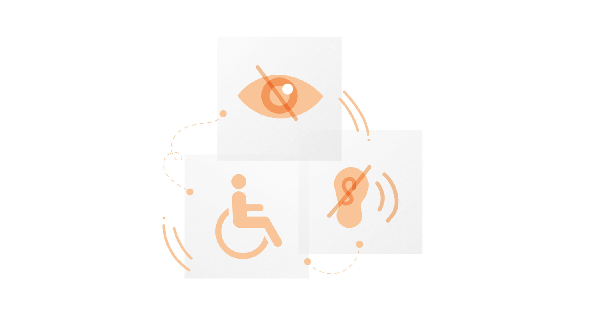
Accessibility or accessible design helps differently-enabled users to interact with a product. It involves designing for people who are color blind, blind, deaf, and people with cognitive disabilities, among others.
We made use of the principles of accessible design to create a product that simplified application to Medicaid for senior citizens.
2. Adaptive
An adaptive interface is a set of layouts designed specifically for different devices. It is designed to detect the device type being used and display the appropriate layout for it. Different versions of the same site are created, these versions are optimized to be viewed on mobiles, desktops, or tablets.
3. Affinity map
Affinity mapping, an important UI UX term, is a method used to interpret and group insights from a user research exercise. It can be used to categorize large volumes of data into designated categories based on themes or relationships.
4. Affordance
Affordances are clues that tell us what an element can do to us. Affordances are properties of objects denoting the actions the users can take. From the context of the user interface, they help in communicating to users what can and cannot be done on a screen. Users should be able to perceive affordances without having to consider how to use the items. For instance, buttons on interfaces, for example, afford being pressed to trigger an action.
5. Agile
One of the most frequently used UI UX term, Agile, is a process by which a team can manage a project by breaking it up into several stages and involving constant collaboration with stakeholders and continuous improvement and iteration at every stage. Instead of building the entire product at once, Agile breaks it down into smaller bits of user functionality and assigns them to two week cycles called iterations.
Learn more about what designers can learn from the Agile methodology in this blog.
6. API
Application Programming Interfaces, or APIs, are pieces of software that help different applications communicate with each other. Products develop APIs to let you access and read the information on their dedicated server easily.
7. Artificial Intelligence (AI)
Artificial intelligence (AI) refers to the simulation of human intelligence in machines that are programmed to think like humans and mimic their actions. Artificial intelligence systems include predictive systems, audio processing, speech-to-text, and natural language processing.
Understand the role played by AI in enterprise UX design in this blog.
8. Back and Front-End Development
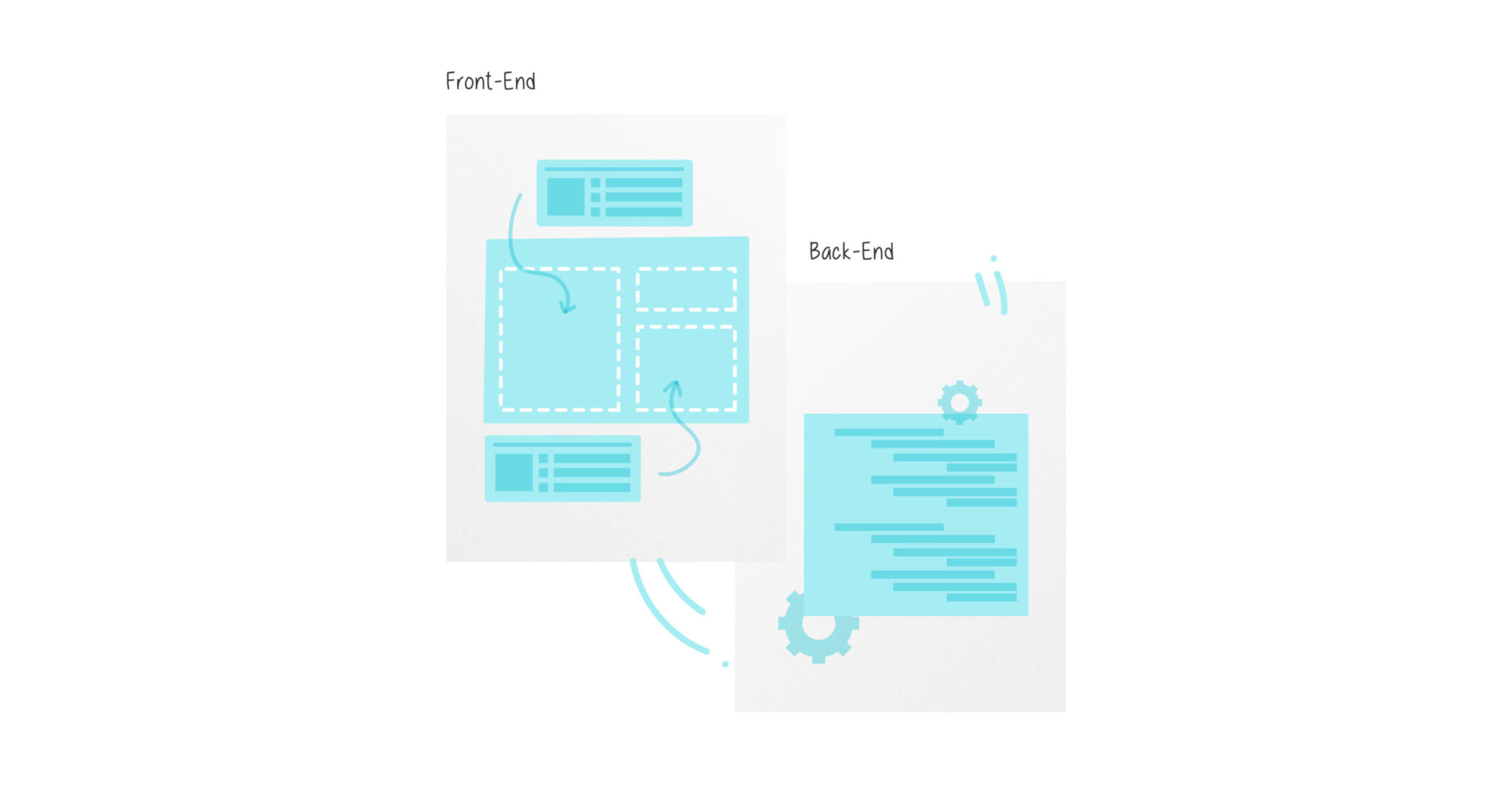
Back end development refers to the server-side of an application and everything that communicates between the database and the browser.
The front-end is what users see. Think buttons, text, beautiful colors, and the layer seen on screen when interacting with a product.
9. Backlog
A queue of work that needs doing on a product. A backlog is a list of tasks required to support a larger strategic plan. In a product development context, it contains a prioritized list of items that the team has agreed to work on next. Typical items on a product backlog include user stories, changes to existing functionality, and bug fixes.
10. Beta Testing
Beta testing is a soft launch of an unfinished product to a select group of users in order to assess its performance. This allows you to identify bugs, pain points, and areas of improvement for your imperfect beta product before developing and releasing it fully.
11. Breadcrumb
Breadcrumb navigation systems help users understand their location in a website or app. They’ll show a sequence of steps users have to take to get where they are.
12. Bug
Bugs are mistakes in software that can cause a product to malfunction, behave in unintended ways, or even crash.
13. Call-To-Action (CTA)
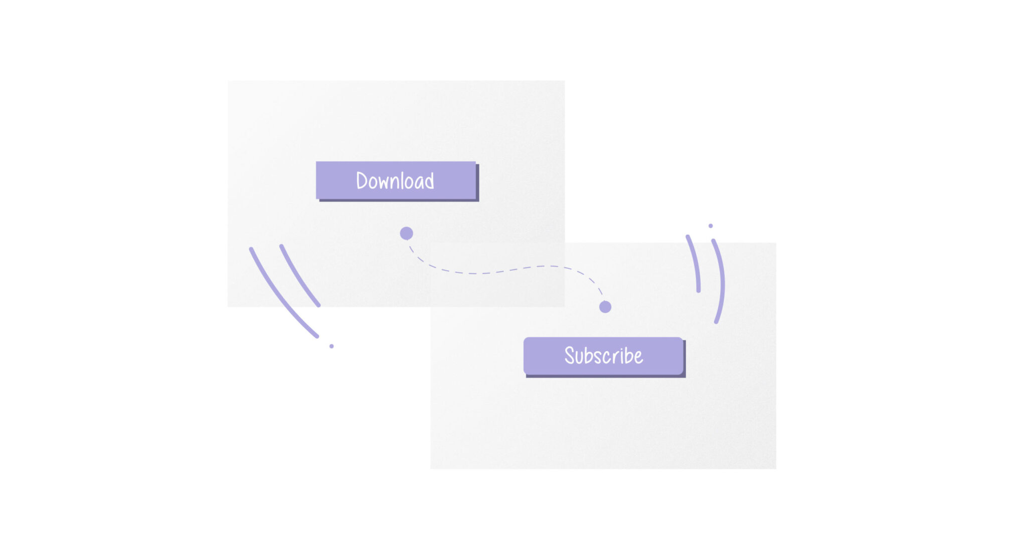
A call to action button is a visual or interface element that invites a specific action from the user. In apps and websites, CTAs often take the form of a short snippet of text, followed by a button.
14. Card Sorting
An exercise where participants are asked to sort a batch of cards into different categories based on their interpretation. It’s a way of understanding how people intuitively associate different items with one another. This can then be used as a basis for navigation structure or other decisions around information architecture.
15. Chatbot
Chatbots are a chat interface that allow the user to ask questions to the system and receive answers and/or guidance. They are a popular customer service tool made to mimic the experience of texting a friend.
16. Checkbox
A checkbox is a UI element that allows the user to make a binary (yes/no, cancel/confirm) choice for a specific option.
17. Clickstream
Clickstream refers to the path of clicks taken by the user to accomplish a goal.
18. Cognitive Load
Cognitive load is a crucial factor to consider when designing products, services and features. Put simply, cognitive load is the amount of mental effort required to complete a certain task.
19. Consistency
Consistency is all about providing a consistent experience to the users. It ensures that users don’t need to learn new ways of completing tasks or solving problems at every turn.
20. Contextual Enquiry
Contextual enquiry is a user research method that involves observing and interviewing users while they interact with your product in their actual environment. So, rather than asking them questions about their experience of the product after they’ve used it, you watch them in action and ask questions directly at the source to fill in any gaps.
21. Customer Experience (CX)
Customer experience or CX, is the customers’ holistic perception of their experience with a business or brand. It covers every interaction the customer has with a business, from navigating the website to talking to customer service and receiving the product/service they bought. CX tends to be broader in scope than user experience (UX). UX is focused on a person’s interaction with an app or website, while CX is more about that person’s overall experience of a brand, including advertising, product quality, and customer support.
22. Customer Journey Map
The concept of a journey map, though commonly used as a UI UX term, is actually borrowed from service design. It is a document that shows how a customer moves through an entire service and the different touchpoints they encounter. (See also user journey.)
23. Customer Relationship Management (CRM)
Customer Relationship Management software systems help manage business processes, like sales, data, and customer interactions, including inbound support tickets, and sometimes email marketing as well.
Go through these easy tips to improve CRM design in this blog.
24. Design debt
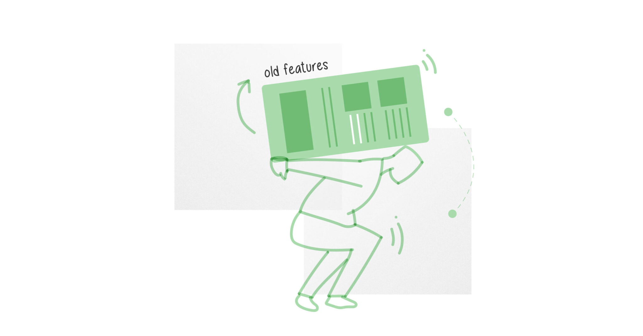
Design debt is the natural decay that accrues as a project matures—new features are added, old features grow stale, and the codebase starts to get unwieldy.
Learn more about how design debt weighs down businesses in the long run in this short video.
25. Design Sprint
No glossary of UI UX terms is complete without the mention of design sprints. A design spring is a collaborative methodology for rapidly identifying and solving a design problem. The five stages of a sprint are: define the challenge, diverge (ideate possible solutions), converge (choose the strongest concepts to develop), prototype, and test.
When can you use design sprints in your team? This short video tells you all about it.
26. Design System
A library of user interface elements, components, and guidelines that are used as the basis for any new and updated features in a product. The purposes of a design system include: maintaining consistency across a product when new features are added; making it easier to update components across an entire product; and reducing the amount of development time involved in any project.
Here’s how we applied the Atomic Design System method in our award-winning project.
27. Design Thinking
Design thinking is a 5-stage method for creative problem solving. The 5 stages are:
- Empathize: Understand the challenge
- Define: Define the problem
- Ideate: Brainstorm potential solutions
- Prototype: Build your solutions
- Test: Test your solutions
28. Diary Study
A diary study is a research method used to collect qualitative data about user behaviors, activities, and experiences over time. In a diary study, data is self-reported by participants longitudinally — that is, over an extended period of time that can range from a few days to even a month or longer.
29. Empathy
Empathy is the ability to metaphorically put yourself in someone else’s shoes—is the cornerstone of UX design. Empathy enables you to understand your user’s needs and pain points, and to design solutions accordingly.
30. Empathy Map
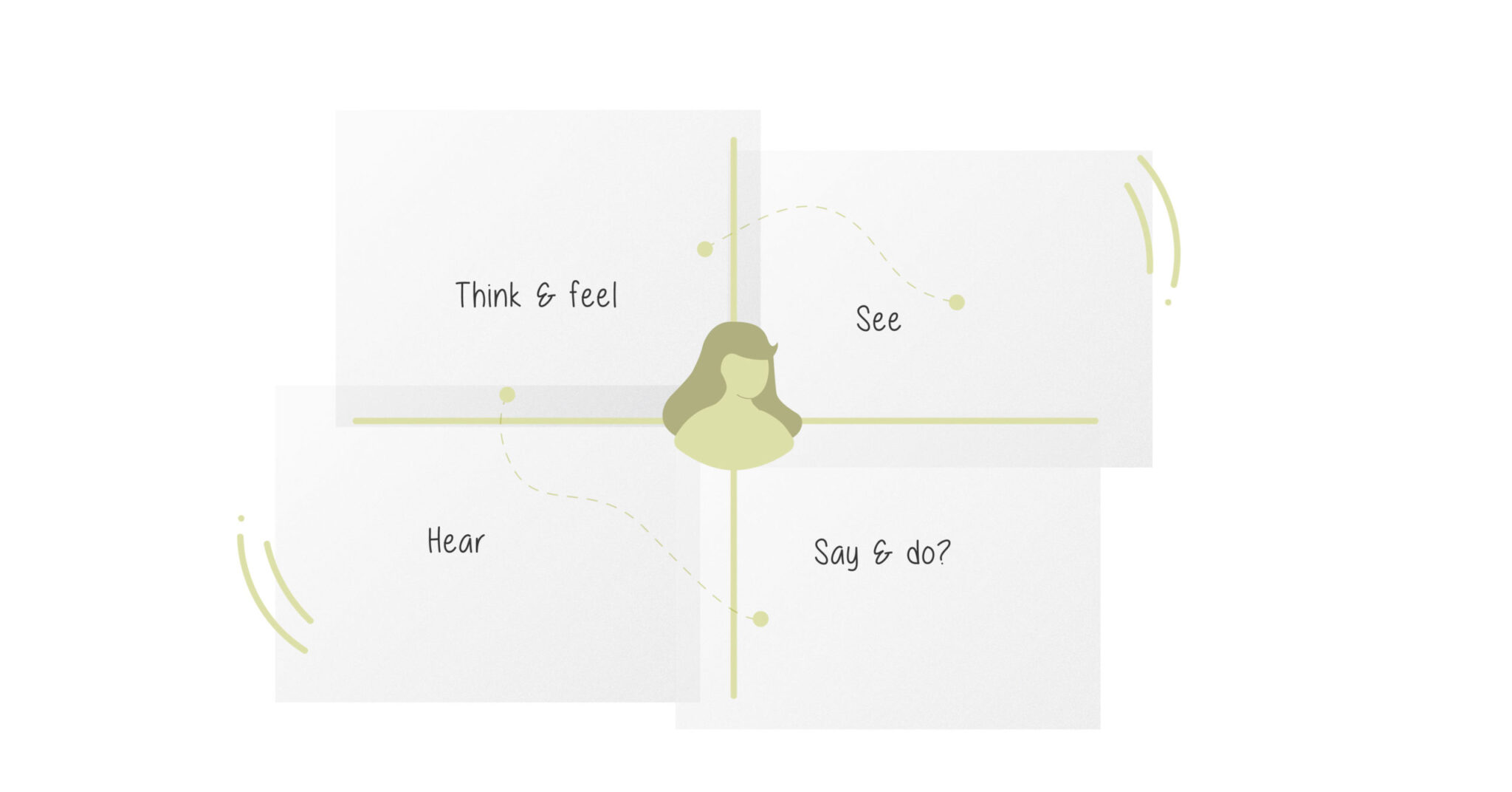
Empathy maps are collaborative tools that help visualize user behavior, attitudes and feelings. They are split into 4 equal quadrants containing information about what the user is saying, thinking, doing and feeling. The user persona is placed at the center. Then, each quadrant is filled with information collected through user research.
31. End User
An end user is any user of an app or website. Do not mistake end users to be customers always. In the B2B context, the end user would be the employees using the product.
32. Eye Tracking
An advanced method for assessing the visual hierarchy of information on a screen. Eye trackers record where the user is looking on a screen and for how long. Results are often displayed in the format of a “heat map”; this information can then be used to optimize a design.
33. Fidelity
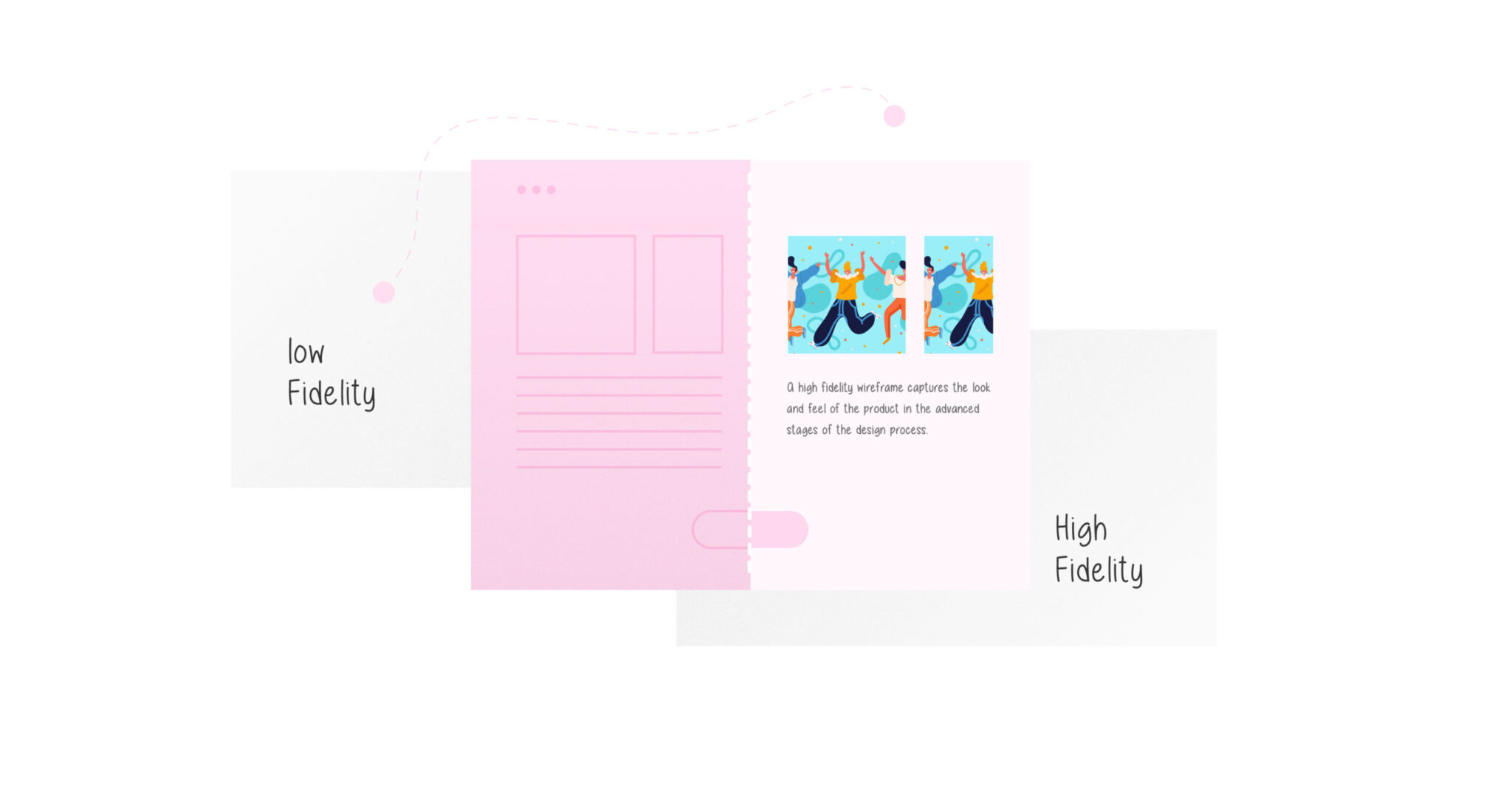
A concept in both wireframing and prototyping. Low-fidelity wireframes and prototypes aim to cover basic layout and links between screens, while high-fidelity prototypes and wireframes aim to be very close to final visuals and functionality.
34. Flat Design
Flat design is a user interface design style that uses simple, two-dimensional elements and bright colors. It is often contrasted to the skeuomorphic style that gives the illusion of three dimensions through copying real-life properties.
35. Flowchart
Flowcharts illustrate the steps a user can take to complete a task on a product.
36. Floating Action Button
A user interface (UI) element that sits on top of a screen design, often in the bottom-right-hand corner, and doesn’t move when the user scrolls. An example of a FAB is the floating “plus” button in Gmail’s interface.
37. Focus Group
A focus group is a UX research method that involves a group of users to discuss issues and concerns about the features of a product. Focus groups are moderated by a UX researcher and have to be conducted in a free flowing manner in order to gather a variety of perspectives.
38. Form
A UI element that gathers information from the user. Forms range from extremely short to extremely long. An example of a very short form is an email signup, which may have only an email address field and a submit button. An online loan application, however, might have a series of long forms in the flow.
39. Full Stack
Typically heard in the context of “full-stack developer”. The term refers to a person or role, and means that the person has both front-end and back-end development skills. It’s becoming increasingly common to hear the term “full-stack designer”—this typically means that the person has a mix of UX, visual/UI, and graphic design/illustration skills.
40. Gamification
Gamification is the process of integrating game-design elements and principles into products in an effort to drive user engagement.
41. Gestalt Principles
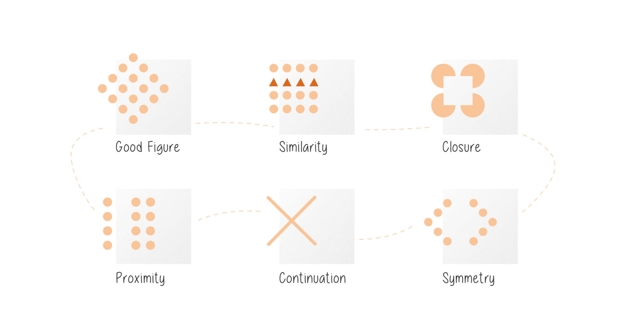
A set of visual principles of grouping, underpinned by the idea that elements sharing proximity or features in common tend to be understood as related to one another.
Here’s a blog explaining the use of Gestalt principles to communicate visual hierarchy.
42. Graphical User Interface (GUI)
A GUI (graphical user interface) is a system of interactive visual components for computer software. A GUI displays objects that convey information, and represent actions that can be taken by the user.
43. Graphics Interchange Format (GIF)
A legacy web graphics format that has frame-by-frame animation. It’s now used almost exclusively for animation.
44. Grid
A layout constraint that determines the positioning of user interface elements on a screen or page. Grids are fundamental to effective design systems.
45. Hack
In software development, a hack is a quick solution to a specific problem or bug, but which probably won’t be a long-term solution.
46. Heat Map
A heat map is a graphical representation of the areas on your product that receive the most user attention. They use a warm-to-cool color spectrum to show you where exactly your users are going. The red areas in the heat map below, for example, are the areas users interact with the most on the website.
47. Hamburger Button
A visual pattern of three (or sometimes two or four) horizontal lines that typically indicates a hidden menu. Tapping or clicking it reveals the menu.
48. Heuristics
A heuristic is a mental shortcut that enables people to solve problems and make decisions quickly, based on what they’ve learned from previous experiences. A heuristic evaluation is used to assess the usability of a digital interface in most UX audits.
49. HyperText Markup Language (HTML)
A markup standard used for coding web pages. HTML has gone through many iterations, the latest of which is HTML5.
50. Human-Computer Interaction
HCI is a field of study concerned with the design and use of computer technology. It studies how we interact with interfaces and computers today.
51. Hybrid App
Hybrid mobile apps combine both native and web technologies. They’ll often use a combination of technologies like HTML, CSS, and JavaScript and will live inside a native container that lets it access device capabilities.
52. Information Architecture (IA)
The structure and organization of information in a website or app. In UX design, it tends to refer to the process of organizing content and creating a navigation structure that makes sense to the user and allows them to find what they need in a logical way.
53. Interaction Design
Interaction Design, or IxD, is the practice of designing interactive digital products and considering the way in which users will interact with them.
Read about the important dos and don’ts of interaction design in this blog.
54. Intuitive UX Design
Intuitive UX design is the creation of products or interfaces that are easy to understand and use without requiring extensive instruction or explanation. It’s when users can instinctively grasp how to interact with a product, often drawing on their existing knowledge or experiences.
55. Iteration
The process of repeatedly gathering feedback on a design solution, and acting on that feedback to make targeted improvements and move towards a final design.
56. Javascript
We’ve looked at HTML and CSS, two of the 3 cornerstone technologies in web development. Javascript, the 3rd cornerstone, defines how both the HTML and CSS should behave. Think of it as the language that helps us make elements on a page interactive. Converting PSD to HTML is vital for making designs both visually appealing and functional.
57. KPI
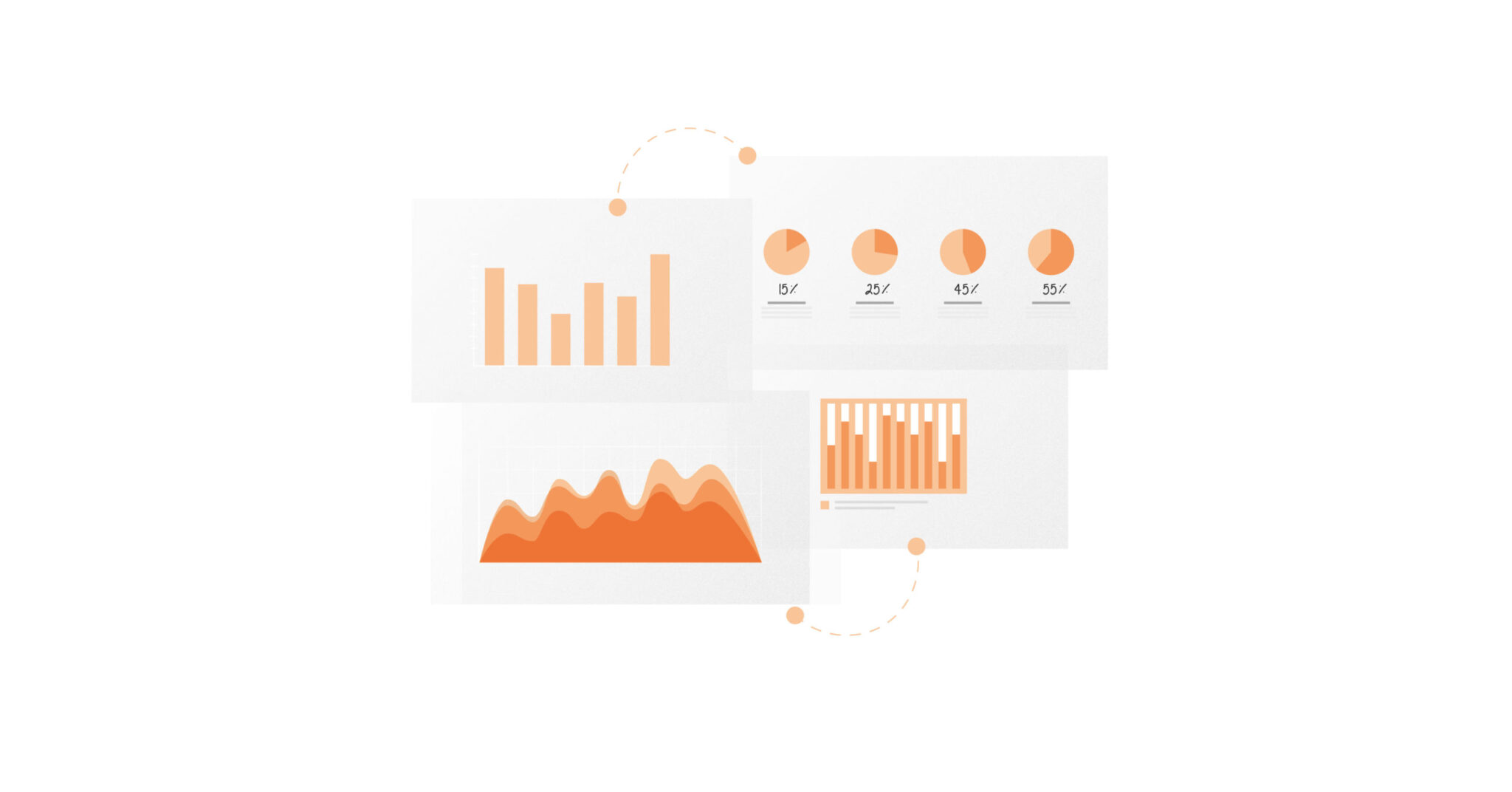
KPIs, or Key Performance Indicators, are measurable values that help us understand and track how well a product is doing. As a UX designer, you’ll often work with KPIs like task success rate, user error rate, and time on task.
58. Lean UX
Remember Agile? Lean UX, based on Agile, is a collaborative user-centric approach that prioritizes “learning loops” (building, learning, and measuring through iterations) over design documentation.
59. Material Design
Material Design, often called just Material, is a design language developed by Google used in Android devices.
60. Mental Model
A mental model represents what the user believes to be true about a product’s functionality. The more a user’s mental model aligns with a product’s functionality, the easier it will be for them to use it.
61. Microcopy
Microcopy refers to the tiny tidbits of copy found on websites, applications, and products. These short sentences tell a user what to do, address user concerns, provide context to a situation
62. Minimum Viable Product (MVP)
An MVP is a basic version of a product that is designed specifically for early release, to test marketability and whether further resources should be invested in developing a fully-featured product.
Read all you need to know about the MVP process in this blog.
63. Mobile Web
The mobile web refers to browser-based World Wide Web services accessed from handheld mobile devices, such as smartphones or feature phones, through a mobile or other wireless network.
Mobile UX for enterprise applications is a different ball game altogether. Read this blog to know more about designing mobile versions of enterprise applications.
64. Mockup
A term that gets thrown around often in work environments, mockups are static representations of a product. You can’t click through them or interact with them. They are essentially a picture of what the product will look like.
65. Modal
Also known as a modal window, modal dialog, or modal pop-up. A kind of in-window or in-app dialog box that either displays a message to be dismissed, or invites some kind of action from the user. Modals are often seen when people first land on a website, for example to offer a voucher code or encourage the user to sign up. They’re also often used to convey important information, like advance notice of a service outage.
66. Navigation
An element of user interface (UI) design that manages how users move between sections and features in an app or website.
67. Near Field Communication (NFC)
A technology that allows two physical devices that are in close proximity to share information. This is the technology that allows you to use your smartphone handset to pay at checkouts.
68. Onboarding
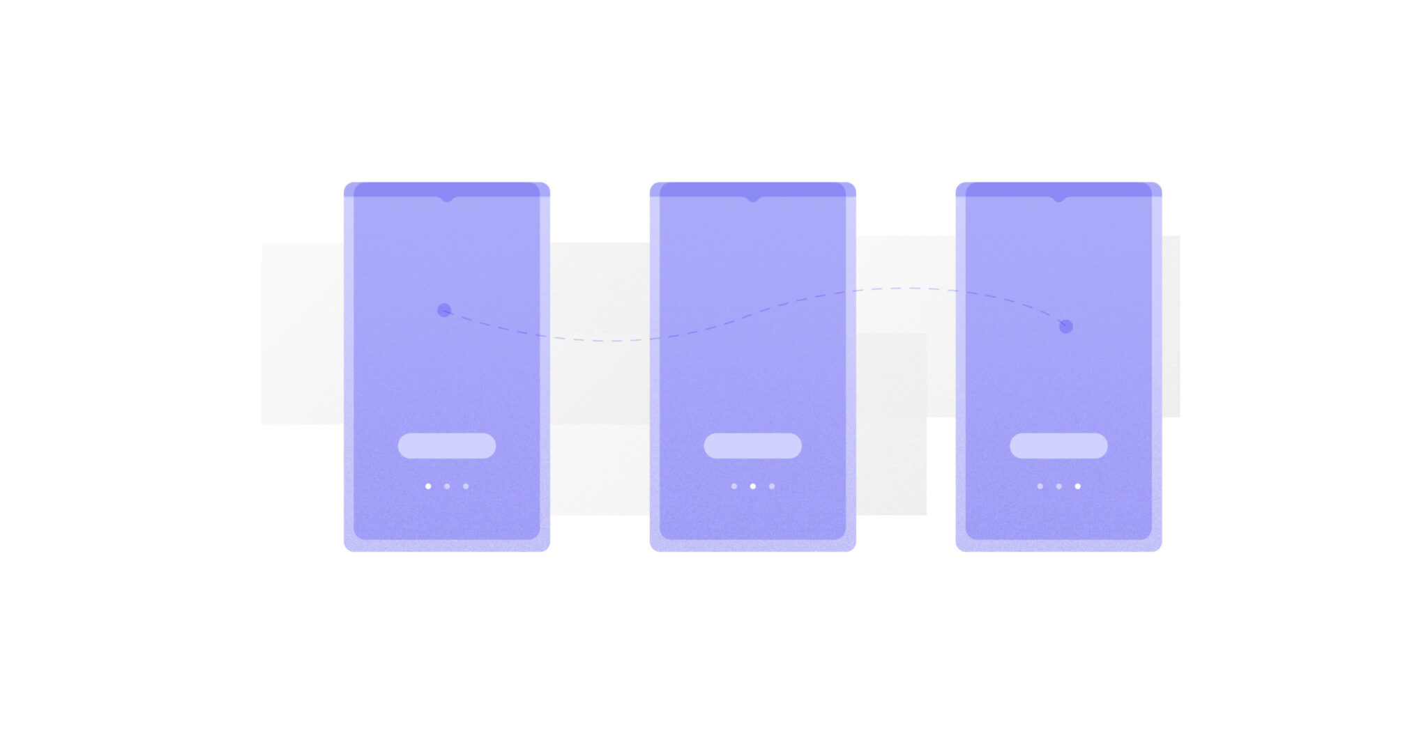
This refers to the steps that a user goes through when they first open up an app or join a service. Onboarding is an extremely important part of the overall user experience. Even if you have a user-friendly product, people are likely to abandon it during onboarding if they are not brought up to speed effectively.
69. Pain points
Pain points refer to the issues, problems, frustrations, or hiccups a user encounters during a given experience or interaction. UX designers and researchers conduct research in order to uncover user pain points and to design experiences that seek to solve them.
70. Paper Prototyping
The creation of a product prototype using roughly sketched interfaces on pieces of paper. Paper prototyping is often used in design sprints and any other setting where rapid prototyping is needed.
71. Persona
A persona is a document that takes findings from multiple user research data points (such as interviews and questionnaires), and synthesizes them into an archetype. Although the “person” in a persona doesn’t exist as a real individual, each persona comes to represent an idealized end user of a product.
Read about developing personas for enterprise products in this blog.
72. Pixel
Pixels are literally tiny squares used to construct the images seen on device displays. They aren’t a specific color, but rather, change to be able to show different images and graphics.
73. Picker
A picker is a UI element that allows the user to choose, for example, a date, time, or color. Pickers tend to be used where there is a very high number of options, or the input is highly conceptual.
74. Problem Statement
A problem statement in UX design is a concise description of a user’s pain point or need. It clearly articulates the issue that your design solution aims to address.
Key components of a well-crafted problem statement include:
User: Who is experiencing the problem?
Problem: What is the specific issue or challenge?
Context: When and where does this problem occur?
Impact: How does this problem negatively affect the user’s experience or goals?
75. Product Roadmap
A product roadmap is a high-level plan that outlines a product’s vision, strategy, and goals over time. It serves as a visual representation of the product’s journey, from its current state to its desired future.
Key components of a product roadmap include:
Vision: The long-term goal for the product.
Strategy: The approach or plan to achieve the vision.
Goals: Specific objectives or milestones to be reached.
Features: The functionalities or enhancements that will be added to the product.
Timeline: The estimated timeframe for each feature or milestone.
76. Progressive Enhancement
The practice of adding functionality or visual finish as technical constraints are removed. For example, a browser that supports cutting-edge web standards might allow extra touches when it comes to interaction and 2d animation.
77. Prototype
A prototype is a simulation or sample version of a final product, which is used for testing prior to launch. Its goal is to test products (and product ideas) before sinking lots of time and money into the final product. Examples of digital prototypes include interactive mockup of an app, website, or device.
Here’s a blog that will help you figure out the right prototyping method for your product.
78. Qualitative UX Research
Qualitative UX research is a method of gathering insights into user experiences and behaviors through in-depth exploration and understanding. Unlike quantitative research, which focuses on numerical data, qualitative research aims to delve deeper into the “why” behind user actions and motivations.
Examples include user interviews, diary studies, focus groups, and ethnographic studies.
79. Quantitative UX Research
Quantitative UX research is a method of gathering numerical data about user experiences and behaviors. It involves collecting and analyzing measurable information to identify trends, patterns, and statistical relationships.
Examples of quantitative research include surveys, A/B testing, and data gathering from analytics.
80. Refactoring
Refactoring is the process of cleaning up and tidying code without affecting functionality, essentially increasing its quality. It isn’t done all at once but rather in small, incremental steps.
81. Responsive Design
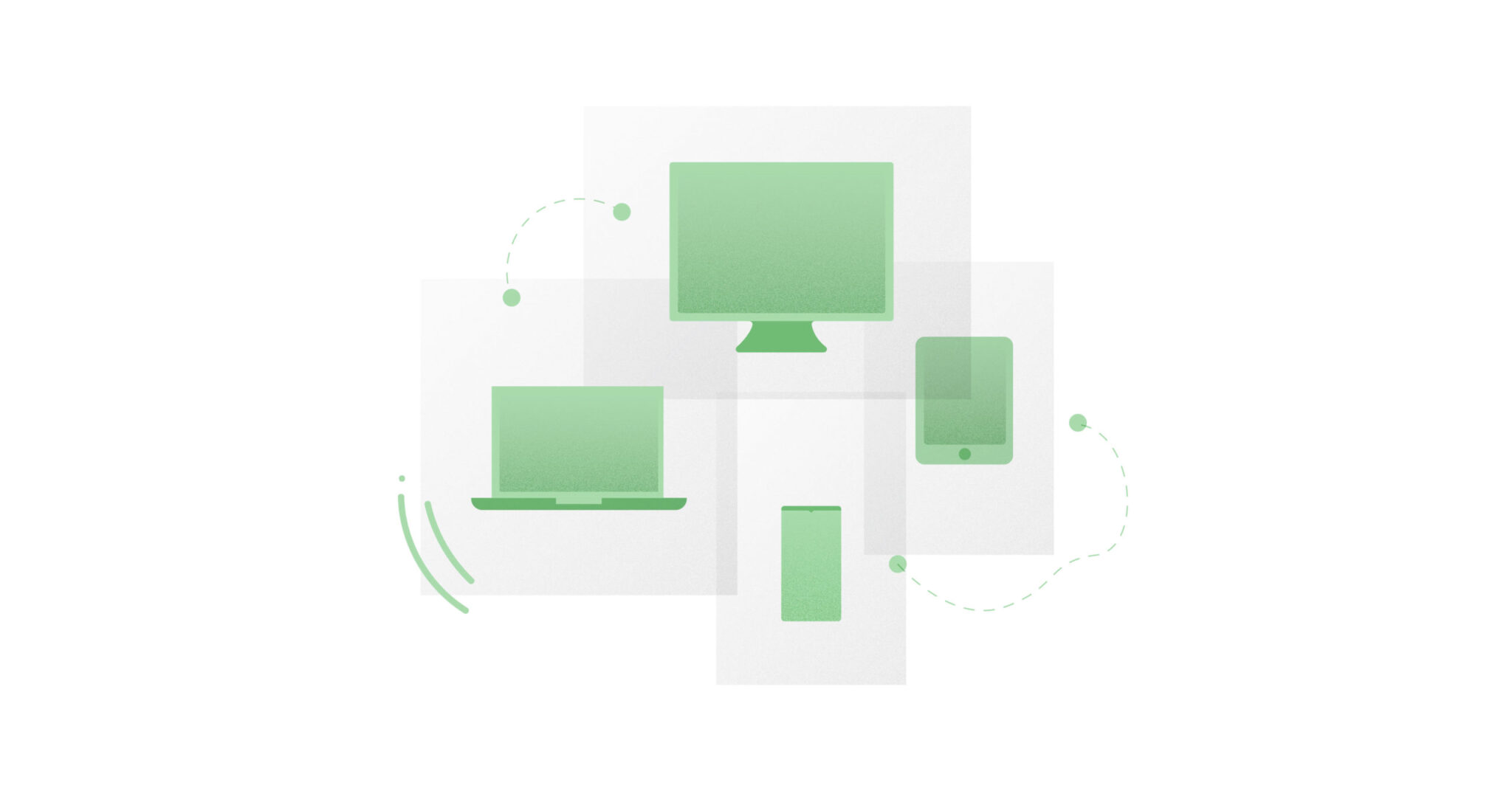
Not be confused with adaptive, responsive websites adapt to fit the device they are being displayed on. They are a single layout that shrinks and stretches and rearranges the content on it to be easily viewed on each device type.
82. SaaS
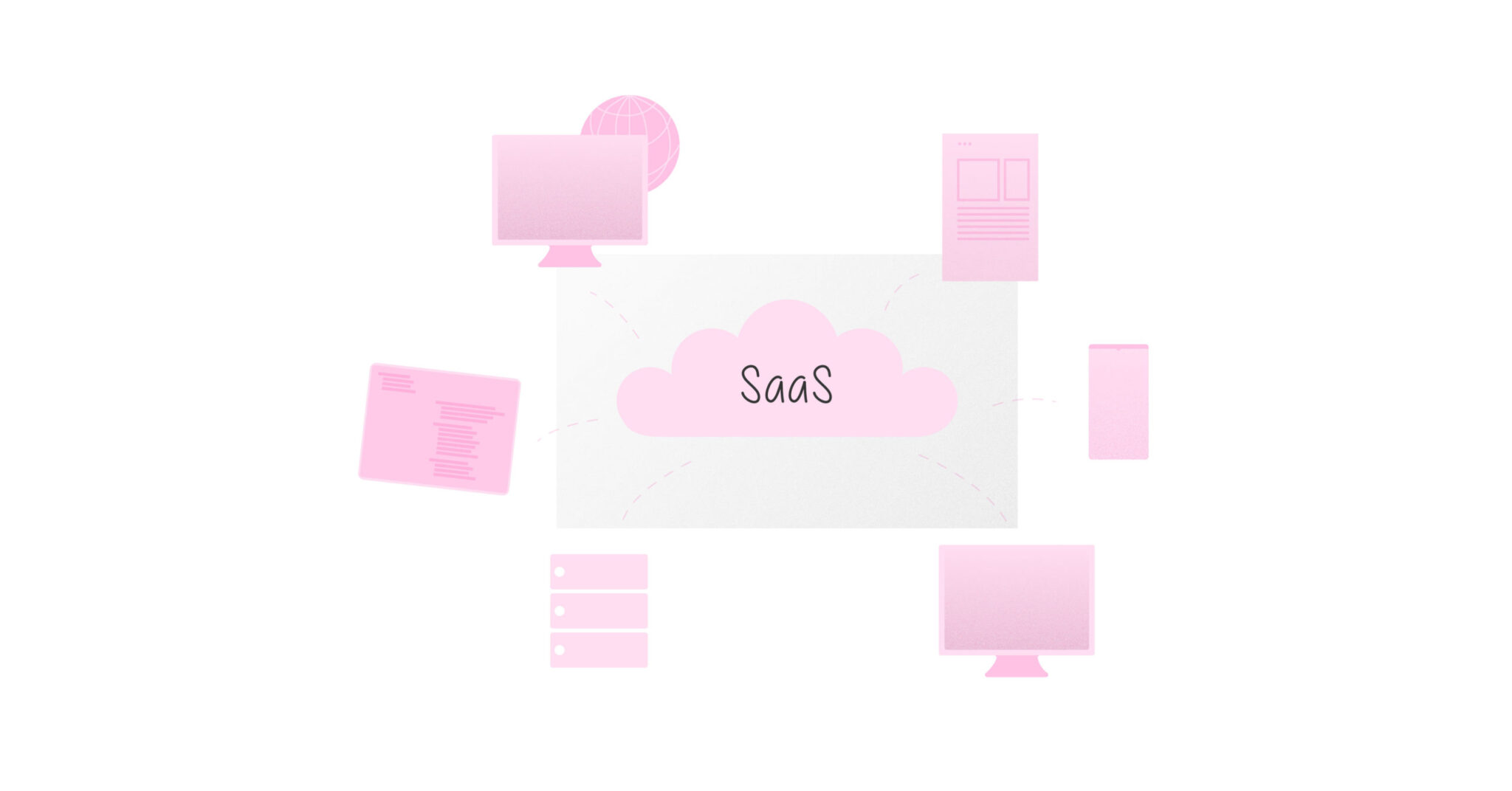
Software as a Service, or SaaS, is a software distribution model in which software is licensed on a subscription basis and hosted on external servers. Subscribing users are able to access it through the web. The practice of delivering software via online subscription, rather than as a standalone product that is purchased one-off. An Office 365 subscription is SaaS; Office 97 on a CD-ROM is delivered as a one-off license.
83. Scalable Vector Graphics (SVG)
This is a graphics file format that has been around for a long time, but is now supported by mainstream web browsers, so is being used more often online. The advantage it has over pixel-based graphics formats like PNG and JPG is that an SVG can be resized infinitely without losing quality. This is because the file is saved as a set of mathematical data about curves and points, not as an array of color values for individual pixels.
84. Scrum
A set of project management practices emphasizing daily communication, flexible planning, and short, focused phases of work.
85. Switch or Toggle
A UI element that allows the user to turn a setting on or off.
86. Stakeholders
Stakeholders in a B2B context are individuals or organizations that have an interest in or are affected by the success of a B2B product. They can include:
Internal stakeholders:
Employees: Individuals who work for the company.
Executive team: The senior management is responsible for making strategic decisions.
Department heads: Managers of various departments within the company.
External stakeholders:
Customers: Businesses that purchase the company’s products or services.
Suppliers: Businesses that provide raw materials, components, or services to the company.
Partners: Other businesses that collaborate with the company.
Investors: Individuals or organizations that have invested in the company.
87. Storyboard
Storyboards are a visual representation of a user’s experience with a product or problem space. They are a film technique we’ve adopted and look a lot like comic strips.
88. Style Guide
A style guide is a comprehensive set of guidelines and standards that define the visual language and interaction patterns of a product or brand. It ensures consistency and cohesion across all aspects of the user interface, from typography and color palettes to button styles and spacing.
89. Task Analysis
Task analysis is the process of listing tasks or the steps a user takes to complete any given goal from the user’s perspective. It is typically done during early stages of product development to help us identify and communicate problems in the user experience.
90. Technical Debt
Technical debt is similar to design debt but instead of taking a toll on the design system, it takes it on the code.
Products accrue technical debt whenever an easy but messy development solution is favored over a better yet more time-consuming alternative. Eventually, the messy solution will need to be cleaned up, generating work. This is what we call technical debt
91. Unit Testing

The process of testing parts of an application to ensure they’re working properly. It can be done manually or can be an automated process.
92. Usability Testing
Usability testing is a research method that lets us evaluate how easy a product is to use by testing it on a group of representative users.
93. User-Centered Design
Like the term suggests, user-centered design, or UCD, is an iterative design framework in which users and their needs are always kept at the center of every decision.
94. User Experience (UX)
The user experience refers to a user’s emotions, attitude, and perceptions about a product, system, or service. In other words, it is how you feel while interacting with an app or website. Good UX makes a product useful, usable, desirable, findable, accessible, and credible.
95. User Interface (UI)
User interface is the front-end of an app or website that the user directly interacts with through an input device.
96. UI Element
User interface (UI) elements are all the different parts found on an interface we need to trigger specific actions or get around an app or website. Think the buttons, input fields, toggles, and radio buttons.
97. UI Pattern
UI patterns are reusable solutions to common usability problems in products or on the web expressed as a collection of UI elements. Think about a login screen. A common login UI pattern is made up of two input fields, one for a username and one for a password, and a button to submit these. We call this collection of elements a login pattern.
98. User Flow
A user flow describes the intended series of steps a user needs to take to complete a goal on a product. They often include a name, steps and a description of what happens during each step.
99. User Journey
A user journey is a description of the steps a user will go through when using a product. This usually takes the form of some kind of diagram, but formats vary widely. Journey mapping is also a concept in service design.
Learn more about the application of journey mapping while designing complex enterprise solutions in this blog.
100. User Research
User research is the methodic study of target users—including their needs and pain points. It focuses on understanding user behaviors, needs, and motivations through observation techniques, task analysis, and other feedback methodologies.
Here are some useful tips to get your stakeholders on board with user research.
101. User Scenario
A story-like description of a specific situation or chain of events in which a user might interact with a product. User scenarios help designers and developers understand the context in which a product is realistically going to be used and to grasp any special constraints or opportunities that the situation presents.
102. User Stories
User Stories share actions different kinds of users can take in a product. The formula for user stories is simple:
“As a <insert kind of user>, I want <insert feature or action>, to be able to <insert desired outcome>.”
103. Waterfall
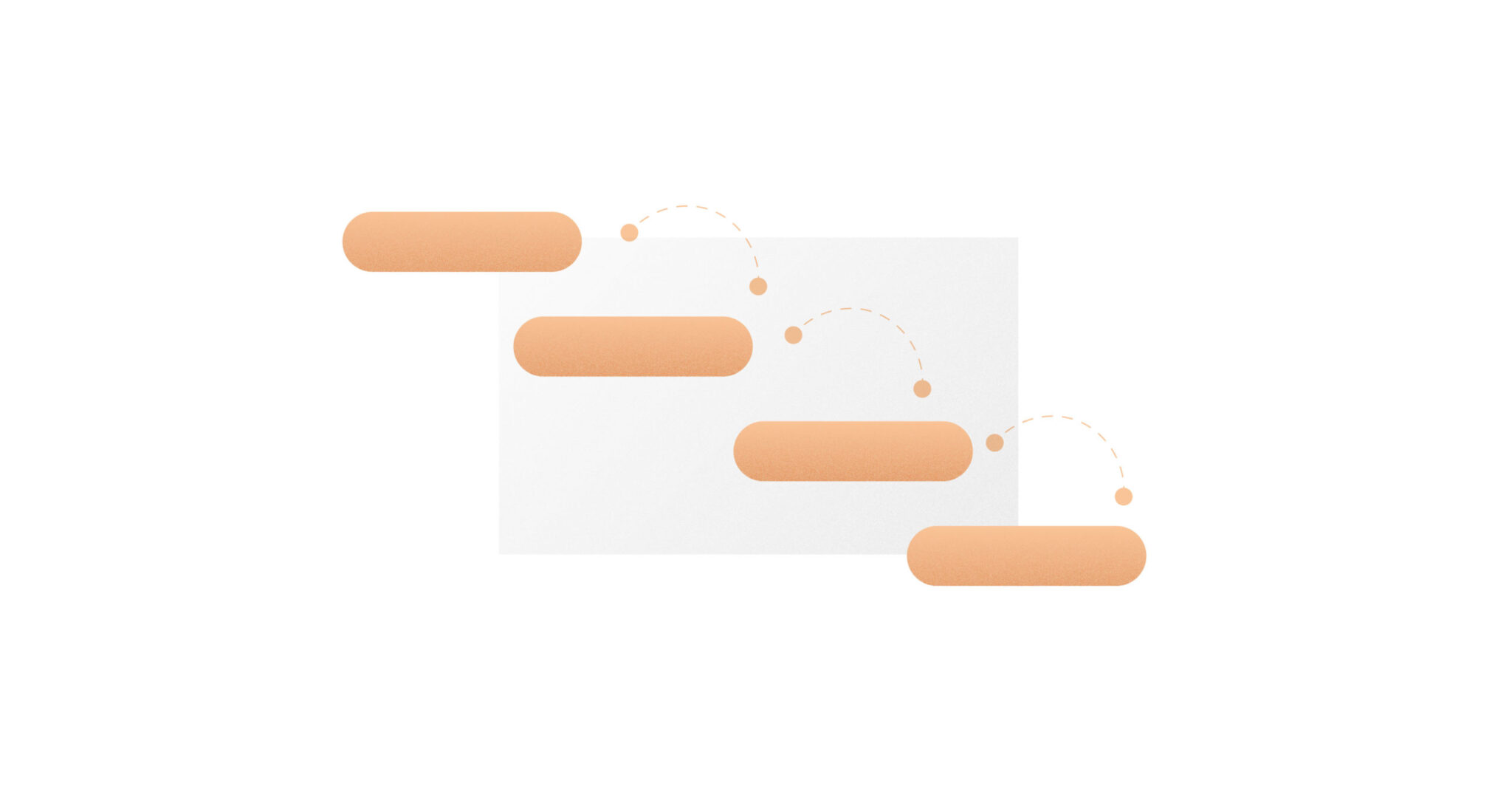
In software waterfall development, each phase must be completed before the next phase can begin. So, all the designs would have to be completed before developers could begin any work.
104. White space
White or negative space refers to the unoccupied or blank space on a page. In the shot below, white or negative space is used cleverly to shape a cursor.
105. Wireframe
A wireframe is a rough version of a screen design that allows the designer to rapidly explore different options for layout and visual hierarchy and gather feedback through testing. Typically, a wireframe does not include any decision-making around color or typography, although wireframes can range from low- to high-fidelity.
A strong foundation in UX design terminology is essential for creating exceptional user experiences. By understanding and effectively using these terms, you can communicate more effectively with your team, make informed design decisions, and deliver products that truly resonate with your users.
This glossary has provided a comprehensive overview of key UX design concepts, from fundamental principles to emerging trends. As the field of UX design continues to evolve, it’s important to stay updated on new terms and methodologies.


