
Are you still on the fence about getting a UX audit for your healthcare app?
We get it.
When you’re preoccupied with a dip in your product’s performance, it’s natural to question every solution offered to you.
But here’s the truth – conducting UX audits is an effective way to identify potential problems and take the first step towards addressing them, among numerous other business benefits.
A UX audit is thus a powerful tool that enables healthtech organizations to assess the effectiveness and efficiency of their digital interfaces, ultimately enhancing the overall user experience.
In this article, we will dive into the actual process of conducting a UX Audit on a Telehealth Platform facilitating virtual patient communication.
We will give you a walkthrough of the entire UX audit report from start to end so that you get a realistic idea of what to expect and what your product team stands to gain from it.
Let’s begin!
UX Audit Report of a Telehealth Platform
This UX audit was conducted on TeleCare, a Telehealth platform that comprises a patient dashboard, call interface with transcription, and tools for data collection and consultations.
The goal of the UX audit exercise was to assess and recommend areas of improvement based on the customers’ experiences with TeleCare.
At Koru, our Double Diamond UX Approach focuses on understanding the user. It takes this user-centric context to evaluate the interface engaging scientifically defined UX methods.
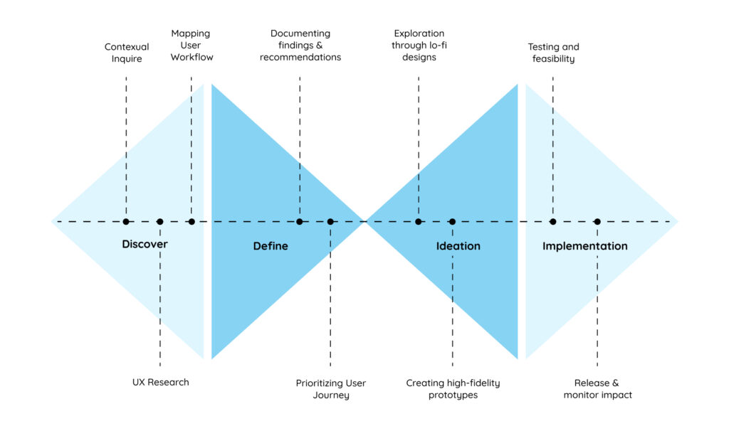
The UX audit is conducted over the following steps:
- Persona Development: Understanding the user’s background, needs, and definition of success when on task.
- Build Business Context: Understanding the business’s needs, dependencies on the workflow, and goals.
- Objective Assessment of Interface: Heuristic evaluation, adherence to compliance standards, and Design System Management.
- Assessment of Experience: User interviews and journey mapping conducted by an expert.
- Synthesis of Insights: Isolating Insights into challenges and their impact on Business and/or UX.
- Defining the Roadmap: Recommended steps and focus for Product Development.
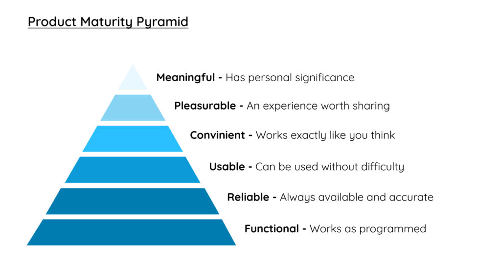
- We refer to the product maturity pyramid to deliver an objective assessment that engages scientific evaluation methods to generate measurable and qualitative insights.
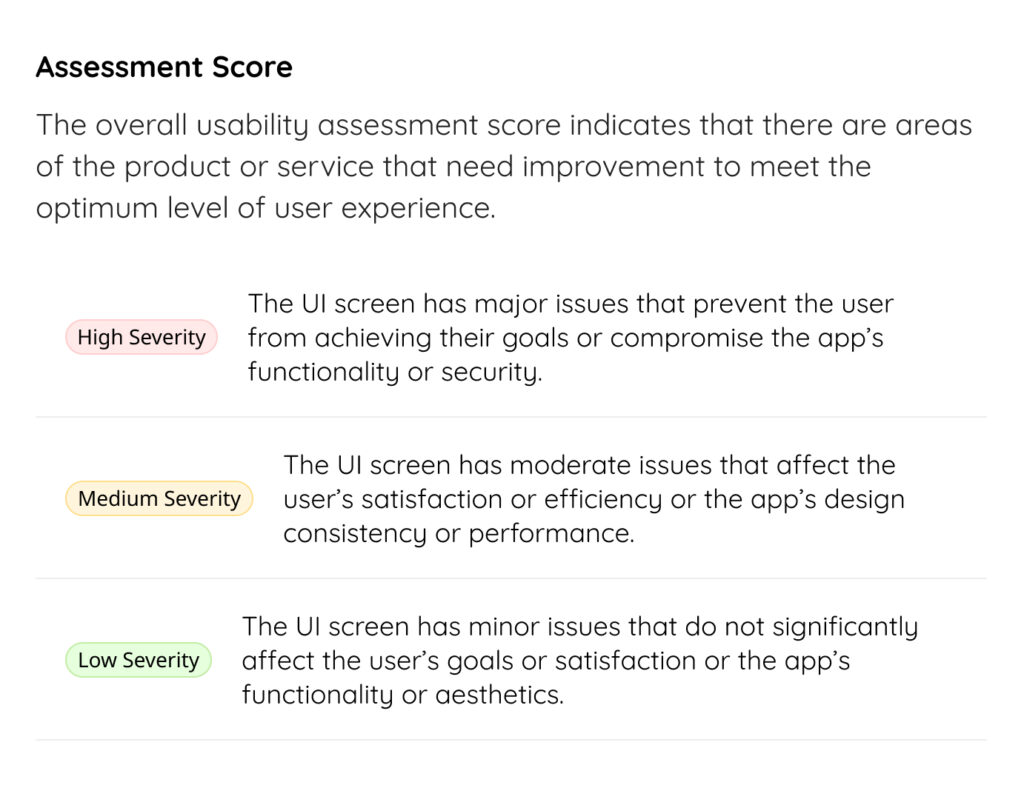
Assessment Score
The overall usability assessment score indicates that there are areas of the product or service that need improvement to meet the optimum level of user experience.
These are divided into 3 categories of severity- High, Medium, and Low.
10 Insights from the UX Audit Report of a Telehealth App
Medium Severity
1) Table header and column sorting
Finding
Users can only sort using a single parameter, that is the MRN. This severely limits the options to access and organize patient information with ease
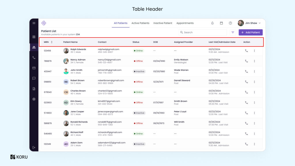
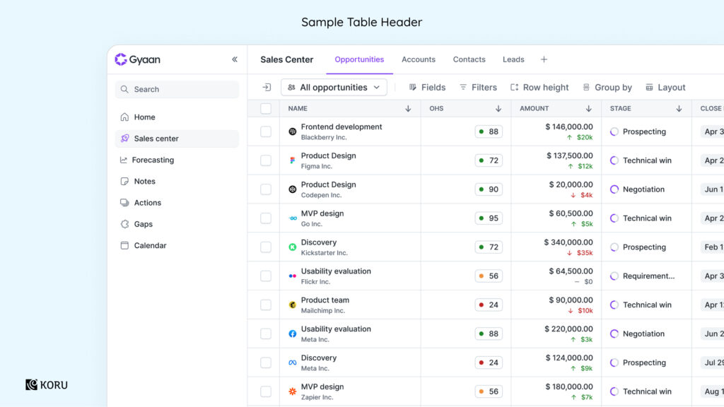
Recommendation
Implement sorting and filtering options using inputs from user research – based on the criteria they prefer (such as by provider, status, or recent activity). Here’s how it would look like, as shown in the UI above.
2) Left navigation menu
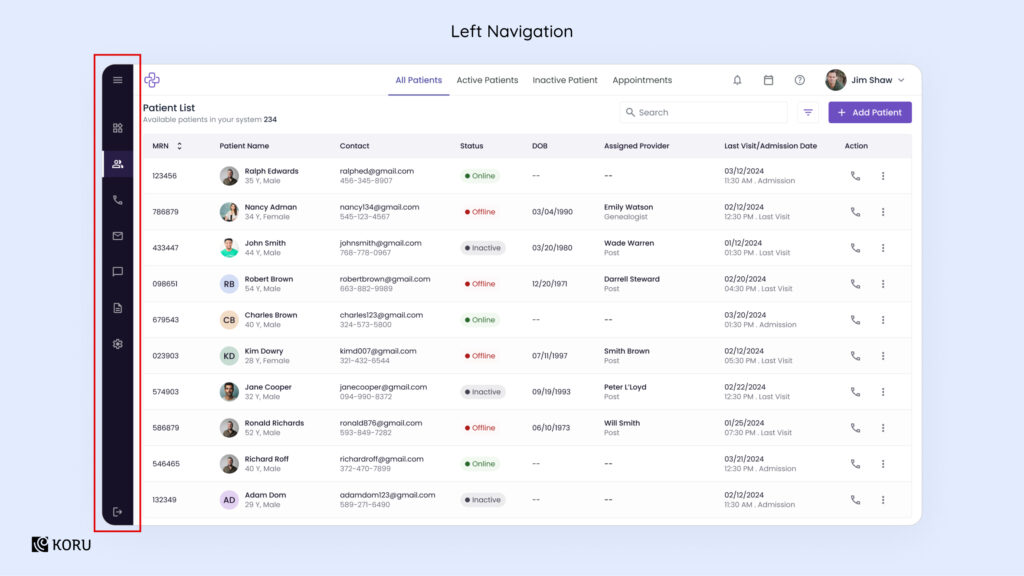
Finding
The navigation bar on the left that’s highlighted above relies solely on icons to represent options. The absence of labels creates potential confusion, resulting in a steeper learning curve for users.

Recommendation
While designing icons, it is important to add clear, concise labels to negate any confusion. A collapsible sidebar is an acceptable way to make the layout compact and provide the right context.
3) Top navigation
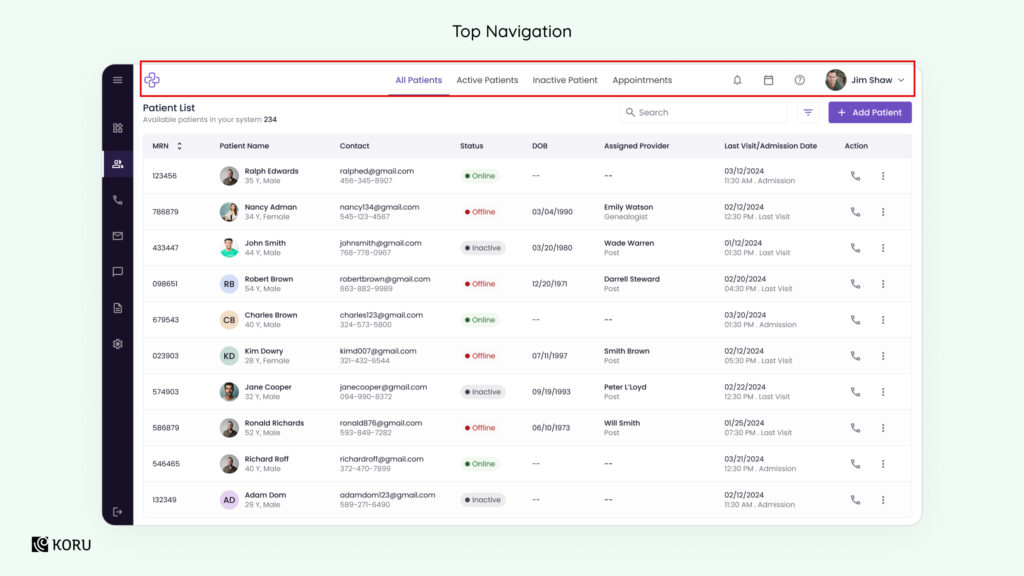
Finding
The multiple filters placed at the top of the table as highlighted above go against the established best practices of UI design. Further, the ‘Appointments’ tab is redundant since it duplicates the calendar icon’s functionality.
Recommendation
The table filters can be moved above the patient list and can be accessed in a toggle or dropdown format. The ‘Appointment’ tab can be done away with, relying solely on the calendar to access appointments.
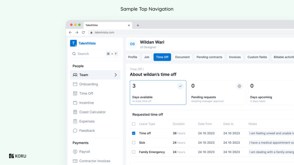
4) Search bar
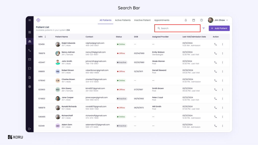
Finding
The placeholder text in the search bar lacks clarity, resulting in inefficient searches.
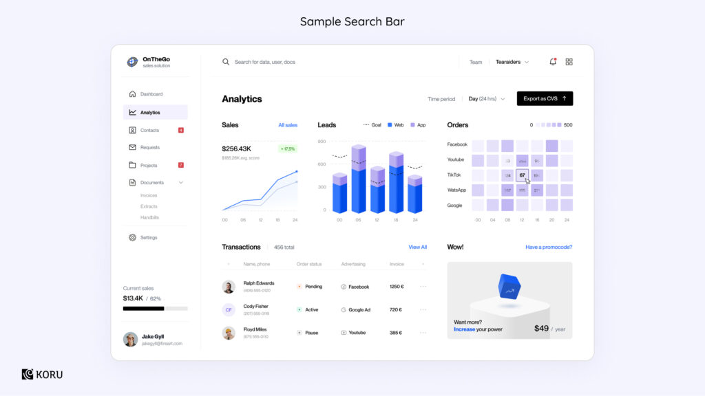
Recommendation
As shown in the sample search bar above, adding suggestions for search terms makes it easy for the user to input the right term. Consider implementing advanced search functionality to guide users to conducting more efficient searches.
5) Inconsistent action presentation
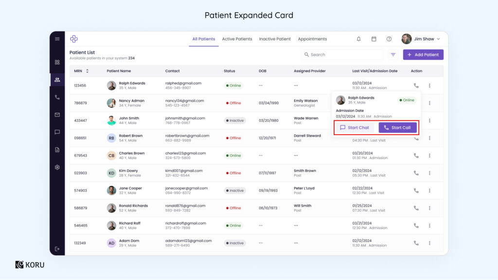
Finding
The expanded card highlighted above is creating confusion via the action it’s offering (Start Chat), whereas the main table view only has the telephone icon which represents phonecalls/voicecalls.
Recommendation
This problem can be solved by adding the chat and other quick action icons to the main table view so that users can see them upfront.
6) Information redundancy
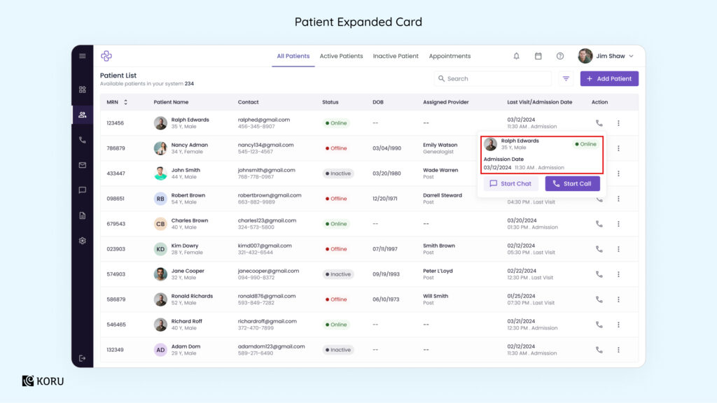
Finding
Less is more, especially when dealing with premium spaces on a healthcare product’s dashboard. The highlighted card contains a repeat of the patient details that are already visible in the table row.
Recommendation
Leverage the additional space in the card to add other parameters that would add value and justify the extra click for accessing it.
7) Redundant information entry
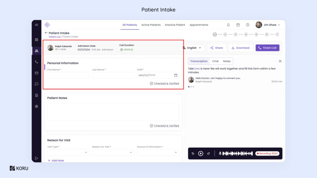
Finding
Redundancy affects the user experience, causing frustration in your users. Here we see that the form above has fields of Name and DoB – information that is already present in patient records. It is an unnecessary avenue of data entry and thereby shows potential for error.
Recommendation
Autopopulate the form with existing information as much as possible. Make way for editing when required.
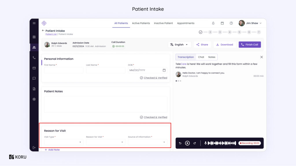
8) Unclear progress indication
Finding
While a progress indicator is a useful feature to have, especially for any input activity with numerous steps, it can be designed better than what we see above.
Recommendation
Adding descriptive labels to each step and highlighting the existing step will give the user more context and clarity.
9) Limited context for a call
Finding
The intake form as seen above, does not display the call’s purpose, which can lead to cognitive overload. It pushes users to switch between data entry and managing the call without a clear objective.
Recommendation
A section that summarizes the call’s purpose, or integrates this information with the “Reason for Visit” section will be helpful to resolve this issue. This addition will provide better context, helping users stay focused during the intake process.
Low Severity
10) Unclear visual hierarchy
Finding
There’s no clear visual hierarchy between the patient details form and the transcript section. The transcript, which is likely the primary focus during a call, lacks visual prominence.
Recommendation
Enhance the visual prominence of the transcript section, possibly by using a distinct background color. Alternatively, implement a collapsible patient details section to allow the transcript to take center stage, facilitating better focus on the ongoing conversation.
Download the full UX audit report (no, there’s no form filling, just click the link!).
Remember, a frustrated user is a lost customer, not to mention, a headache for your support team. Systems lacking in basic flexibility – from technical to infrastructural are a burden on the business.
A UX audit is a powerful tool that enables organizations to assess the effectiveness and efficiency of their digital interfaces, ultimately enhancing the overall user experience.
Questions? Thoughts? We’re here to help you answer all your queries regarding a UX audit for healthcare and medical apps. Get in touch, now!