For enterprise product owners, making themselves available on enterprise mobile apps brings a unique set of challenges. It’s a major reason why some enterprises are hesitant in adopting an enterprise mobile strategy for their applications.
The complex, functionally-heavy nature of enterprise mobile applications makes it difficult to convert them into a wholesome mobile UX. It is probably why discussions on mobile app UX design strategy keep getting deferred over time. Commonly, enterprise product owners consider making enterprise mobile applications out of existing desktop applications for their employees.
Did you know?
59% of employed Americans are working beyond 9-to-5 using enterprise mobile apps and 71% of employees spend more than 2 hours a week accessing company information on mobile devices.
It’s a good goal to have – providing a savvy enterprise mobile application that supplements and increases productivity.
Importance Of Mobile App User Experience
Having a clear understanding of the desired mobile UX is crucial. When the design or development teams fail to comprehend how to implement the mobile strategy from the enterprise’s perspective, the project gets stuck in an endless loop of rework and approvals.
As a result, enterprise product owners are faced with a long list of perplexing questions with regard to the mobile app user experience. UX is one of the most, if not the most critical concerns for enterprises looking to develop enterprise mobile apps. So, before moving on to mobile UX design, here’s a brief on what user experience actually is.
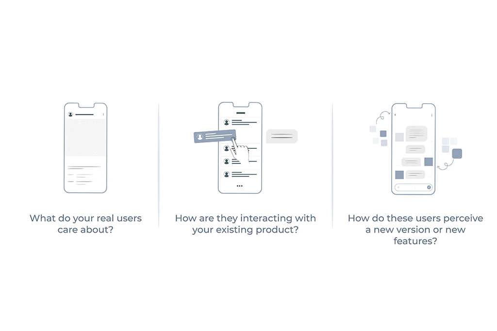
For starters, it is not to be misconstrued as visual design. It is an expansive, scientific concept based on user research data, which is the driving force behind its innovative results. It seeks to answer important questions from the user’s and business perspective to ensure that the end product matches their targeted needs, questions like –

Top 6 Ideas on Getting the Right UX for Enterprise Mobile Apps
There are numerous best practices when it comes to UX design, but in this blog, we’ll be focussing on things you need to look out for while overseeing a mobile app’s design process.
A Mobile App Is Not A Scaled-Down Desktop App
Let’s get this clear before we move forward – while the mobile UX design process has a few commonalities with web and software design, it is not a scaled-down version of a desktop or web experience.
The mobile app design process is an independent one that starts from the ground up, identifying the mobile user’s needs, and fulfilling them with the right features. The UX needs to be uniquely made for the mobile and not as a replica of the desktop/web version.
There are numerous best practices when it comes to UX design, but in this blog, we’ll be focussing on the high-level things you need to look out for while overseeing a mobile app’s design process.
Mobile and desktop users are the same but different

While developing an enterprise mobile application already in use, its users can be taken for granted, seeing as they are the same people using the desktop version of your software.
However, remember that mobile users are highly task-oriented – they access their phones to accomplish a specific task and accomplish it quickly. For example, if they’re hungry, they might want to have food delivered.
The commonality across the many use cases is that they are seeking to accomplish a clear goal. This contrasts with desktop/web users who may have to explore or learn or accomplish several tasks over time. Therefore, it’s crucial that the design team take note of these distractions and make task completion speedy and efficient.
This has to be done by setting specific goals for the mobile app, and not considering it as a mini version of the desktop version as mentioned in the previous point. It is vital to keep the number of steps, clicks, or taps to a minimum to help users achieve their goals without being delayed or distracted.
Ensure that functionality delivers value
How can you determine the right level of functionality for your enterprise mobile app’s users?
When do features become too much?
Desktop versions of enterprise applications are typically very complex and laden with features, both usable and obsolete. When you think about providing value, think about contexts like these – does it help users to be able to read, approve, and make notations offline if they then have to redo everything once they’re online?
Or providing users only 10% of the data they need to make a decision, just because mobile apps have to be lean? Of course not! Enterprise users may not have the luxury to completely abandon such an app, but they sure would avoid making use of it.
Consider this as an example – if there is a mobile application of a CRM being designed for field sales agents, you might only have features like the number of appointments for the day and status updating, instead of heavier features like uploading reports or monthly analysis. The focus should always remain on providing value and not features.
The MVP process is a good fit
What if there was a way to avoid investing unnecessary time and effort into untested features while creating a mobile app? Indeed there is a way, referred to as the Minimum Viable Product or MVP process, wherein you design a simple app with the basic, most important features, release it, and test it with users to test its viability.
The MVP method is put to good use by mobile teams at Dropbox, Lyft, Facebook, and numerous others to make small, iterative changes to their app every few weeks. There exists a tendency to go full out to build an app with comprehensive features without really understanding how each feature may impact and drive user behavior.
However, the MVP process involves making small iterative changes and testing them to reveal a fairly accurate cause-and-effect relationship between the changes made and user behavior—something that’s impossible to track with larger releases.
Keeping the scope simple allows validation of ideas by seeing whether users respond positively or negatively, as well as helps avoid assumptions in a shorter time frame. And there’s the bonus of forgoing the immense pressure and uncertainty that comes with larger, untested releases as well.
UX comes first, then UI

When creating an enterprise mobile user experience, top considerations should include:
- appropriate back-end connectivity,
- offline support,
- performance,
- overall reliability,
- and user interface, in that order.
34% of work productivity is improved when companies allow employees to use enterprise mobile apps. Loopholes in the user experience of your enterprise mobile apps can cause user frustration and lower productivity rates.
To prevent this, the enterprise mobile app has to primarily function well and be responsive. An enterprise mobile app must, at all times, be available and functional. It has to be able to perform critical functionality offline. Therefore, putting considerable effort to fine-tune that aspect of the user experience is essential.
Users may be willing to overlook some level of degradation in the UI, but only if they are able to optimally perform their tasks. While this is applicable for desktop apps as well, it’s more valid for mobile versions.
Setting Parameters For Performance
Well-defined KPIs are quantifiable measures crucial for your project to achieve its goals. Some examples of KPIs for enterprise mobile apps include:
- Decreased wait time for maintenance
- Quicker response time in communication
- Reduced paper costs
Depending on the nature of your business, you need to set KPIs that are measurable, specific, and relevant to the goal you wish to achieve with your enterprise application.
Standalone indicators such as time spent in the application or how many times a user has logged in can be irrelevant in the case of enterprise apps. However, when you start comparing these against KPIs such as reduced response time or quicker completion of tasks, the bigger picture will emerge.
The more specific the goals, the easier they are to measure. For instance, consider that the problem you’re looking to tackle is extended wait times for support requests, which has resulted in a lot of customer complaints. A good KPI, in this case, would be “faster responses for support requests” or “decreased customer complaints”. The “faster response times” would have to be further defined in terms of time, let’s say by 10-15 minutes or any relevant measure.
Final Thoughts
While developing an enterprise mobile app, your focus should remain on delivering actionable content that lets your users achieve their business goals or tasks. Survey states that 67% of CIOs & IT professionals believe mobility will impact their businesses. On the other hand, 87% of companies are dependent on their employees’ ability to access enterprise apps on their personal smartphones.
Therefore, it is imperative to enhance and invest in UX design for mobile apps, especially for enterprise mobile applications. Because of the complex nature of enterprises, the design and development teams often have to consider additional burdens of government and corporate regulations, data-hierarchy issues, and an organization’s fractured approach to mobile applications development. Therefore, the right level of UX maturity is imperative to driving these projects in the right direction.


