UX Audit
Guide:
Healthcare & Medical Apps
Last Updated: June 2025 | Reading time: 12 mins
Ever notice how some apps and websites are just easier to use? It's not by accident—it's by design.
In healthcare, ease of use can really make a difference. Our comprehensive UX audit services help healthcare organizations identify and resolve critical usability issues.
In this guide, we’ll walk you through how to perform a UX audit specifically for healthcare apps and websites. You’ll discover the key steps to identify problems that could affect user experience, and we'll show you how to make design changes that improve it.
Ready to enhance your digital product and make it more user-friendly? Let’s dive into the essentials of a successful Healthcare UX Audit.
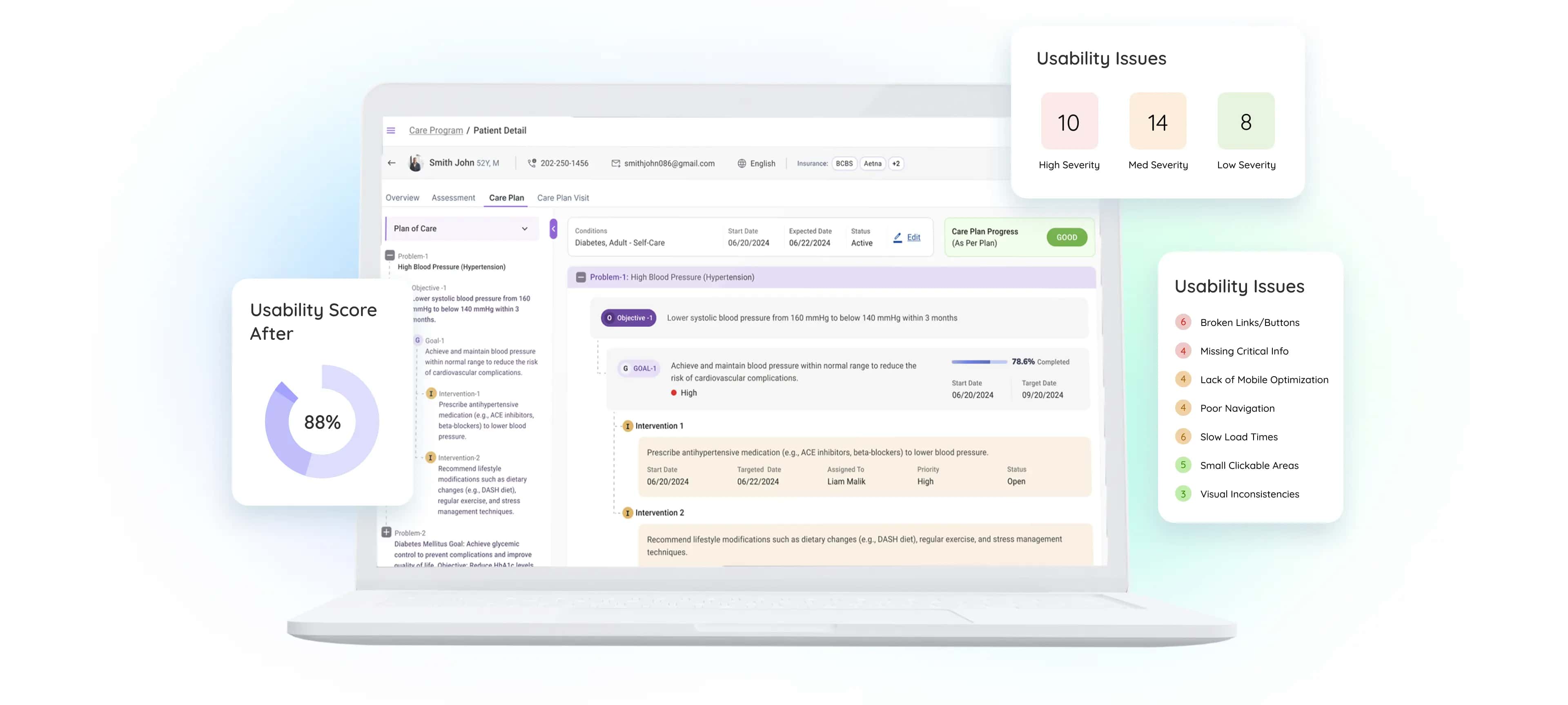
TABLE OF CONTENT

ABOUT THE AUTHOR
CEO and UX Practitioner
Bansi Mehta is leading voice in healthcare UX who has spent over 15 years making complex products feel clear, capable and human. She is equal parts design romantic and technologist - drawn to the elegance of beautifully simple interfaces whilst remaining endlessly curious about AI and the future of human-computer interaction.
As founder and CEO of Koru UX, an award-winning design agency, Bansi leads 45+ designers who have completed more than 1,500 UX projects to improve the way millions of users interact with technology.
What is a UX Audit?
A UX audit is a systematic evaluation of your product's user experience to identify usability issues and opportunities for improvement. This comprehensive UX audit process helps businesses understand how users interact with their digital products and where improvements are needed.
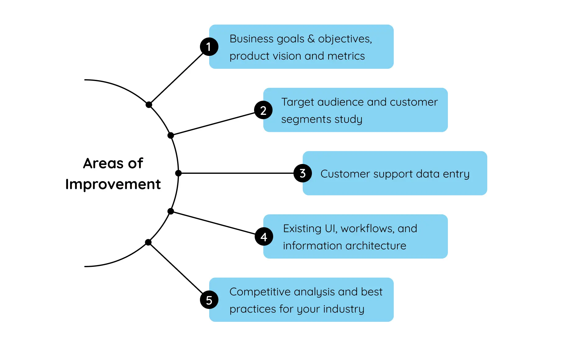
The UX audit process typically involves:
1. User research and stakeholder interviews
2. Heuristic evaluation against usability principles
3. Analytics review and competitive analysis
4. Findings synthesis and actionable recommendations
A comprehensive UX audit helps businesses increase user satisfaction, reduce support costs, and improve conversion rates.
Now, take a minute to consider what brought you here - to this UX Audit guide.
What was it? A sharp and steady customer churn? Poor adoption? Surge in customer support costs? Or was it the competition?
You need to unearth what’s weighing your product down, and a UX audit is the most authentic way to go about it.

What’s the Difference Between a UX Audit and a Usability Audit?
What’s the Difference Between a UX Audit and a Usability Audit?
While UX audits and usability audits are related, they’re not the same — each focuses on different aspects of your product’s experience.
A UX Audit is a comprehensive evaluation of the entire user experience — from functionality and flow to business goals and user satisfaction.
It assesses whether your product is meeting both user needs and business objectives.
A UX audit typically involves a combination of methods, including heuristic evaluation, user testing, data analysis, stakeholder interviews, and comparison against industry best practices.
A Usability Audit, on the other hand, focuses specifically on ease of use and functionality.
It assesses whether users can efficiently and effectively complete their tasks without confusion or frustration.
This process usually involves evaluating the UI against recognized usability principles and guidelines (such as Nielsen’s heuristics) and is less concerned with broader business goals or the overall experience context.
TL;DR
UX Audit = holistic view (user experience + business goals)
Usability Audit = narrower view (ease of use and functionality)
Here is a list of the most common types of UX audits, their pros, cons, and when you should use each:
How can a UX Audit help you?
- -As an unbiased, bird’s eye overview of your product, it helps spot redundancies that you might’ve missed.
- -It gives you a prioritized list of action items so you don’t waste any time on directionless efforts.
- -The findings it provides give you the golden opportunity to actually kickstart those hard conversations among teams.
What does the UX Audit process look like?
What does the UX Audit process look like?
A comprehensive UX audit follows 4 key stages, designed to systematically evaluate and enhance your product's user experience. This proven UX audit methodology ensures thorough analysis and actionable outcomes.
Here's a breakdown of the key stages involved in a UX audit:
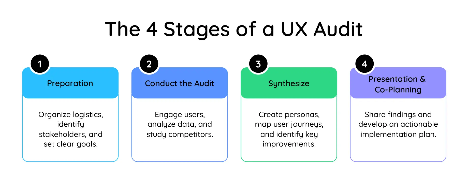
Stage 1. Prep
- -Ensuring that you have your logistics in place (earmarking the right stakeholders and users, gaining access to data, deciding on timeline, resources, and most importantly, the budget)
- -The goal of your audit exercise (why are you doing it, what are you trying to achieve with it)
Stage 2. Conduct the UX Audit
- -This is where the actual action takes place. Talk to your users, stakeholders, and subject matter experts through conversations to gauge their experiences and opinions inside out.
- -Your customer service data is a goldmine of unfiltered user inputs. So dig deep into your customer support tickets, app usage data, and user feedback to get to know the most burning issues that are wrecking your product.
- -Conduct a competitive analysis to get the scoop on your competitors to spot areas where your product can stand out.
Stage 3. Synthesize
- -Untangle the raw data from quotes, conversations, survey inputs, and service tickets into insights to create user personas that are realistic representations of your core user groups.
- -Develop a detailed user journey map to visualize the user's interaction with your product, pinpointing potential roadblocks and optimizing the user flow.
- -Apply techniques like affinity mapping to identify patterns and prioritize the most critical areas for improvement.
Stage 4. Presentation & Co-planning
- -The final stage is about presenting them in bite-sized, consumable pieces. Your presentation must communicate the key insights and prioritized recommendations sans the mumbo jumbo - be as clear as possible.
- -Create a clear implementation plan with all the bells and whistles. Include reasonable timelines, and assign executive responsibilities to the right people. Set the stage for a successful UX refresh.
UX Audit Checklist
UX Audit Checklist
Before starting your UX audit, ensure you have:
Get clarity around your current UX challenges
Consult with award-winning UX designers
Discover bleeding-edge UX practices, including the latest AI/LLM use cases
Determine if we're a good fit to collaborate, and if so, discuss our engagement model, timelines, and your potential investment
When should you get a UX Audit?
When should you get a UX Audit?
Remember, a frustrated user is a lost customer (and a headache for your support team).
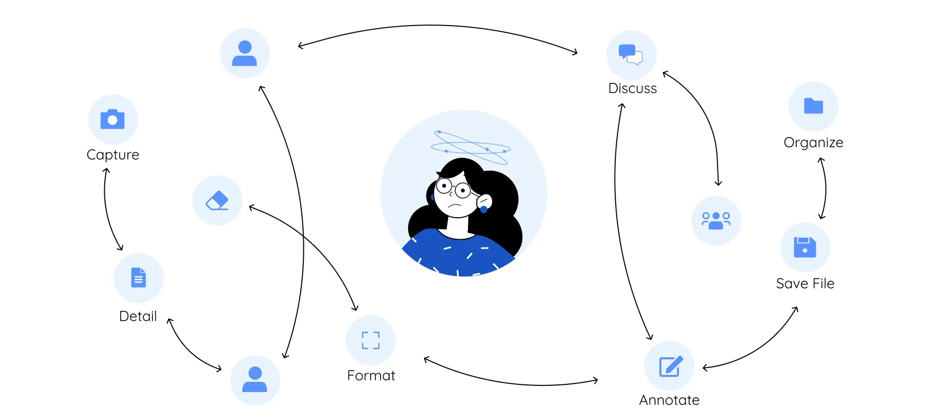
Systems lacking in basic flexibility – from technical to infrastructural are a burden on the business. Who bears the brunt of working with a system such as this? Your unsuspecting users, who perpetually experience a sense of dread while using it.
So if you’re seeing these signs, it’s an immediate go-time for a UX audit.

Process gaps in critical tasks:
Your users are skipping or abandoning crucial steps in a process without a clear understanding.

Inconsistent metrics vs. Expected outcomes:
There’s a clear disconnect between what your product does and what your users are expecting. You notice a mismatch between recorded metrics and the anticipated results.

Persistent customer service issues:
Your customer service center is constantly buzzing - and that’s never flattering. Endless complaints to your customer service center aren’t just a red flag, it’s a whole red forest, indicating recurring issues such as a heavy onboarding process and a lack of user adoption.

Losing sales to competition:
Are potential clients ghosting you following a demo? It’s not them, it’s YOU, or rather your product.
If your product demos aren’t bringing in buyers, or if you’re seeing alarming drop-offs after trial periods, your product isn’t giving the users what they’re looking for.
A UX design audit helps address these points of friction, leading to an enhanced user experience and improved overall product performance. It's like getting a fresh pair of eyes on your product to identify pain points, streamline workflows, and make sure everything is working together seamlessly.
Request a no-obligation UX discovery session, especially for HealthTech product teams

Who is a UX Audit best suitable for?
Who is a UX Audit best suitable for?
By now there’s no contesting the value that a UX audit brings to enhancing your product experience. However, they’re especially game-changing for certain organizations -


UX Audit for Different Industries
UX Audit for Different Industries
While this guide focuses on healthcare UX audits, our methodology applies across industries. Each sector has unique user expectations and compliance requirements that inform the audit approach:
-
E-commerce UX Audit: Optimize checkout flows and product discoveryE-commerce UX audits focus on optimizing the conversion funnel, from product discovery to checkout completion. Nielsen Norman Group's e-commerce research provides 1073 design guidelines based on testing 350+ e-commerce websites, whilst Baymard Institute's specialized audits offer checkout-specific optimization based on 150,000+ hours of user research.
-
SaaS UX Audit: Improve onboarding and feature adoption SaaS platforms require specialized evaluation of subscription flows, feature discoverability, and user activation patterns. Baymard's SaaS audit methodology compares against leading platforms like Slack and Adobe, while their research-backed SaaS UX strategies address common pain points in digital subscription services.
-
Mobile App UX Audit: Enhance touch interactions and navigationMobile UX audits evaluate touch-specific interactions, responsive design, and app-native patterns. Google's Material Design research from 46 studies with 18,000+ participants provides the foundation for mobile interface evaluation, whilst UXCam's mobile audit methodology offers practical templates and checklists for app-specific assessments.
-
Website UX Audit: Boost conversion rates and user engagementWebsite audits take a holistic view of user journeys, information architecture, and conversion optimization. Smashing Magazine's detailed case studies demonstrate Nielsen's heuristic evaluation in practice, while ConversionXL's research establishes the direct relationship between UX improvements and business outcomes.
Each UX audit type requires industry-specific considerations while following core UX audit principles. These authoritative methodologies ensure your audit delivers actionable insights regardless of your sector.
UX Audit: Twice as Important for HealthTech
UX Audit: Twice as Important for HealthTech
Traditionally, the healthcare sector has prioritized a positive outcome over a positive experience. However, there has been a significant and rapid shift in recent years.

5 Reasons Why Healthcare Organizations Are Prioritizing UX
1. Good UX Is Good Business
It's no longer enough just to have solid functionality without considering the user experience. These days, both are essential for success.
2. Good UX Means Better Adoption
Offering straightforward, intuitive, and engaging experiences makes all the difference in keeping users engaged. For patients, it could mean sticking to essential health routines; for businesses, it's the key to retaining customers versus watching them churn.
3. Staying Ahead Of Competition
If you're not focusing on UX, rest assured, your rivals will be. In a competitive landscape, delivering a superior user experience isn't just nice to have; it's essential.
4. Elevated User Expectations
The era of tolerating subpar digital experiences is over. Post-COVID-19 users demand quick, straightforward, and efficient digital interactions, setting a higher bar for UX.
5. More Tech = More Possibilities
The explosion of devices and technological capabilities offers unprecedented opportunities for enhanced functionality. Yet, this complexity requires a considered UX strategy to ensure users can easily navigate and benefit from these advancements without feeling overwhelmed.
How to Conduct a UX Audit:
4-Stage Process
How to Conduct a UX Audit:
4-Stage Process
Conducting a successful UX audit requires a strategic approach that combines proven UX audit methodologies with deep user research.
Sounds complicated? It isn’t if you know what you’re doing and follow the steps in this guide to the T.
Stage 1
Preparing for a UX Audit

Before diving into a UX Audit, planning and preparing is crucial.
As tempting as it is to dive in and start redesigning features, adequate preparation will always ensure a better end result. You wouldn’t build a house without a blueprint, right? Think of this as creating the blueprint for your UX.
Stakeholder Interviews
The first step is to speak to your stakeholders. You can do this formally, in a structured interview setting, or you can arrange informal conversations. It’s up to you. The important thing is that you really understand what others think about your app.
Stakeholders won’t necessarily tell you what they’re really thinking upfront. You might need to probe a little bit.

The “Five Whys” is a great approach to identifying the root cause of a problem. It can feel a little awkward at first (some people might worry about hurting your feelings!), but I promise you it’s worthwhile getting to the core of their feedback.
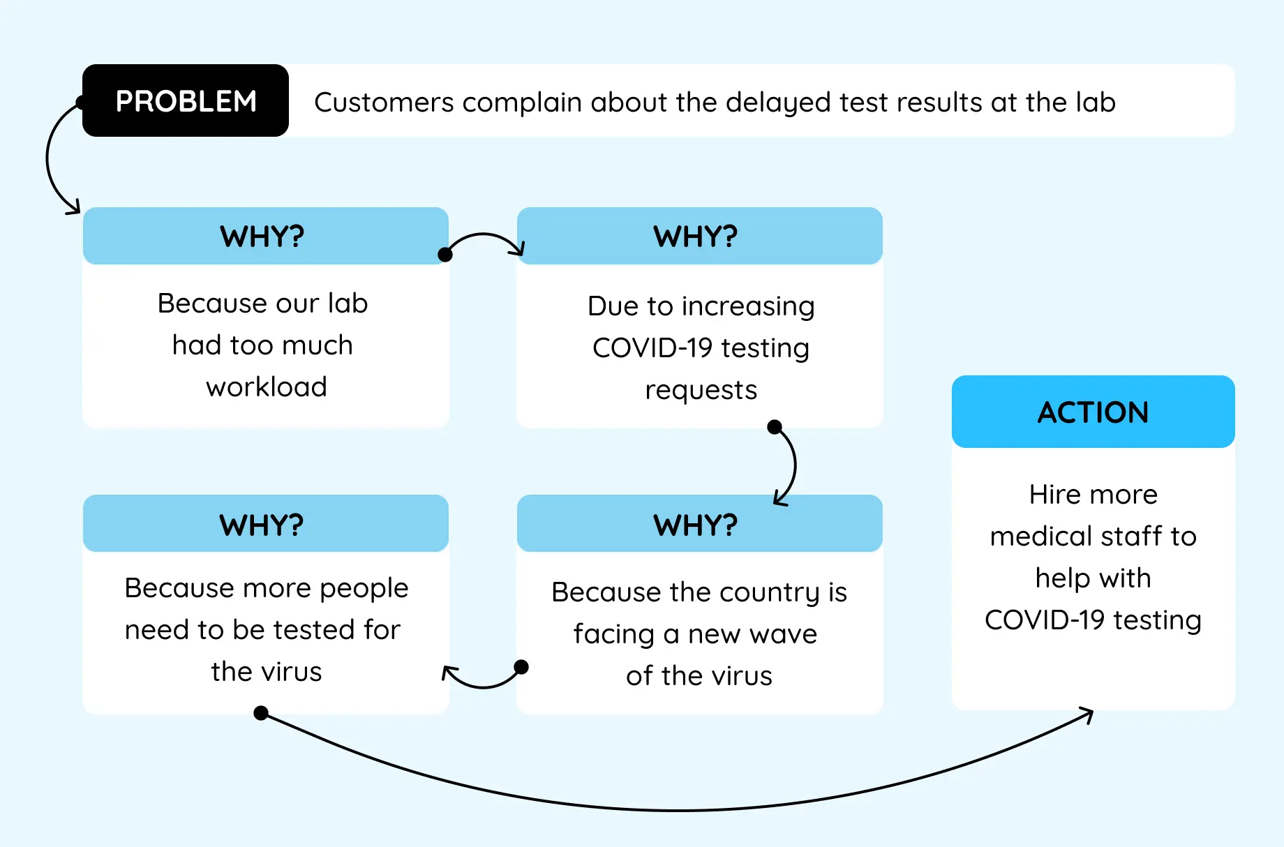
Here are ten questions to get you started:
- -What do you like most about using our app?
- -What do you dislike about our app?
- -Is there anything you find confusing or difficult to use in the app?
- -How does our app meet your needs compared to other similar apps?
- -Can you describe a recent issue you encountered while using the app, and how did you resolve it?
- -What functionality would you add to improve your experience with the app?
- -How would you rate the overall design and aesthetics of the app?
- -How responsive do you find the app when performing actions or loading content?
- -How secure do you feel using our app, especially for tasks involving personal or sensitive information?
- -Would you recommend our app to others, and why or why not?
Categorize all the feedback you gather into distinct buckets and look for common themes across stakeholders. How does it line up with what you expected? Were there any surprises?
Assemble the Team
A successful UX audit isn't a one-person show. You'll need a team of domain experts with complementary skills to truly make it shine.
To that end, consider partnering with an external agency with a proven track record in UX design. They have a preset filter on their eyes that spot things that you might miss, thanks to their domain expertise (especially important for HealthTech companies to collaborate with a UX team that speaks their language).
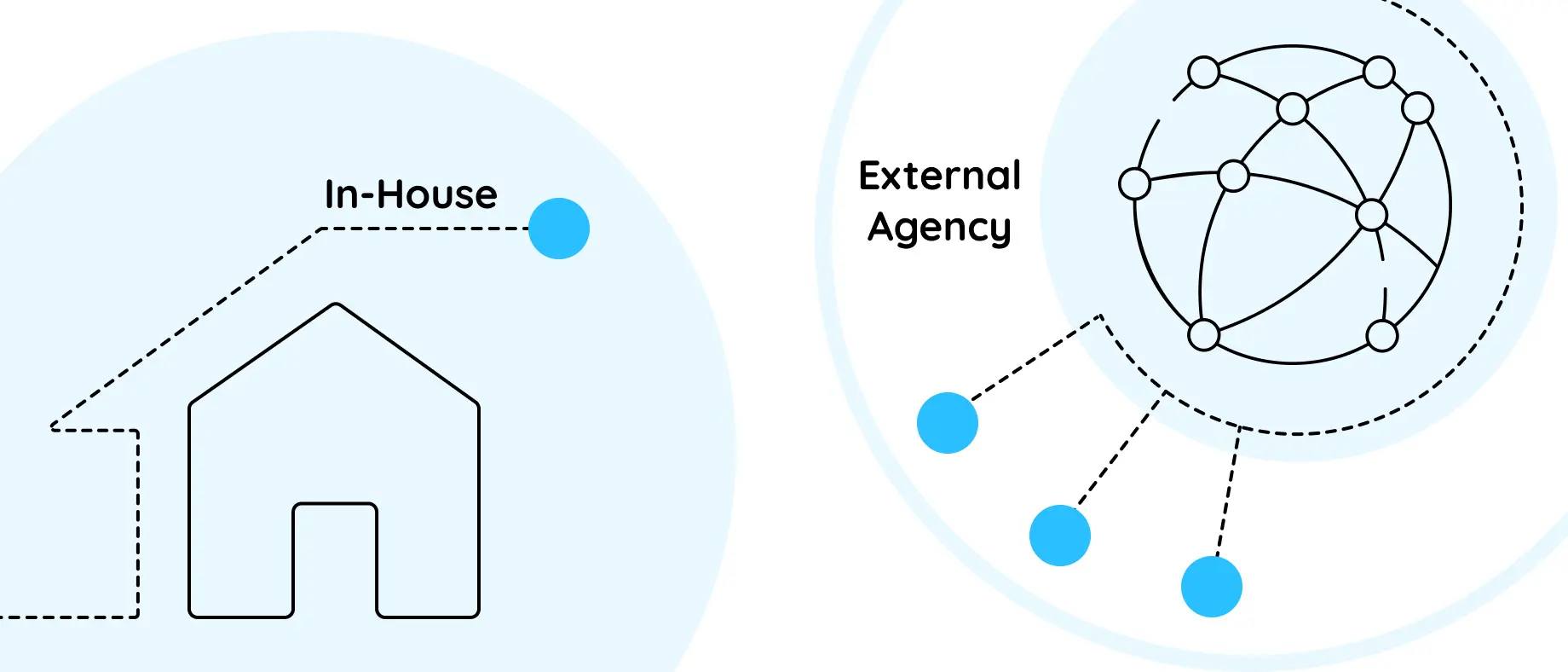
It’s nearly impossible for internal teams to get rid of their inherent bias - they’re too close to the product to be truly objective. They can also be apprehensive of changing priorities, especially when fault lines are drawn. And this is where an external agency shines with their speed and focus - they know what they’re doing and they do it with finesse.
Don’t forget - Internal stakeholder involvement is equally vital. Incorporate representatives from IT, design, marketing, and potentially clinical staff. Each department offers a unique perspective, ensuring a holistic evaluation of the user experience.
Coming back to the team - a successful UX audit is all about that collaborative effort from a team of professionals with complementary skill sets.
Here's a breakdown of the key responsibilities involved:
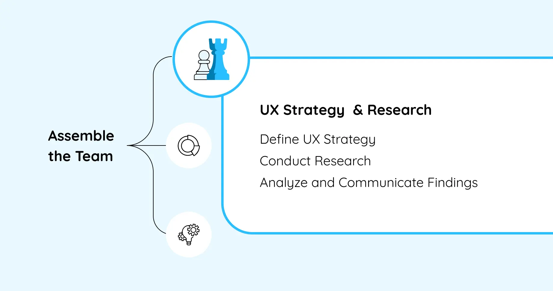
UX Strategy & Research
Best suited for someone meticulous, can ask the right questions, and is sharp enough to extract the right information.
Responsibilities
- -Defining UX strategy and plan by establishing the goals, objectives, and scope of the UX audit. Develop a detailed research plan that outlines the methods, timelines, and deliverables.
- -Utilizing various research methods such as user interviews, surveys, contextual inquiries, and usability testing to gather data about user behaviors, needs, and pain points.
- -Collecting qualitative and quantitative data, ensuring it is comprehensive and reliable. Analyze the data to identify patterns, insights, and areas for improvement.
- -Communicating with stakeholders to understand their perspectives, gather requirements, and keep them informed about the progress and findings of the audit.
- -Documenting findings that summarize the research findings, including user personas, journey maps, and key insights.
UX Analysis
Perfect for someone who identifies the method in the madness, someone who sees insights in raw data and can retain an objective mindset.

Responsibilities
- -Conducting heuristic evaluations of the product to identify usability issues based on established usability principles and best practices.
- -Gathering and organizing data collected during the research phase. Ensuring data is accurately recorded and stored.
- -Synthesizing findings to identify key themes and patterns. Creating visualizations, such as charts and graphs, to present the findings.
- -Develop specific, actionable recommendations for improving the product’s user experience. Prioritize these recommendations based on their impact and feasibility.
Project Management
Look for a Type-A personality in your team as this role will call out to them. It’s a no-brainer that project management needs a whole lot of organizational and collaboration skills, perfect for someone who just gets things done the right way.
Responsibilities
- -Developing a detailed project plan that includes timelines, milestones, deliverables, and resource allocation. Ensuring that all aspects of the audit are well-coordinated and scheduled.
- -Handling the logistical aspects of the audit , such as scheduling interviews and usability testing sessions, coordinating with participants, and ensuring necessary tools and materials are available.
- -Facilitating communication and collaboration among team members. Schedule and lead regular check-in meetings to discuss progress, address issues, and adjust plans as needed.
- -Assigning a primary point of contact for stakeholders. Providing regular updates on the project’s status, addressing any concerns, and ensure alignment with stakeholder expectations.
- -Identifying potential risks and challenges that could impact the project. Develop mitigation strategies to address these risks and ensure the project stays on track.
Timeboxing a UX Audit
A UX audit has all the elements to turn a never-ending afternoon soap opera. It has cliffhangers, conflicting priorities, sudden revelations, and not to forget, people with inflated egos. So you want to ensure that your audit is quick, focused, and effective. Enter, Timeboxing.
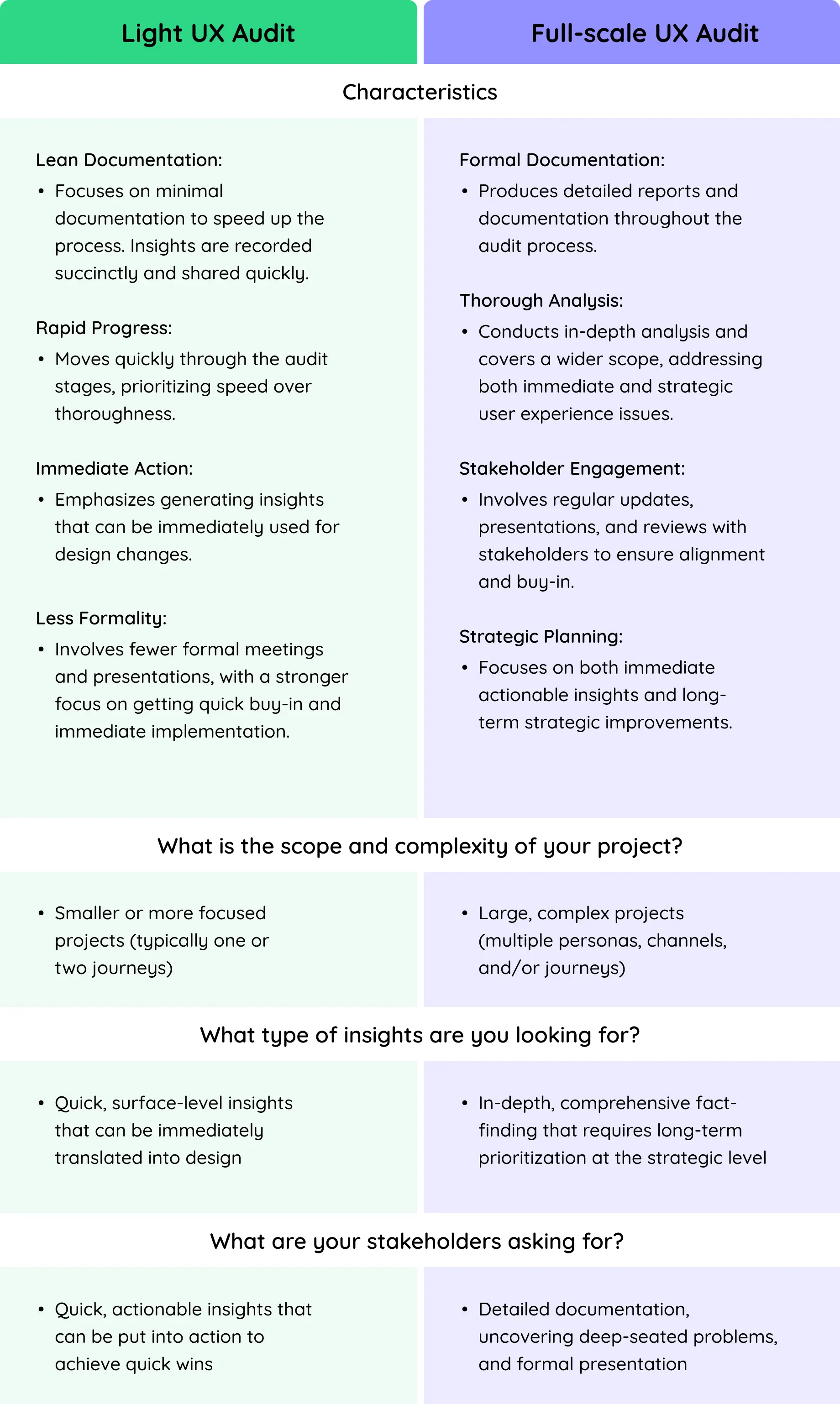
Timeboxing can be approached in two ways: conducting a Light UX Audit or a Full-scale UX Audit. Both approaches have distinct characteristics and serve different purposes depending on the needs and constraints of the project.
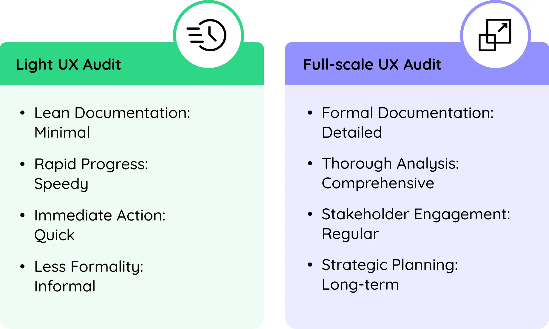
Light UX Audit
A Light UX Audit is lean and fast-paced, aimed at quickly identifying actionable insights that can be immediately translated into design improvements. This approach is not rigorously formal and moves through the audit stages rapidly.
Full-scale UX Audit
Full-scale UX Audit is more comprehensive with detailed documentation, formal presentations, and extensive stakeholder engagement. This approach is more methodical and aims for long-term strategic alignment.
Choosing Between Light and Full-scale UX Audit
Essential Tools and Resources for the UX Audit
- User experience research tools such as UserZoom, UsabilityHub, or UserTesting for comprehensive UX audit data collection and usability evaluation
- Surveys and questionnaires platforms such as Survey Monkey, Qualtrics, or SurveyGizmo (now Alchemer) collect user feedback and insights about their experience with the digital platforms.
- UX analytics platforms like Heap Analytics or Hotjar to gather quantitative user behaviour data essential for thorough UX audit analysis.
- Documentation templates from Confluence, Notion, or Google Docs to record audit findings, recommendations, and action plans for future reference and tracking.
Get Your Product Evaluated from the HealthTech UX Experts

5 Tips to Help You Plan Your UX Audit
1.
Always think quality, not quantity by picking on a smaller group of well-chosen participants rather than a large, less targeted pool.

2.
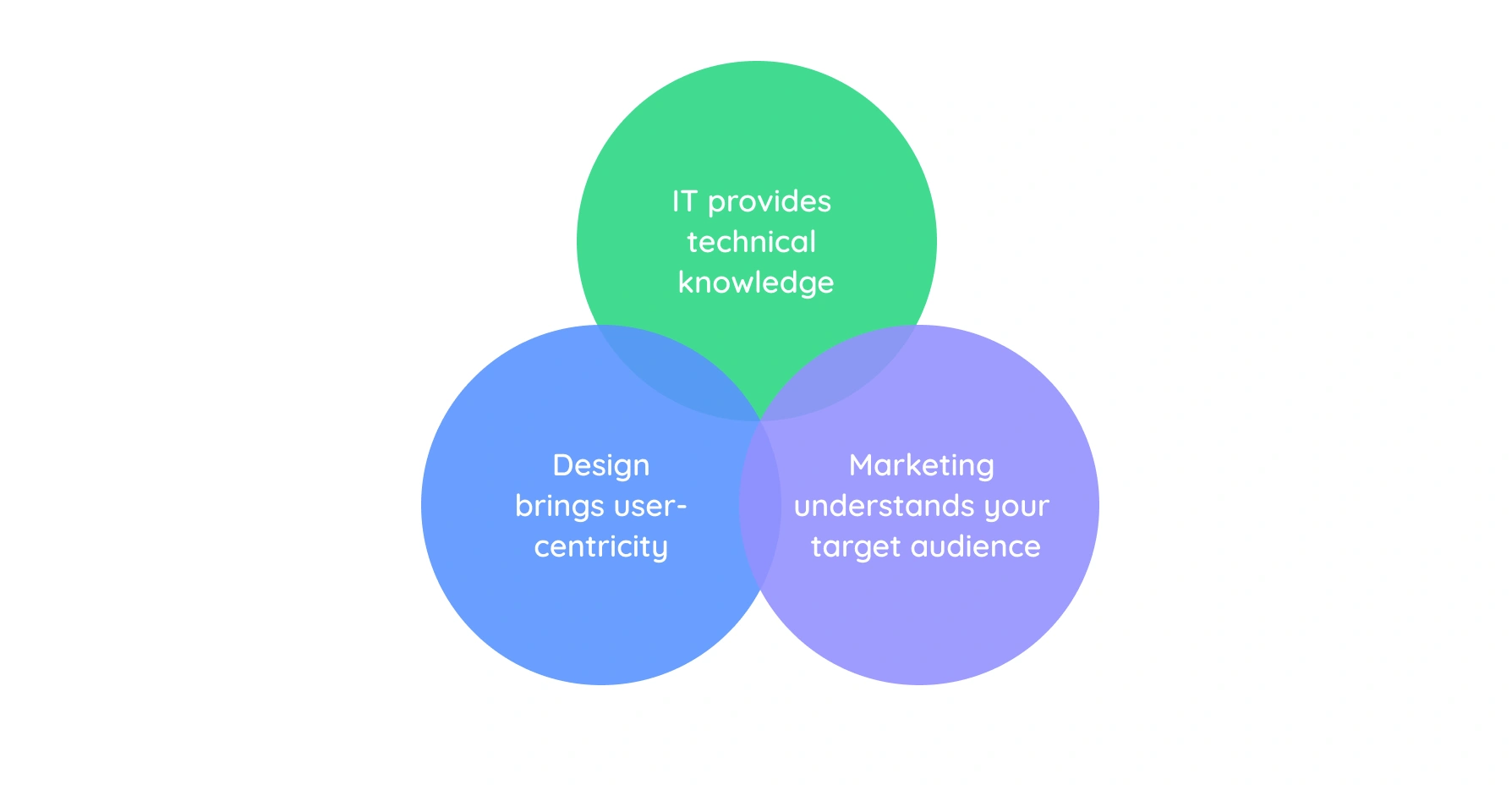
Involve a rainbow of representatives from IT, design, and marketing. IT provides technical knowledge, design brings user-centricity, and marketing understands your target audience.
3.
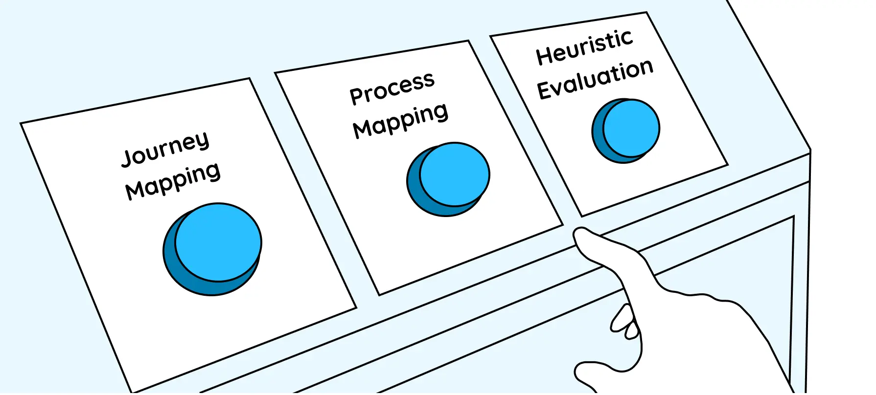
Choose your weapons well For example, journey mapping works well with existing products with established user workflows. However, for a greenfield project, journey mapping might not be the best fit.
- -Process mapping is a good technique for complex, process-intensive products as it focuses on the specific steps users take to complete a task within your product or system. It's ideal for identifying inefficiencies and streamlining workflows, especially for complex processes.
- -Heuristic evaluation is a game-changer for products with complex interfaces and workflows, often revealing "easy wins" – usability issues with clear fixes that can provide instant gratification for users.
4.
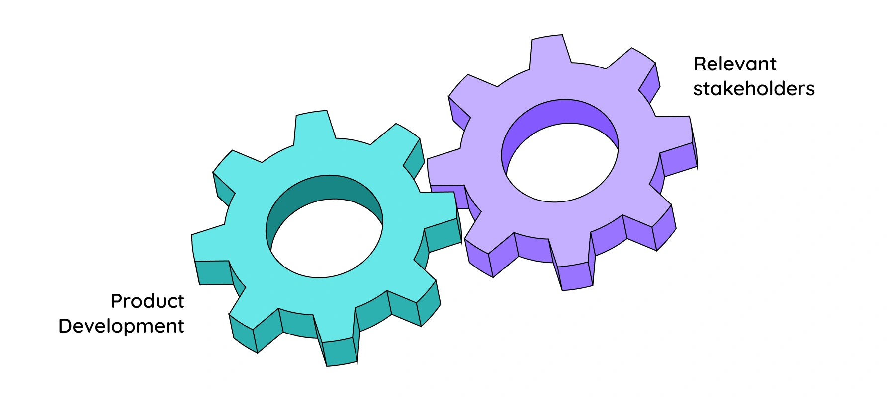
Engage the right stakeholders who can influence product development and implementation. Remember, you want this to be smooth sailing.
5.
Establish clear boundaries for the audit in terms of time and expectations, and let us say this louder for the people at the back. Identify what success looks like to your organization. What concrete improvements do you aim to achieve?
In the next section, we will dive into the actual process of conducting a UX Audit, where you will learn how to review and evaluate existing user interfaces, test and analyze user experience, and identify areas for improvement.
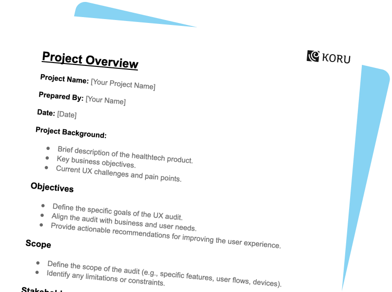
Unlock Superior User Experience: Download Your Free UX Audit Template Now!
Stage 2
Conduct the Audit

Gathering User and Business Insights at the Primary Level
Now that your dream team is assembled, and you’ve zeroed in on the type of audit to conduct, it’s time to get down to business.
Here's how we peel back the layers and uncover the user experience truth
- -Talk to real users, and see them interact with your product. Formal interviews combined with observing them in action (we call it "shadowing") reveal hidden challenges and opportunities surveys just can't capture.
- -Product managers, sales reps, and your customer support crew hold a goldmine of info. Chat with them to understand user feedback, sales roadblocks, and support headaches. This paints a complete picture of the user journey.
- -Your internal Subject Matter Experts (SMEs) are a fountainhead of knowledge. Talk to them to bridge the gap between how the software should work and how users actually experience it. Their insights are key to identifying hidden usability issues.

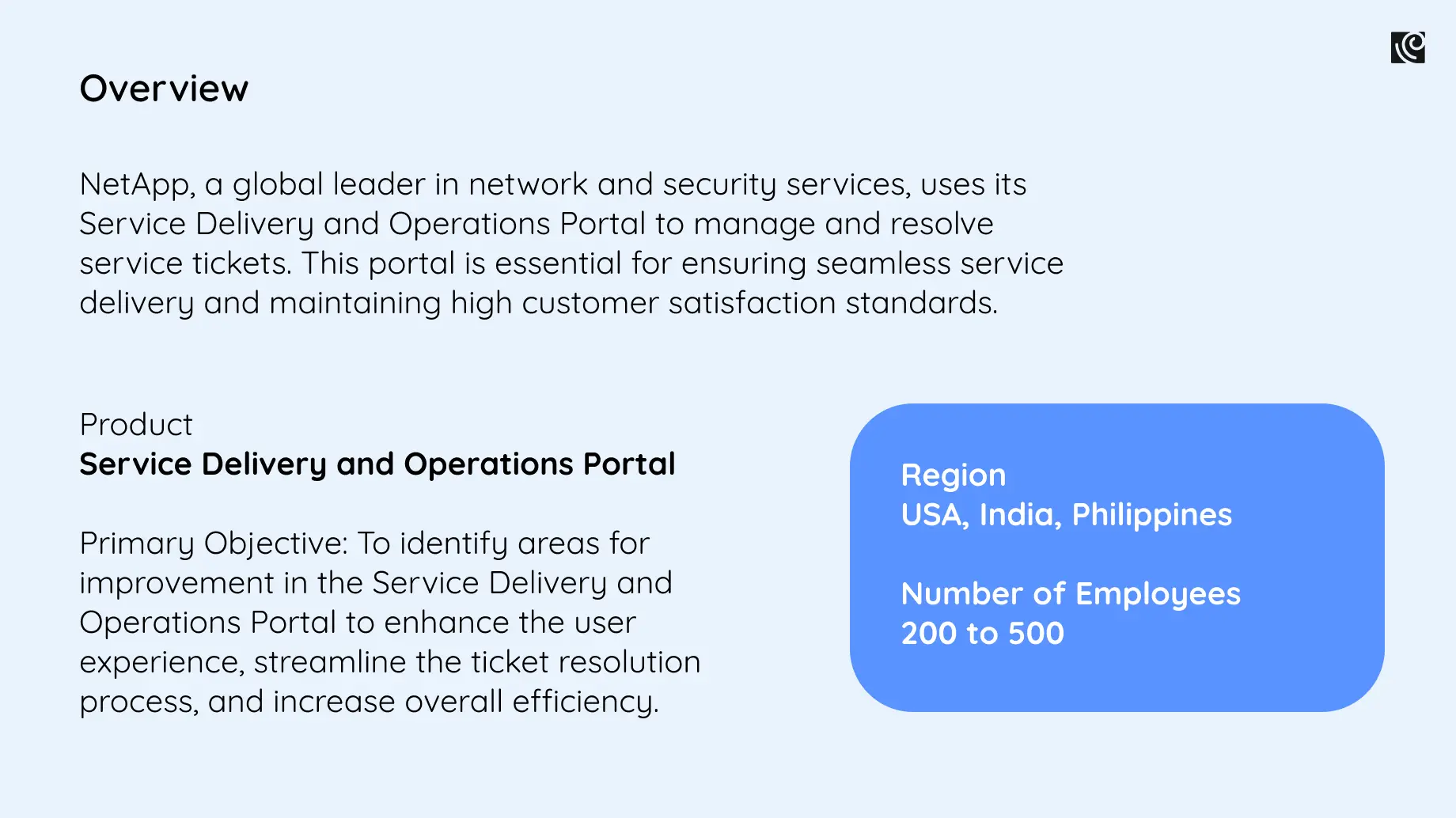
To give you a realistic overview of how a typical UX audit unfolds, we’re the UX audit conducted on NetApp, a product used for ticket resolution by a telecommunications company.
These intel-gathering methods will help you gain a crystal-clear understanding of your users' needs and how well your product is meeting them. It's all about uncovering the good, the bad, and the buggy to pave the way for a stellar user experience.

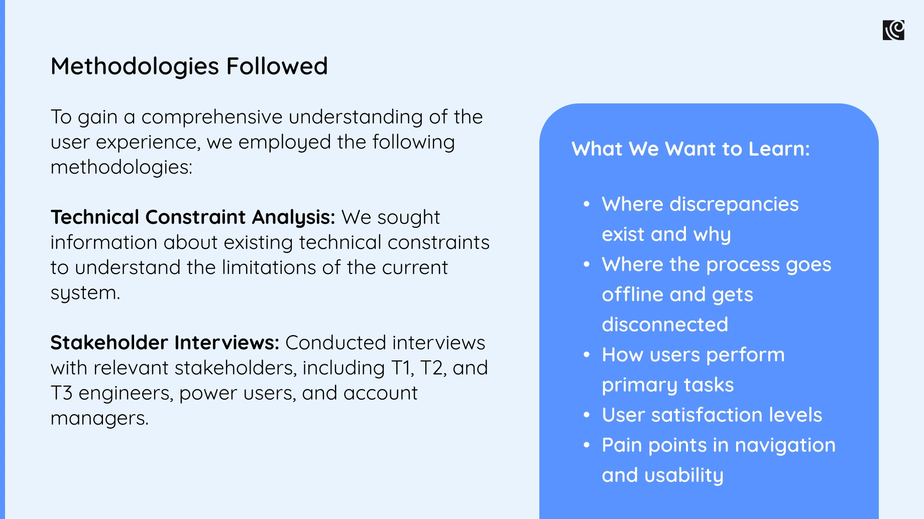
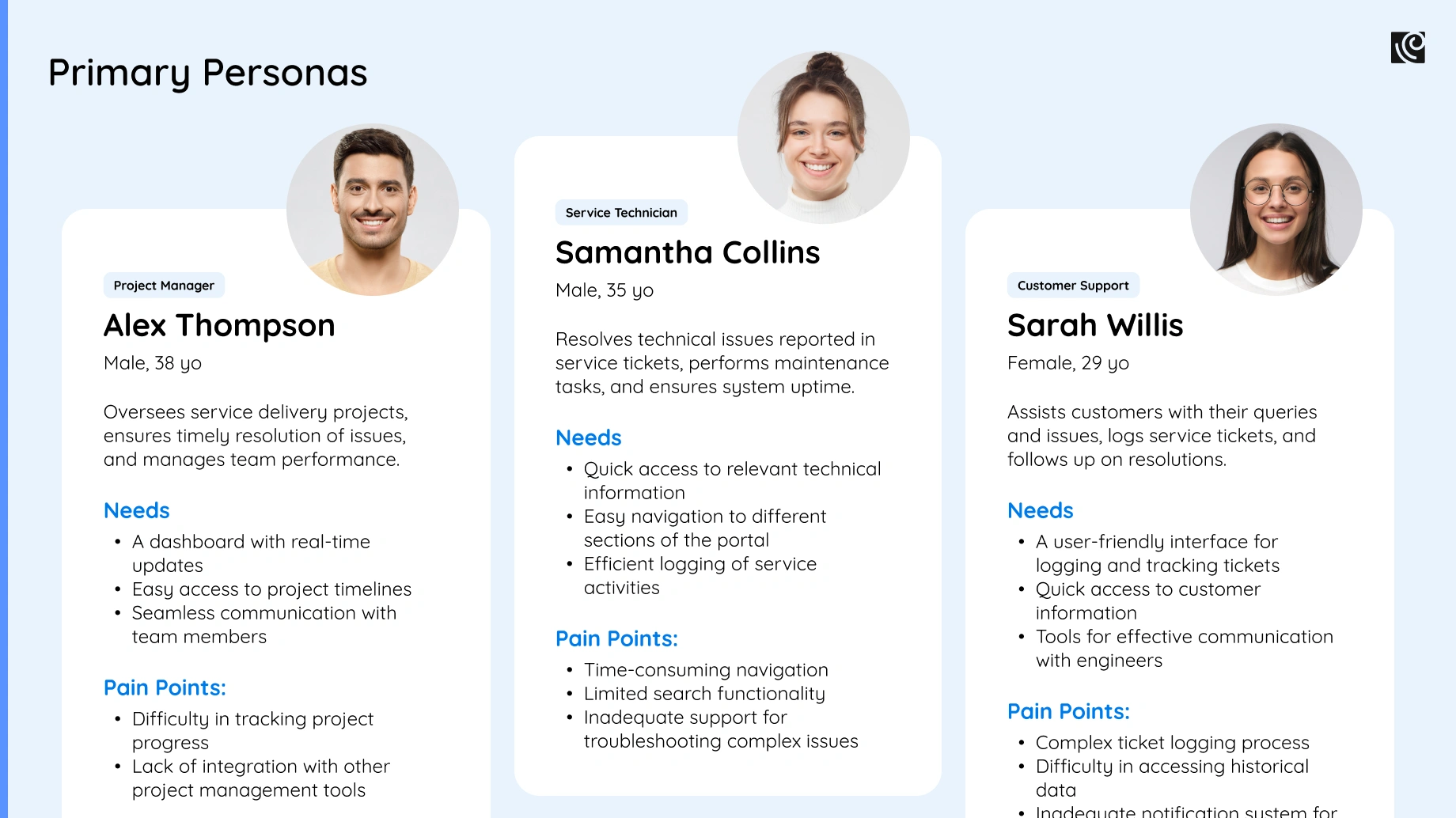
Continuing the example of NetApp - the telecom ticket resolution platform, here is an overview of the methodologies followed. We sought information about the existing technical constraints, and the product’s landscape and conducted interviews with relevant stakeholders to create a primary persona.
Utilizing Data for Context at the Secondary Level
Information gathering doesn’t end there!
The secondary level of investigation is all about analyzing various data sources and conducting competitive analysis and heuristic evaluation.
Analyze data from multiple sources to gain a comprehensive understanding of user behavior and challenges -
- 1.Dive into support tickets, user diaries (if available), and website analytics as these are treasure troves of priceless user insights. Analyze them to understand usage patterns, common pain points, and where users get lost. For example, your support tickets reveal where users need the most help, while web analytics show how they navigate and where they stumble.
- 2.Time to size up the competition! Identify your direct and indirect rivals, then dissect their UX strengths and weaknesses. This intel helps reveal industry best practices and spot opportunities to make your product the champion.
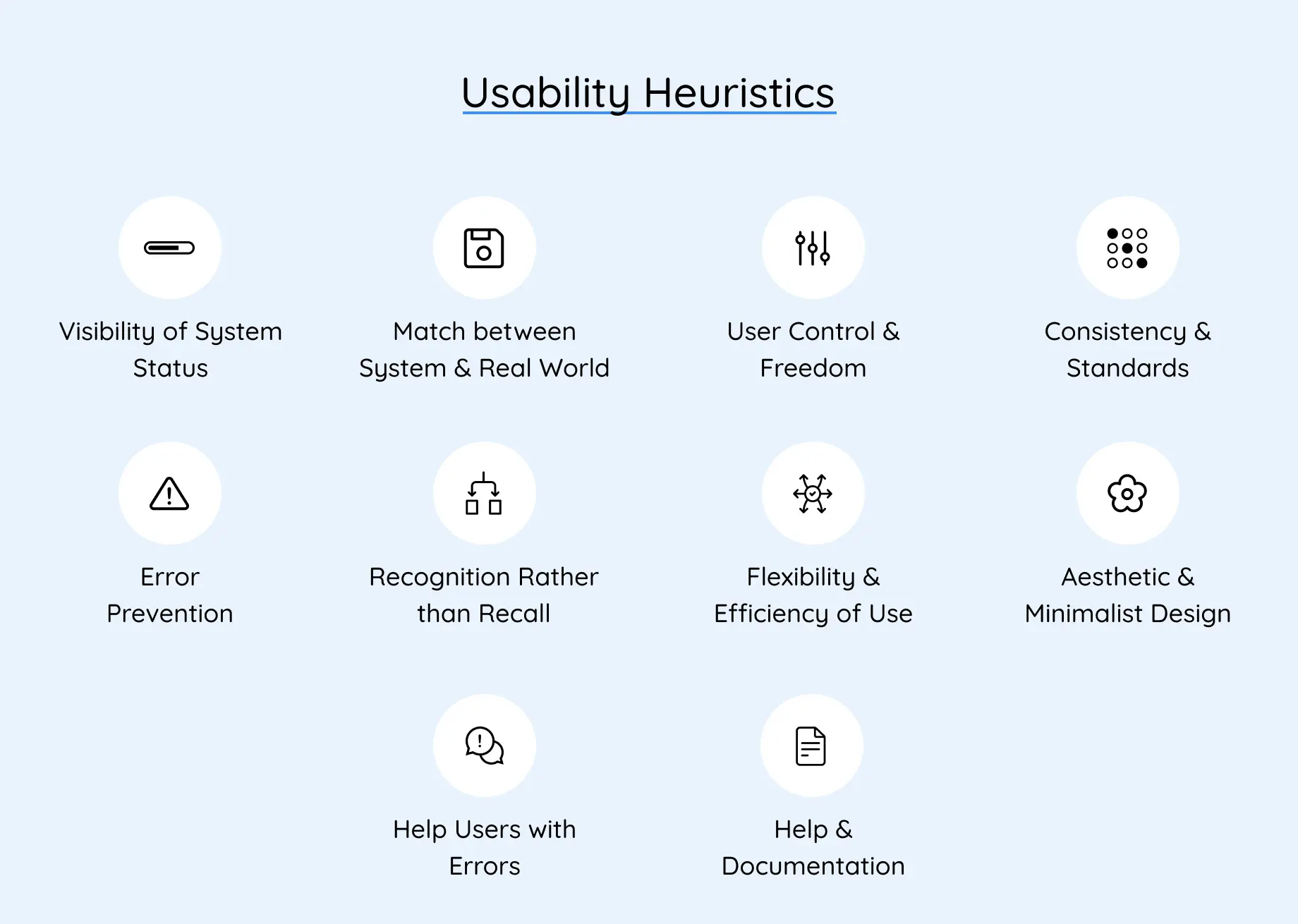
- 3.Let's call in the big guns – established usability principles like Nielsen Norman's 10 Heuristics.Use these as a checklist to systematically analyze your software's consistency, information flow, error prevention, and accessibility. This helps uncover hidden design flaws that might be tripping users up.
Stage 3
Synthesize the Findings

You’ll have a truckload of data at this point and it’s time to make sense of the madness.
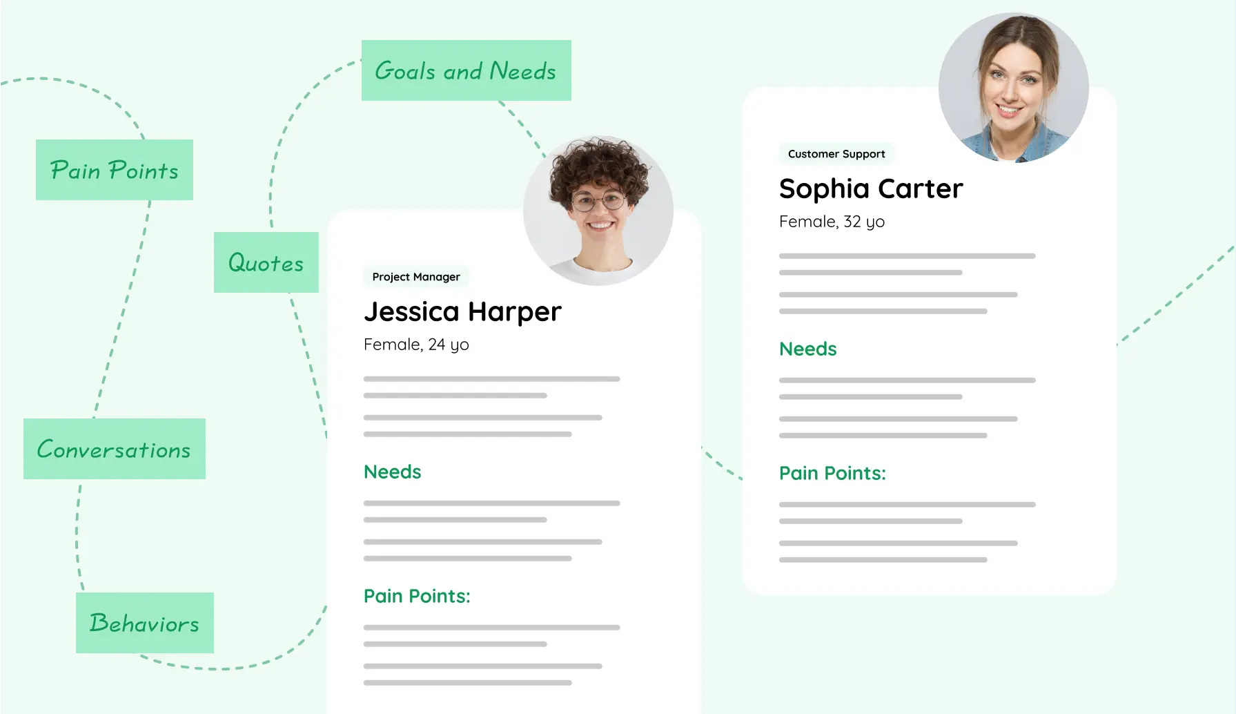
- 1.Remember those user personas you created? Refine them based on everything you’ve learned. This ensures they perfectly represent your real users and their needs within the software.
- 2.Map out the user's entire experience with your product, pinpointing every touchpoint. This way, you can identify areas where things get bumpy and opportunities to make things smoother.
- 3. Affinity Mapping is essentially a fancy term for finding patterns to uncover recurring themes across all the data – interviews, observations, and the data analysis you did. This helps in truly understanding what users need, what frustrates them, and how they behave.
- 4.Now that you are in the know of user pain points, translate those findings into actionable recommendations for UX improvement. These recommendations should be prioritized based on how much impact they'll have and how easy they are to implement.
- 5. Keep stakeholders in the loop throughout the process. Present your initial findings and recommendations, and incorporate their feedback to ensure everyone's on board and potential concerns are addressed.
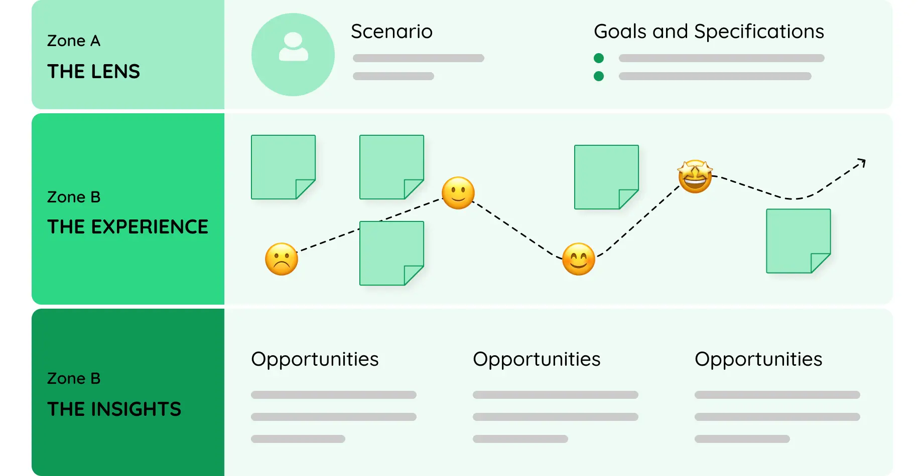
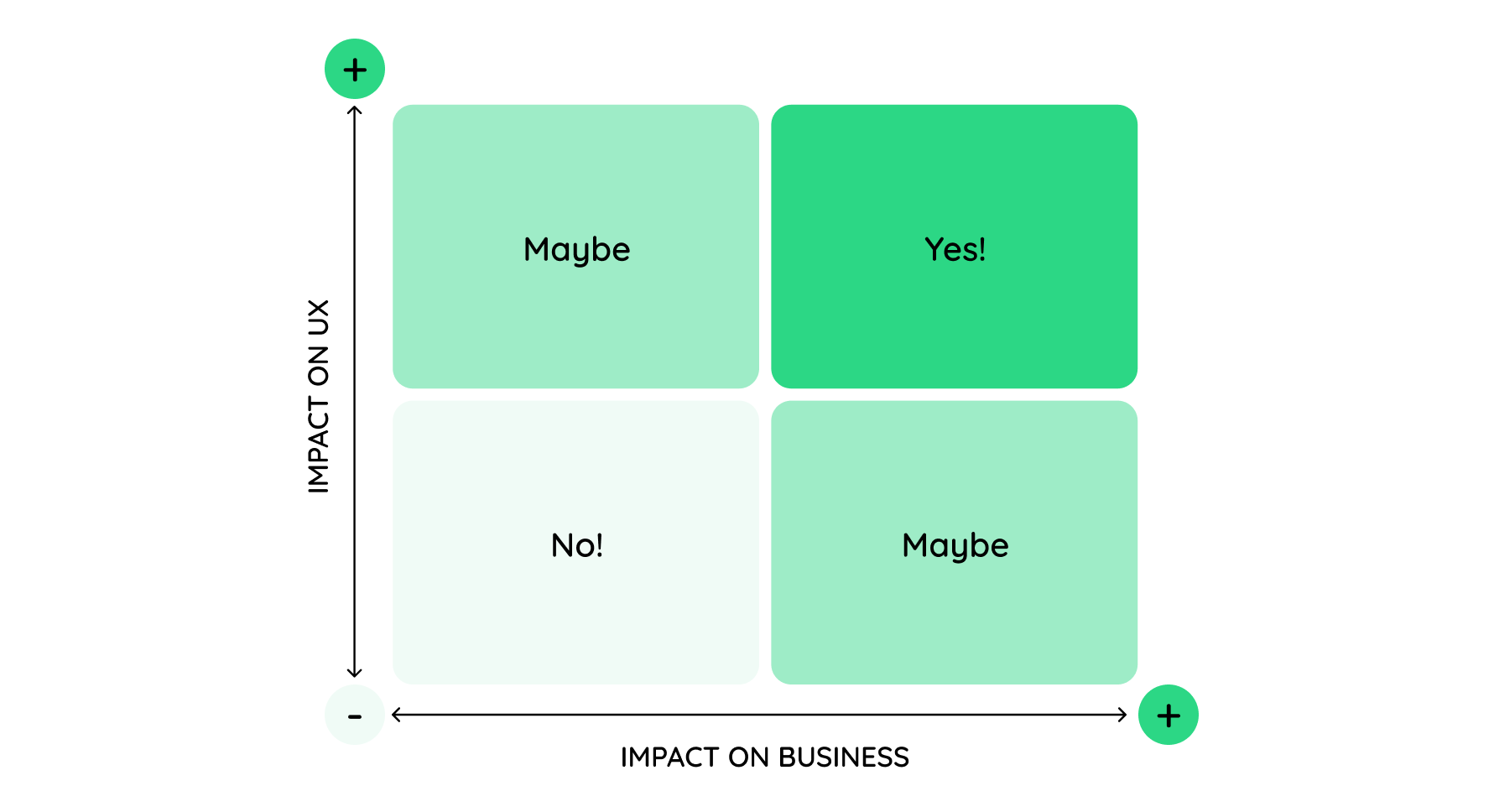

Finally, with a clear focus on the areas for improvement we identified, revisit the heuristic evaluation. This double-check ensures you’ve covered all the bases for UX optimization. By the end of this stage, you’ll have a clear roadmap for transforming your product.
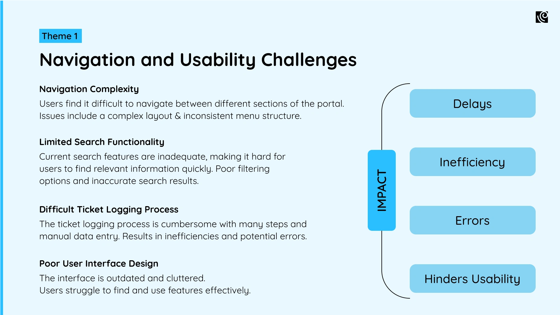
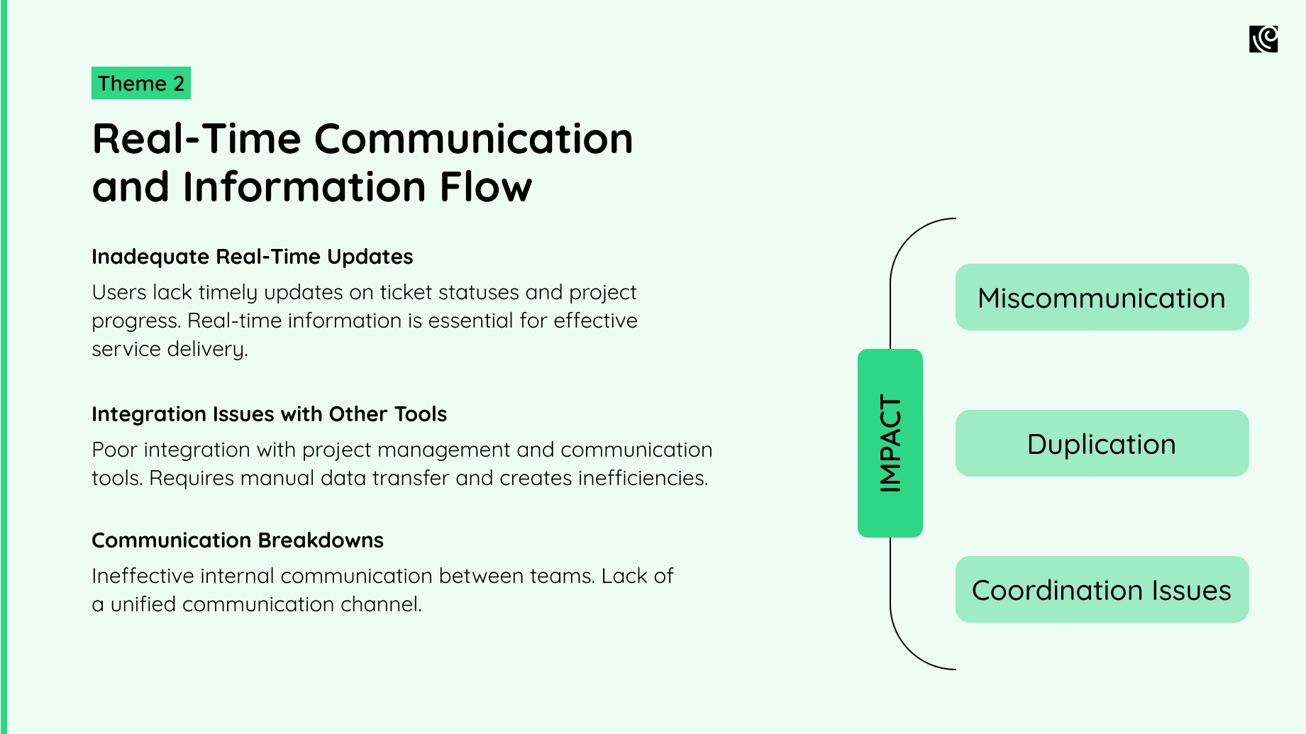
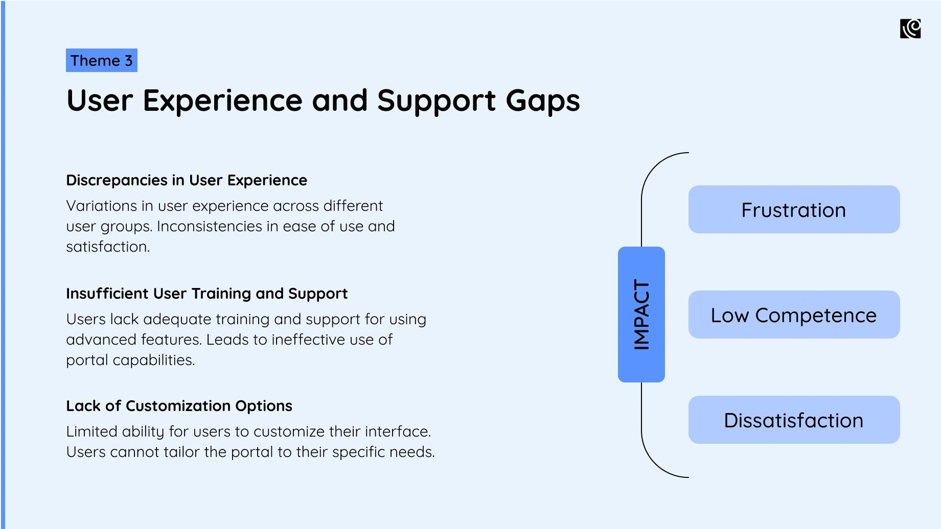
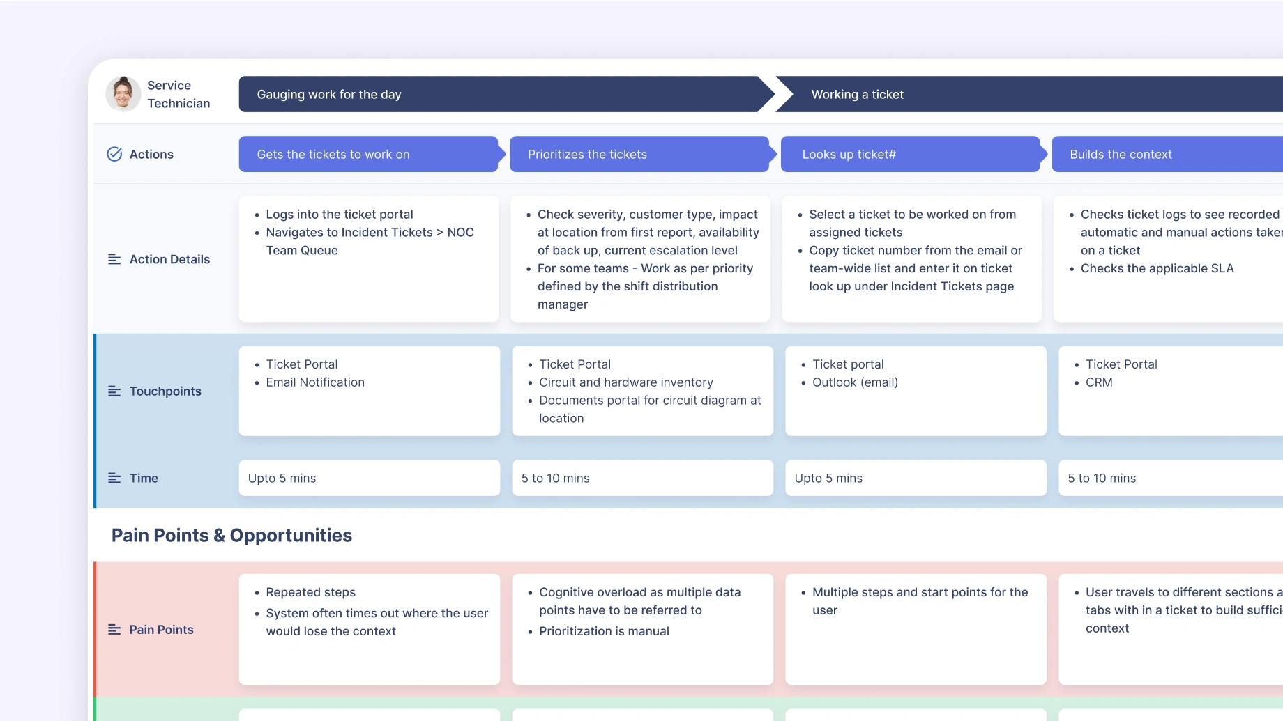
NetApp’s user journey map helped us gain a bird’s eye view of the end-to-end work process. It helped accurately identify the pain points and the opportunities to make improvements.
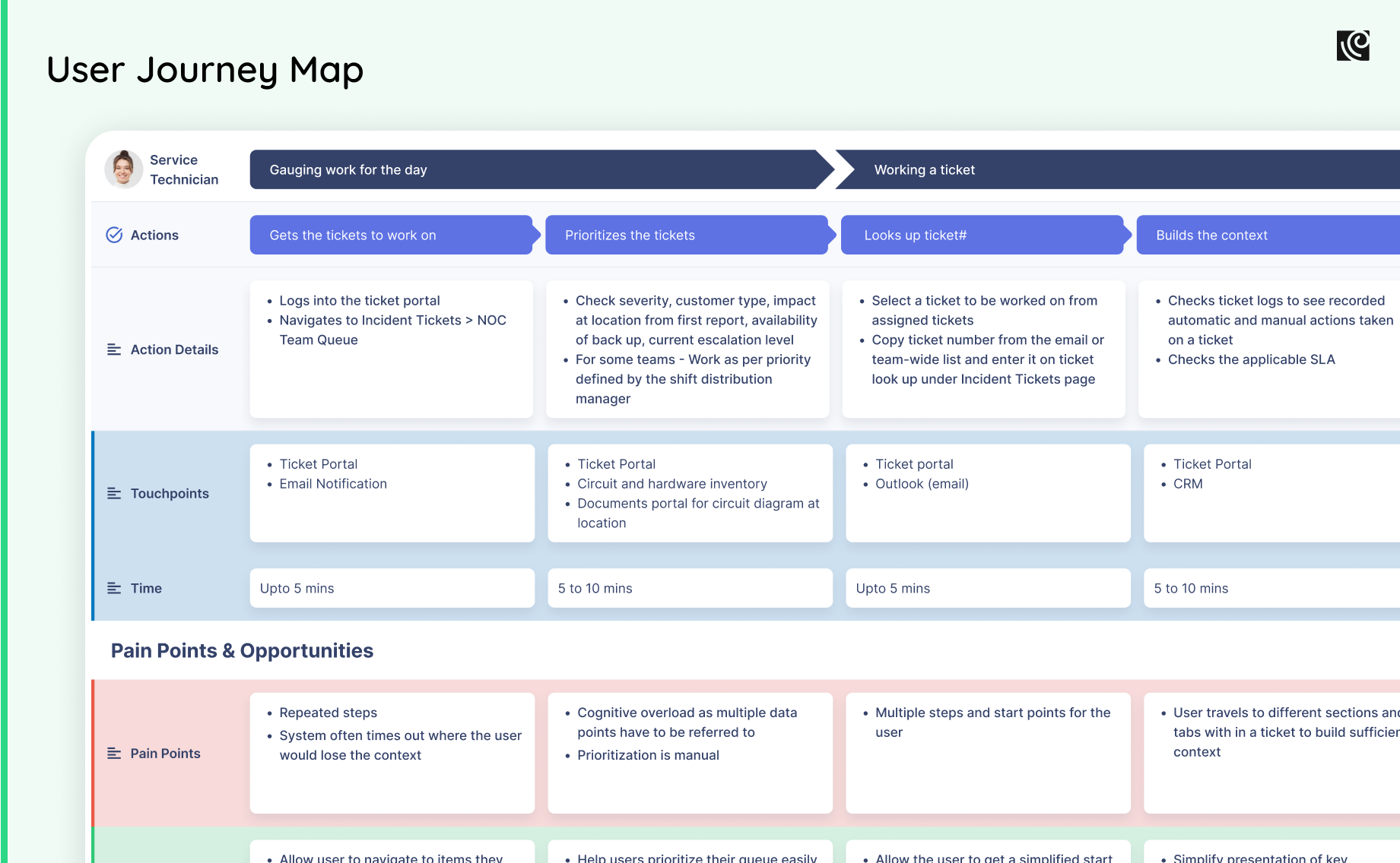
Using the research data gathered from the interviews in conjunction with the observations from the journey mapping exercise, we were able to come up with a list of 5 findings.
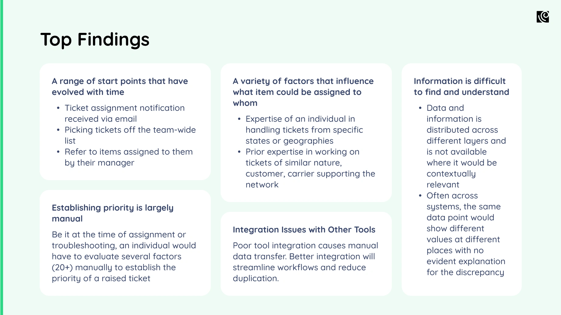
These findings were then grouped into 3 themes that went into the details of the problem, its possible causes, and its impact on the user experience.
Stage 4
Presentation & Collaborative Action Planning

Now that you’re armed with the intel, it is time to present the audit findings.
Create a clear and concise presentation that summarizes the top learnings, user needs, and pointers to make improvements. This is the point where we’ll tell you to be more visual, be concise, use user journey maps to bring your product story to life.
But that hardly works now, does it?
You know your product leaders are possibly going to come to this meeting half-distracted, half-interested, or with some pre-conceived notions. So, how can you ensure your presentation receives the attention it deserves?

Crafting a Compelling Presentation of Your UX Audit Findings
- 1.Keep the number of findings under 10. Classify them based on their severity - low, medium, and high.
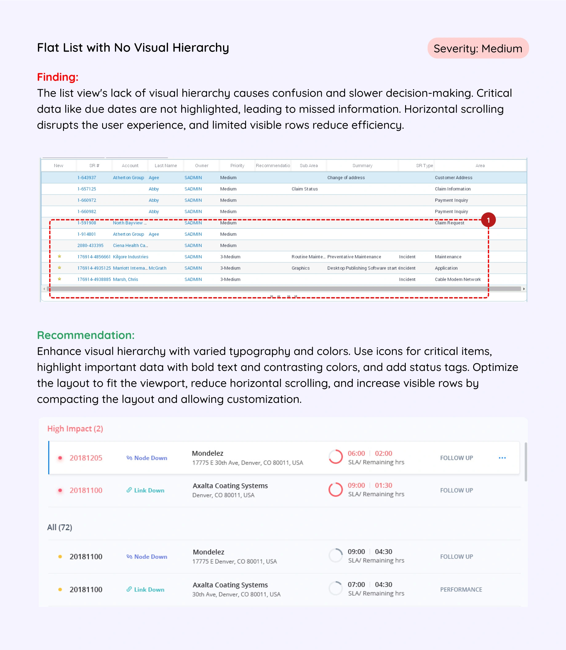
- 2.Mention the finding with the relevant screenshot.
- 3.Follow it with the recommendation and preferably an ideal scenario example.
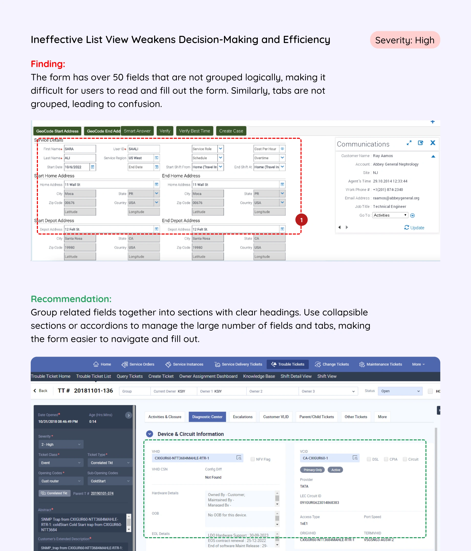
This makes sure you have described the issue at hand, shown how it looks, and what can be done to fix it. For the team that will actually be working on executing the recommendations, you can create a detailed report that provide in-depth analysis.
Include your personas, journey/process maps, affinity mapping results, and heuristic scores so they gain a better understanding and know the right steps to take.
Next, work with stakeholders to prioritize recommendations based on effort, impact, and your business goals. This collaborative approach ensures the action plan is realistic, measurable, and aligns with your overall strategy. Finally, establish success metrics to track how well the UX improvements work.
Here's a glimpse into crafting a winning action plan:
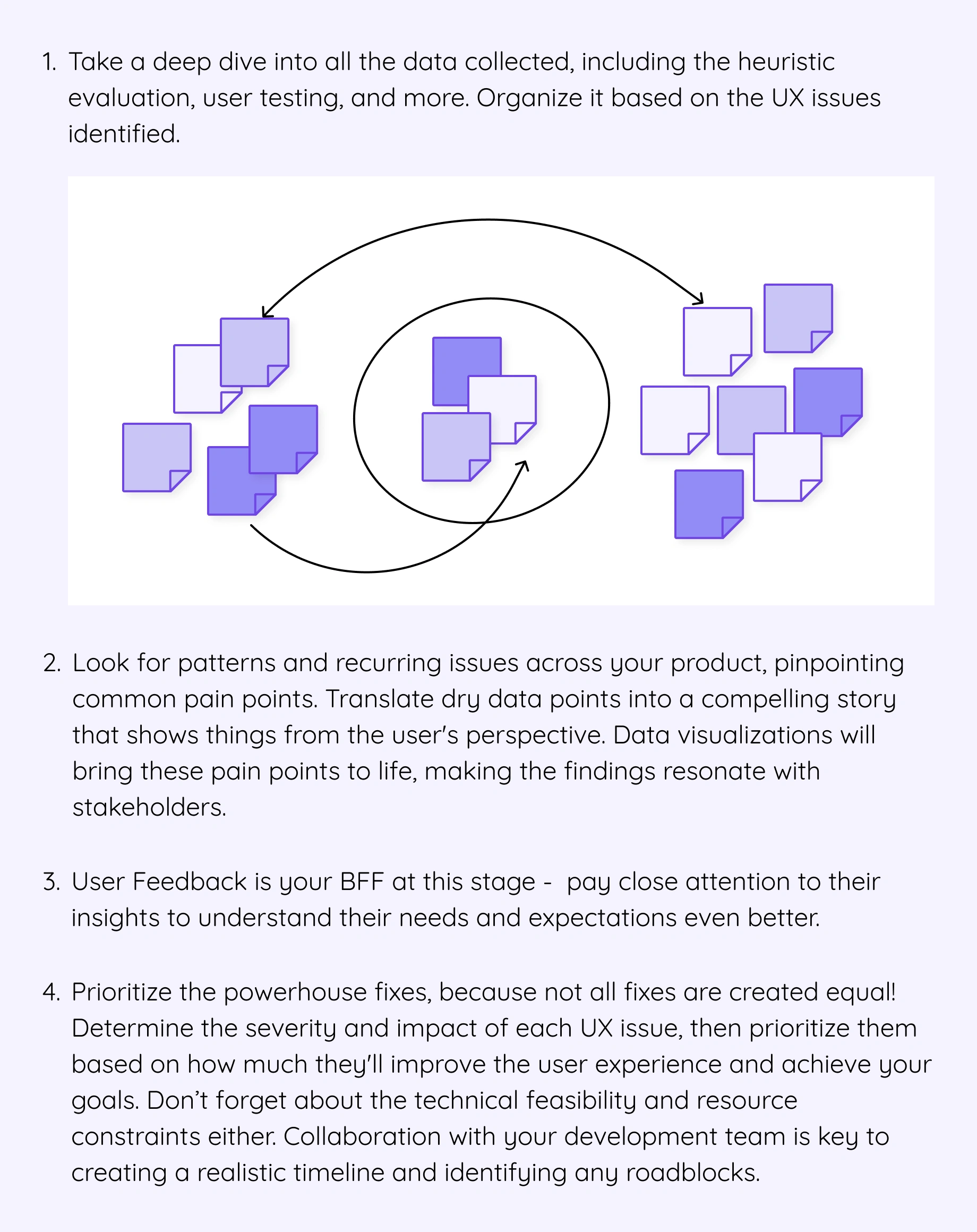
Remember, creating and executing the action plan isn't a solo act! Involve key stakeholders across your organization to ensure the chosen improvements align with business goals and secure the buy-in needed for successful implementation.
As part of the collaborative action plan, we listed the journeys of the 3 main personas and classified them into Low, Medium, and High-priority areas based on the development effort and their ROI.
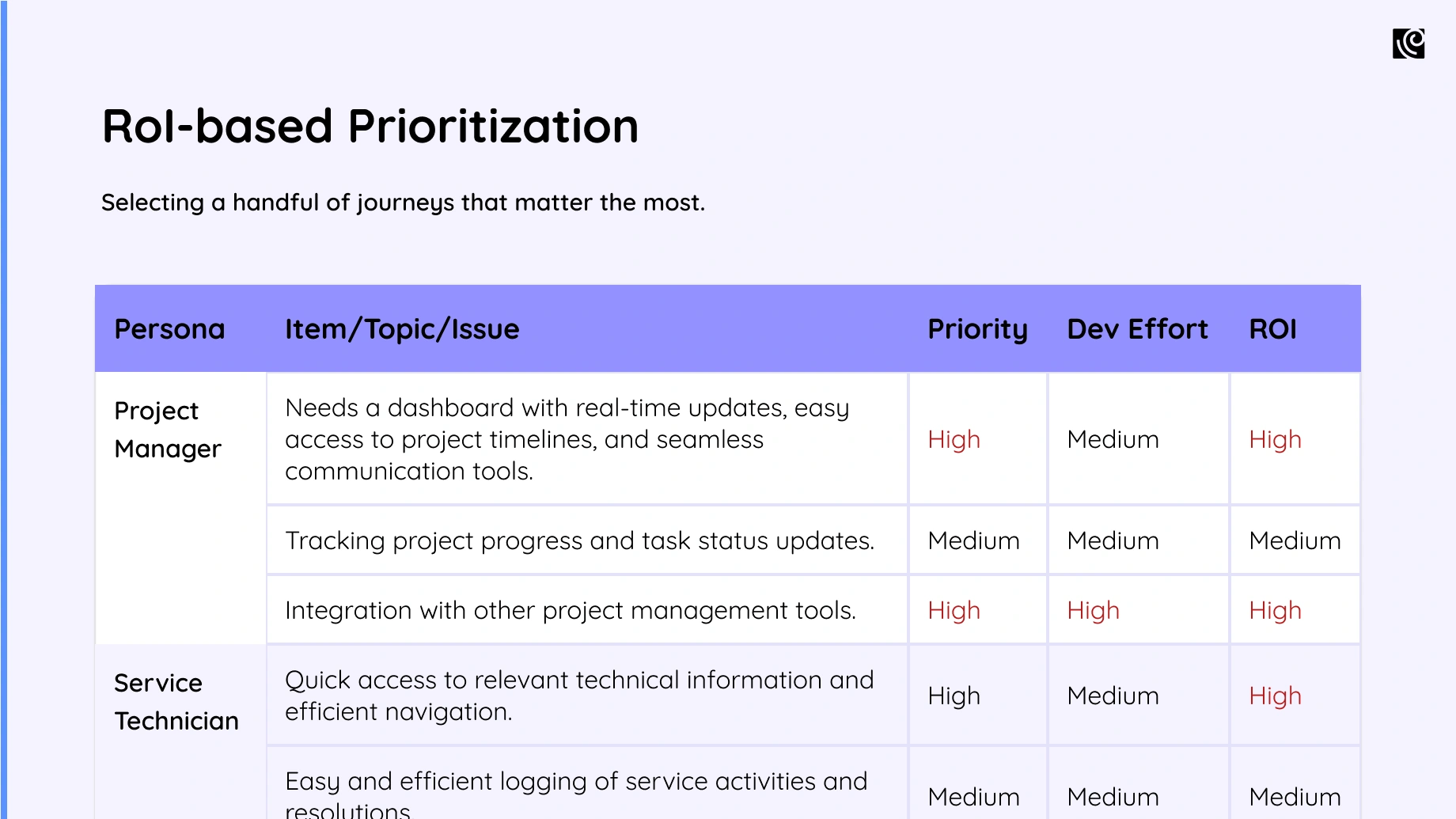
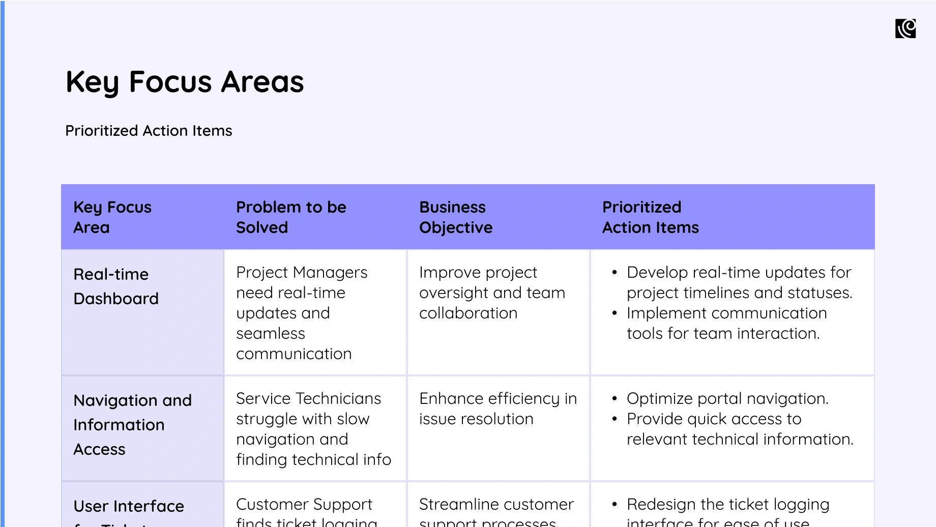
Then, the Key Focus Areas matched the Problem to be Solved with the Business Objective to come up with a list of prioritized action items to take up for the product team.
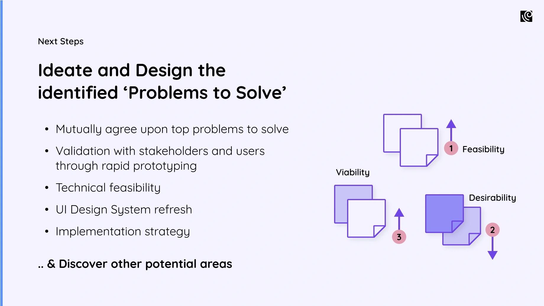
See How Your Product's UX Stacks Up!

Deliverables of a UX Audit
Deliverables of a UX Audit
Now that the UX audit process is behind us, let's get to the deliverables, designed to provide actionable insights and a clear path forward for your product.
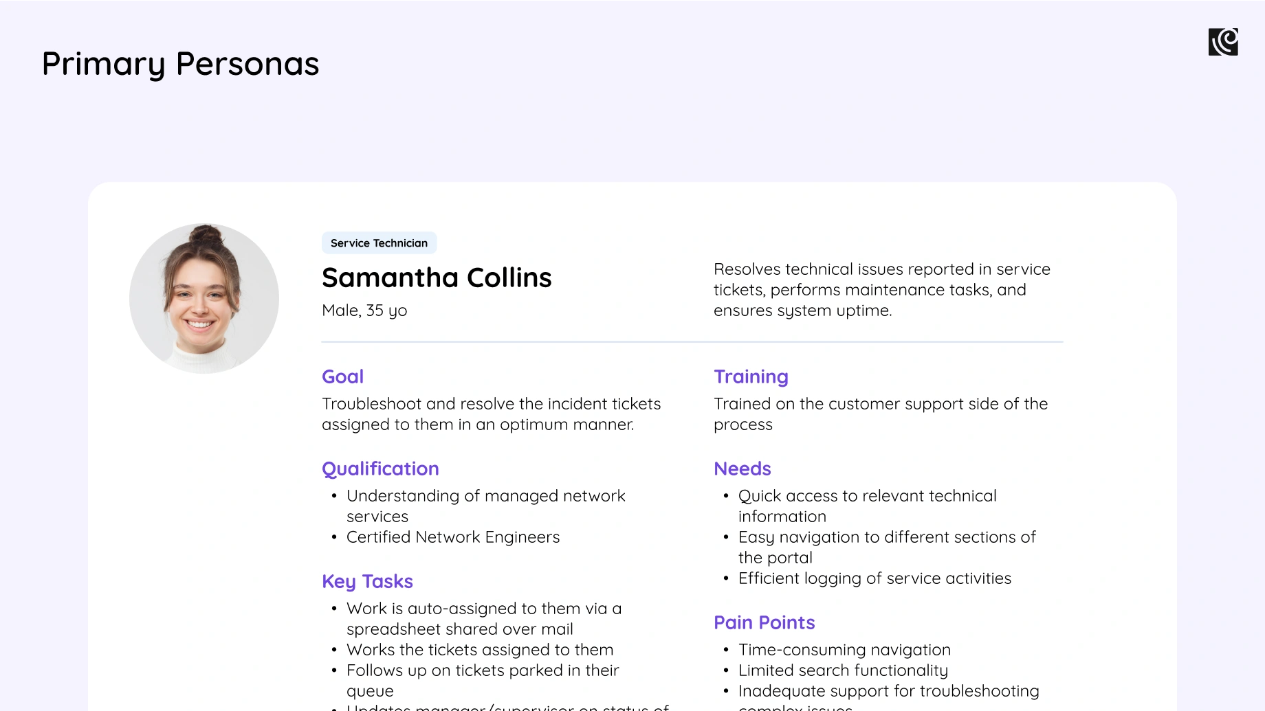
Refined User Personas that accurately represent the target audience and their specific goals within the software's context. These refined personas serve as a constant reference point throughout the design and development process.
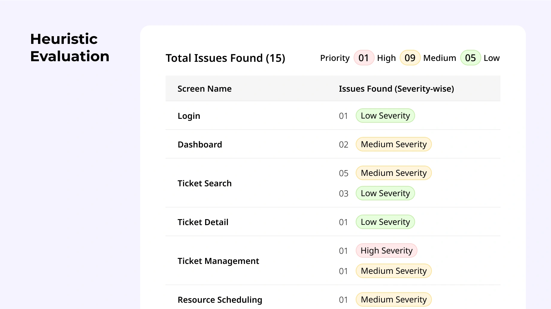
Heuristic Evaluation Report compares your software to established usability best practices. It details any issues found, ranked by how severe they are and how much they impact the user experience. There is a section in this report dedicated to providing recommendations for fixing them and making sure your software is user-friendly from the ground up.
User Journey Map with Pain Points and Opportunities is a visual representation that shows the user's end-to-end experience of the audited journey. It highlights key touchpoints and identifies areas where things get bumpy, as well as opportunities to make things smoother.
Findings and Recommendations Report is a core deliverable that summarizes the key findings gleaned from all stages of the UX audit – user needs, pain points, and opportunities for improvement. Based on this intel, you can outline specific recommendations for optimizing the UX. These recommendations should be prioritized based on how much impact they'll have, how easy they are to implement, and how well they align with your business goals.
Interpreting and Implementing the Results of the UX Audit
Interpreting and Implementing the Results of the UX Audit
All said and done, anyone who’s been in the business long enough knows that the best of recommendations can get buried under a heap of lethargy, short attention spans, or worse, ego tussles.
Here's a breakdown of the key steps involved in implementing UX changes and monitoring their effectiveness:
Prioritization and Planning: From Insights to Action
Prioritizing the Hits: Revisit the identified UX issues and refine the list based on feasibility, how they connect to each other, and their potential impact. Consider development effort, resource allocation, and the return on investment for each fix.
Here are 5 methods to help you do this, take your pick -
1.
Impact vs. Effort Metrices
How it works: Plot each recommendation on a grid with 'Impact' on one axis and 'Effort' on the other.
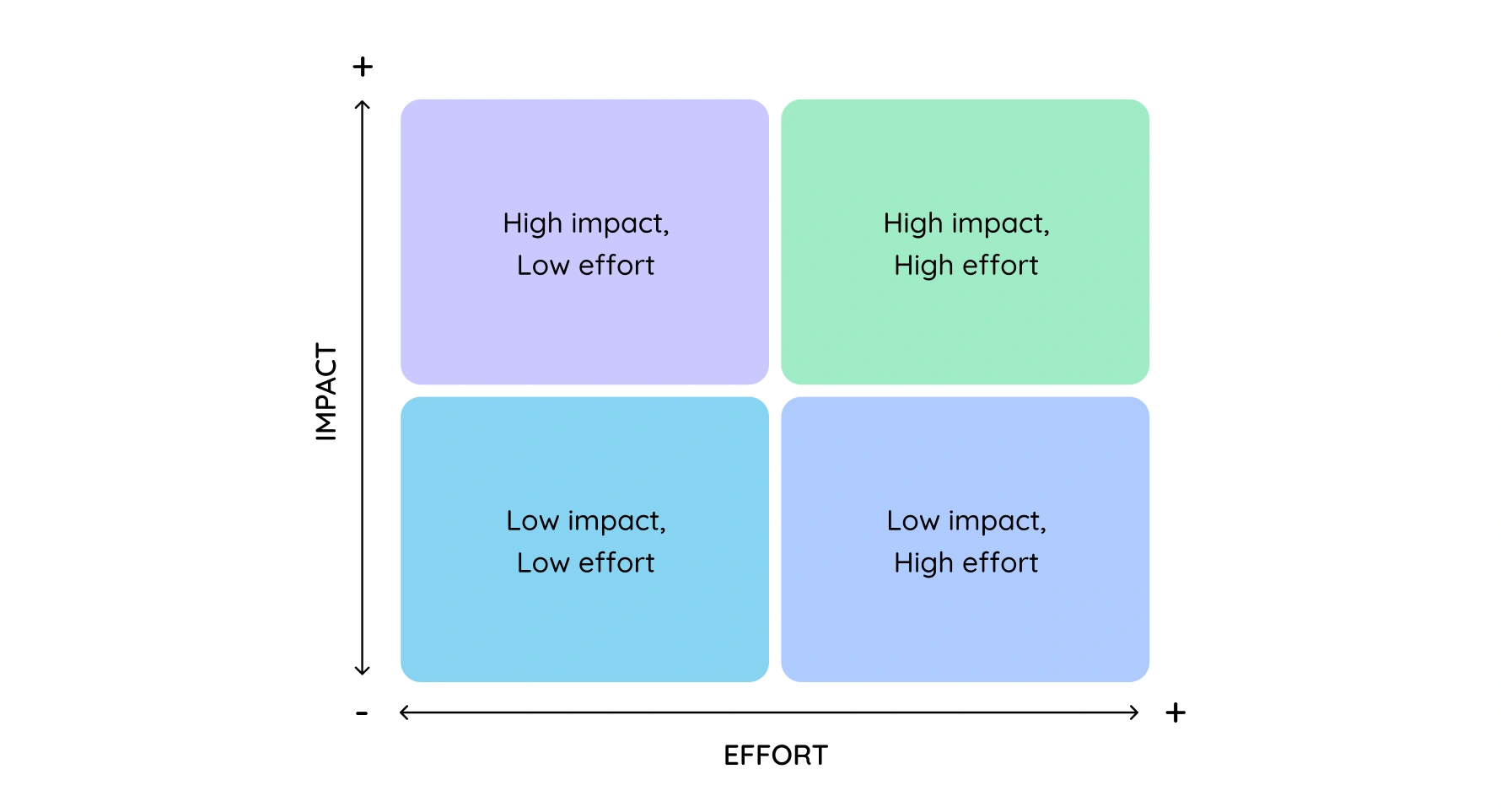
Why it’s useful: This helps you visualize which changes will give you the biggest return for the least effort. Focus on high-impact, low-effort tasks first.
2.
$100 Voting
How it works: Give each team member a virtual $100 to "spend" on the recommendations they believe are the most important.
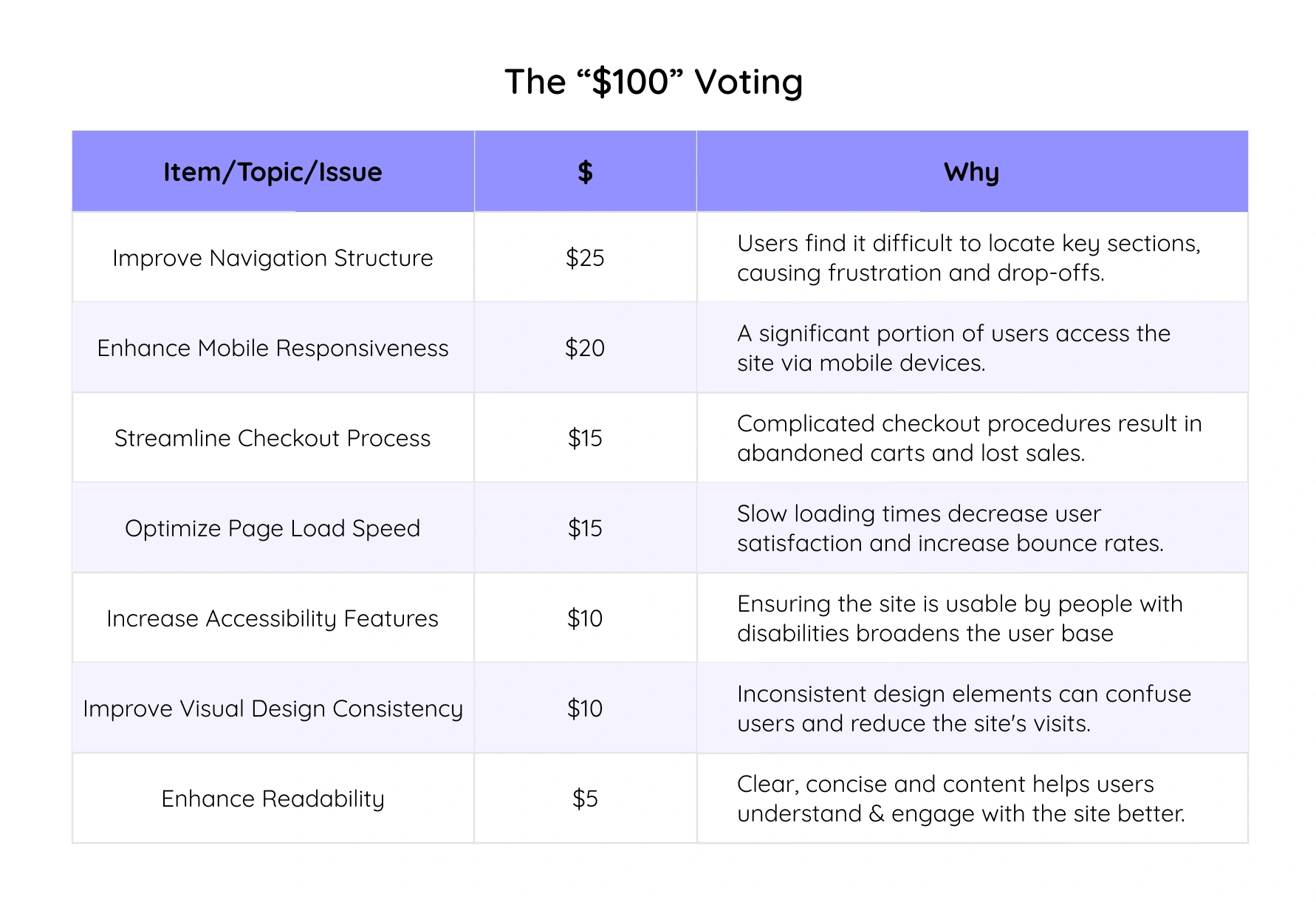
Why it’s useful: This democratic method surfaces collective priorities and ensures everyone’s input is valued.
3.
MoSCoW Method (Must, Should, Could, Won’t):
How it works: Categorize recommendations into four groups: Must have, Should have, Could have, and Won’t have for now.
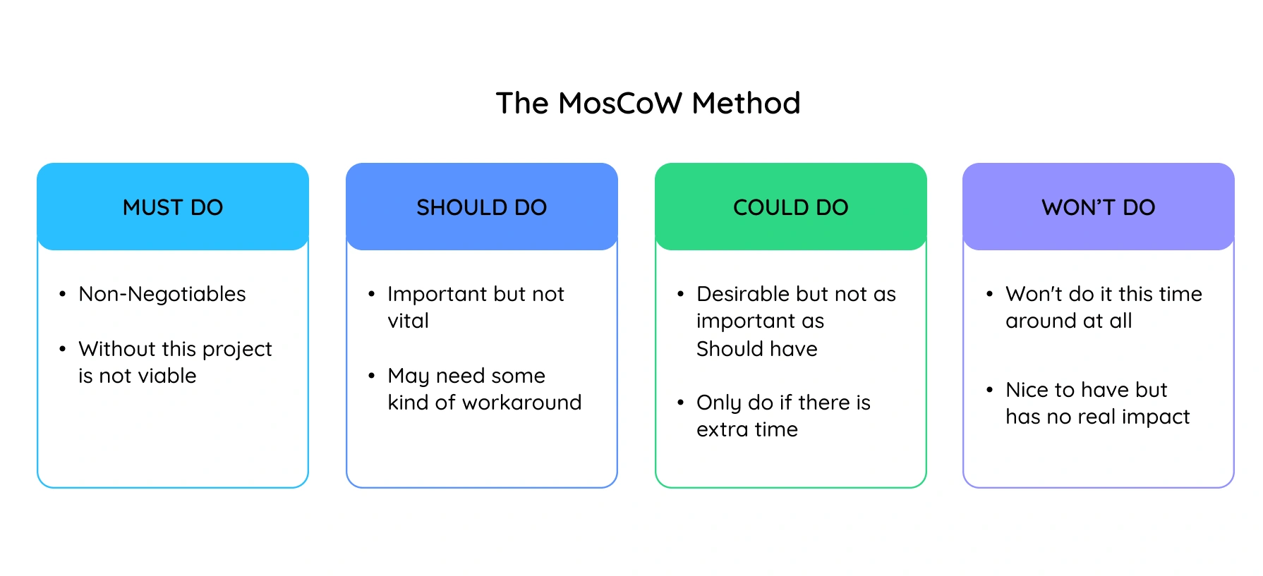
Why it’s useful: This method helps break down priorities into manageable categories, ensuring critical changes are addressed first.
4.
RICE Scoring (Reach, Impact, Confidence, Effort):
How it works: Score each recommendation based on its Reach (how many users it affects), Impact (the benefit to users), Confidence (certainty of success), and Effort (resources required).
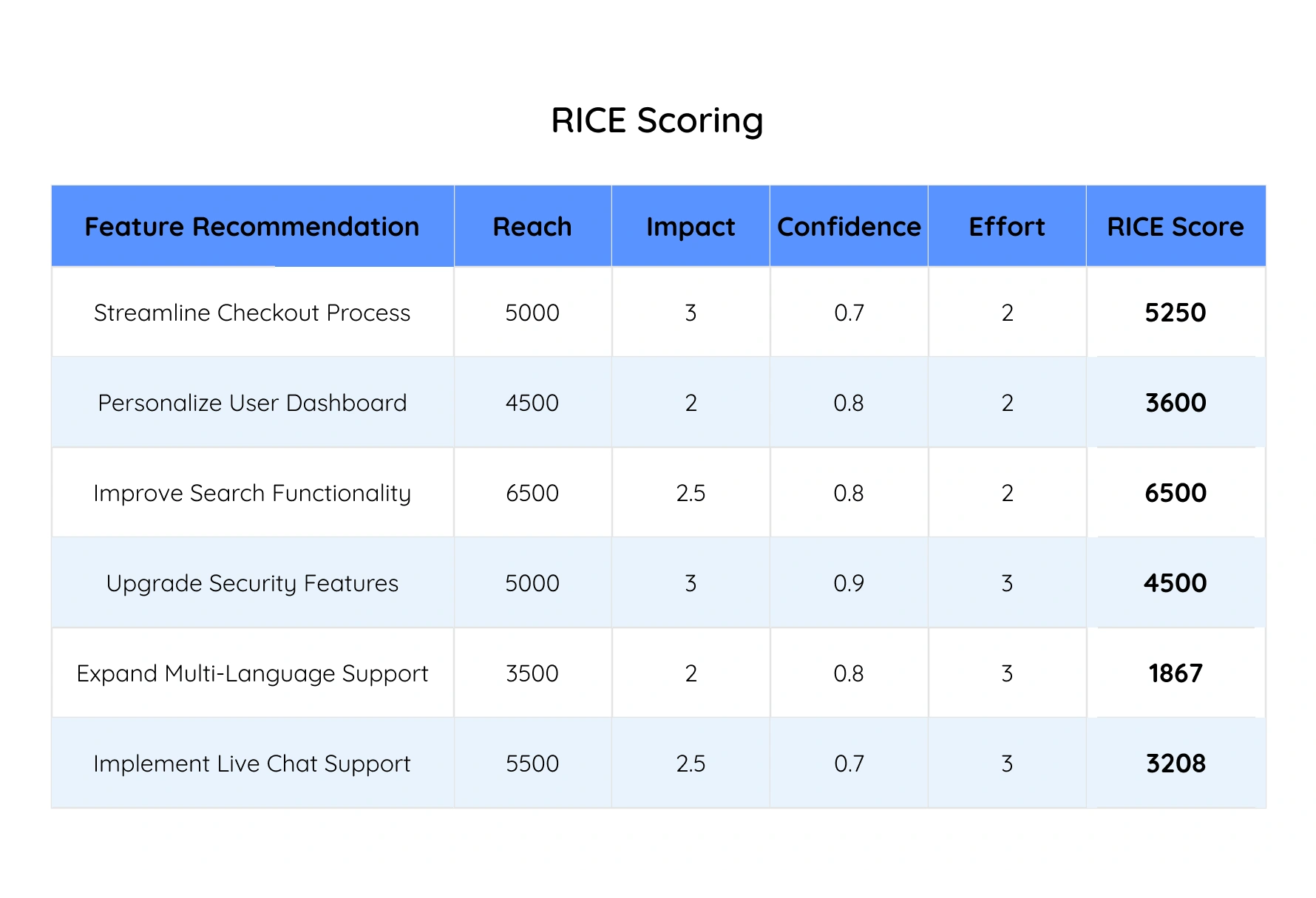
Why it’s useful: RICE provides a structured and quantitative way to compare and prioritize tasks, balancing various factors.
5.
Eisenhower Matrix:
How it works: Divide tasks into four quadrants: Urgent and Important, Important but Not Urgent, Urgent but Not Important, and Neither.
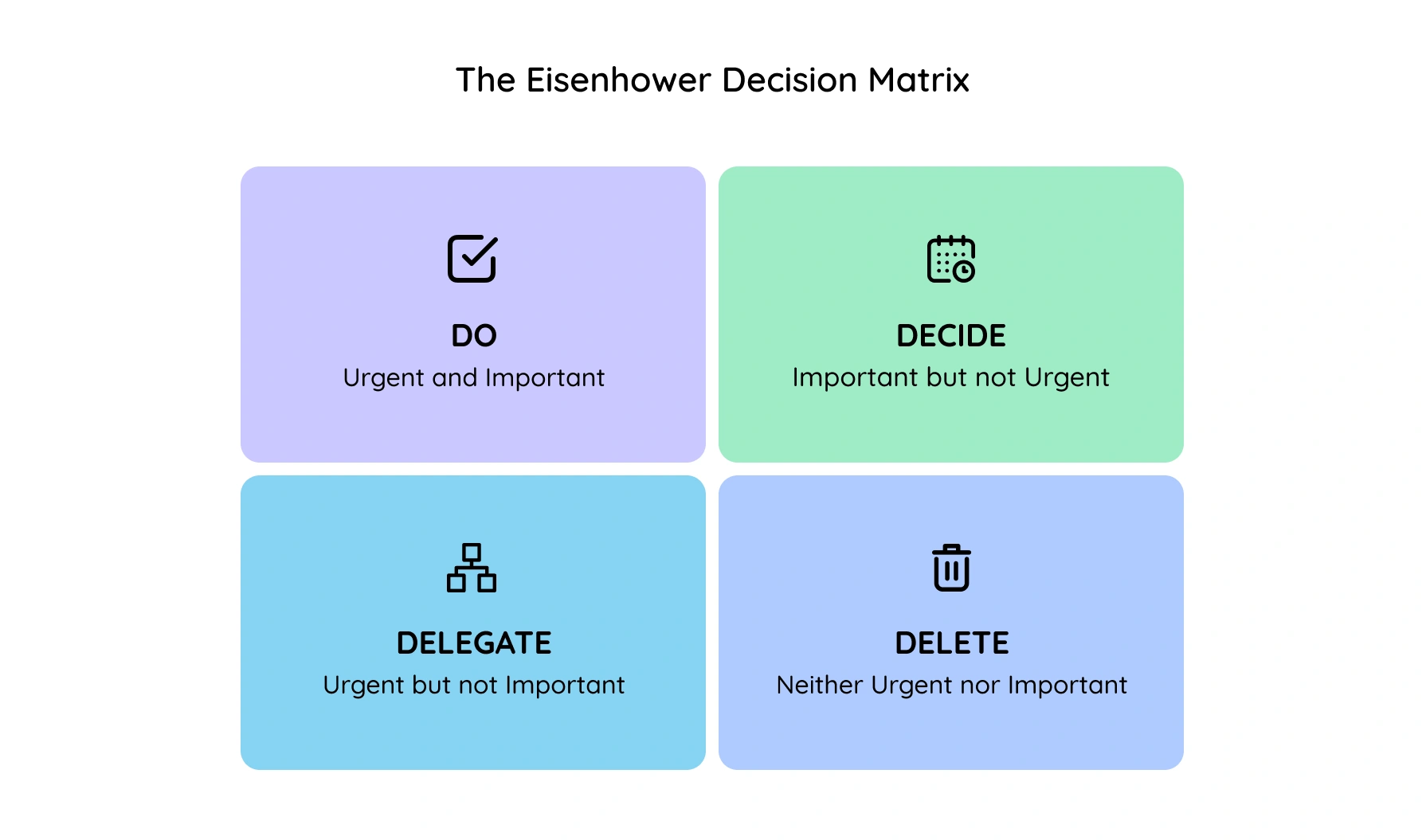
Why it’s useful: This method helps you quickly identify what needs immediate attention and what can be scheduled for later.
Building the Roadmap:
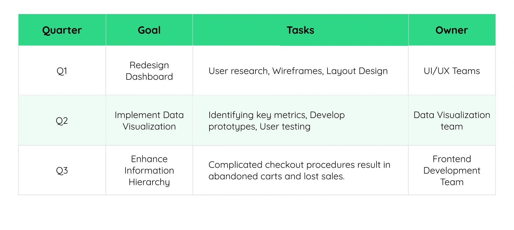
Create a clear roadmap outlining exactly how the prioritized UX changes would be tackled. This includes timelines, assigning ownership to specific team members (designers, developers, product managers), and setting milestones to track progress. Clear communication is key, so we'll ensure everyone involved (design, development, product management, healthcare professionals) is on the same page and understands the plan.
For example, a key insight revelated that your dashboard is too text-heavy, causing users to struggle with finding and interpreting important information quickly.
Designing & Development: Bringing the Action Items to Life
Design with Users in Mind:
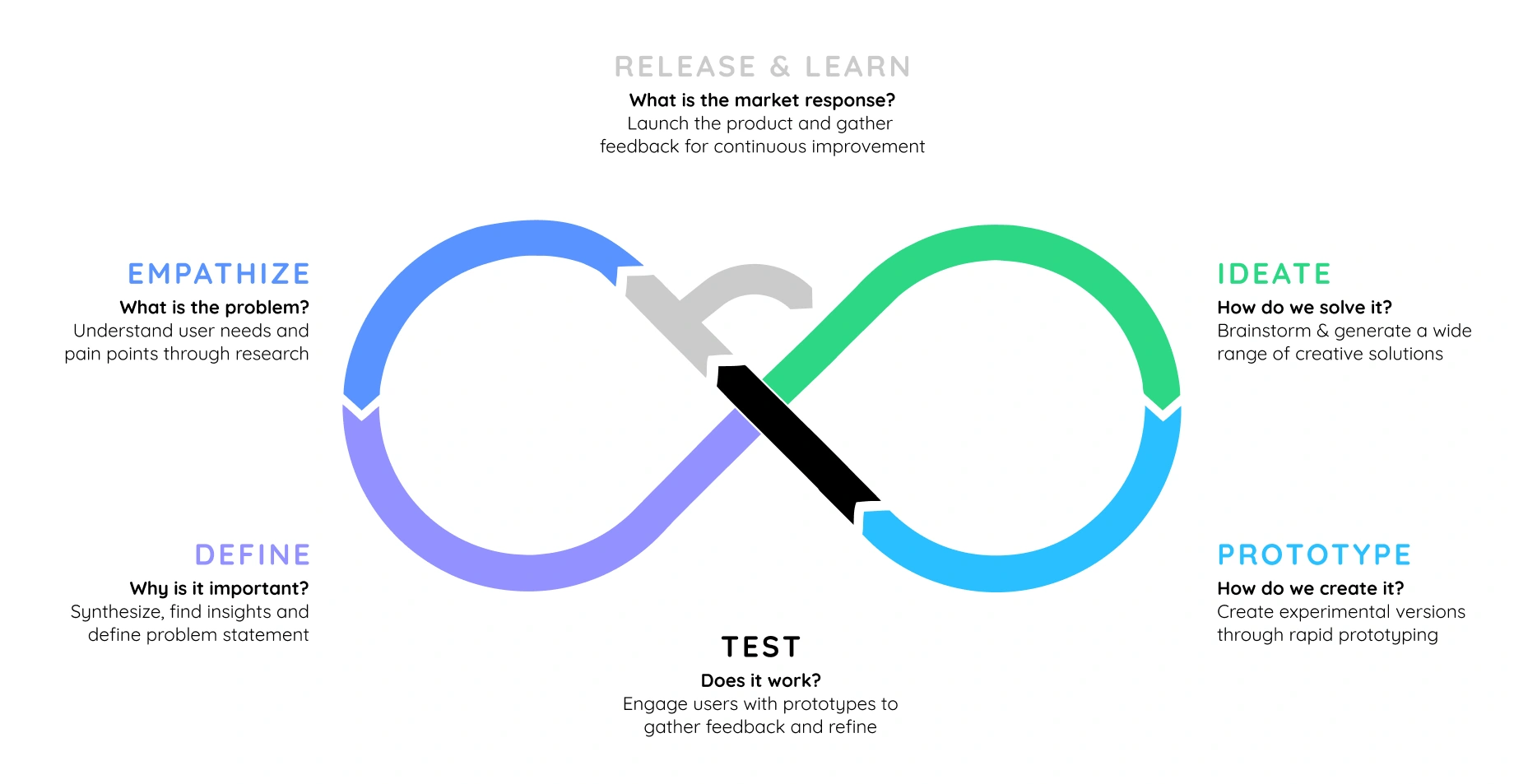
Follow an iterative process of creating prototypes, testing them with real users, and refining the design based on their feedback before full-scale development.
Development & Quality Check:
Once the design is finalized, the developers will be tasked with translating those mockups and prototypes into functional code. Rigorous quality assurance testing is crucial to ensure the implemented changes work as intended and truly address the UX issues we identified.
Following the example above, by addressing the issue of a text-heavy dashboard based on the key insight from the UX audit, the expected impact looked like -
 Improved User Efficiency: Users can quickly find and interpret the information they need, enhancing their overall efficiency.
 Enhanced User Satisfaction: A cleaner, more intuitive dashboard layout improves the user experience and reduces frustration.
 Better Decision-Making: Clear, visual representation of data helps users make informed decisions more easily.
 Reduced Cognitive Load: Less text and more visual elements reduce the cognitive load on users, making the dashboard more user-friendly.
Launch & Monitoring: Seeing is Believing
For significant UX changes, deploy a phased rollout. This will allow you to launch the changes to a smaller user group first, gather feedback, and make adjustments before a full release.
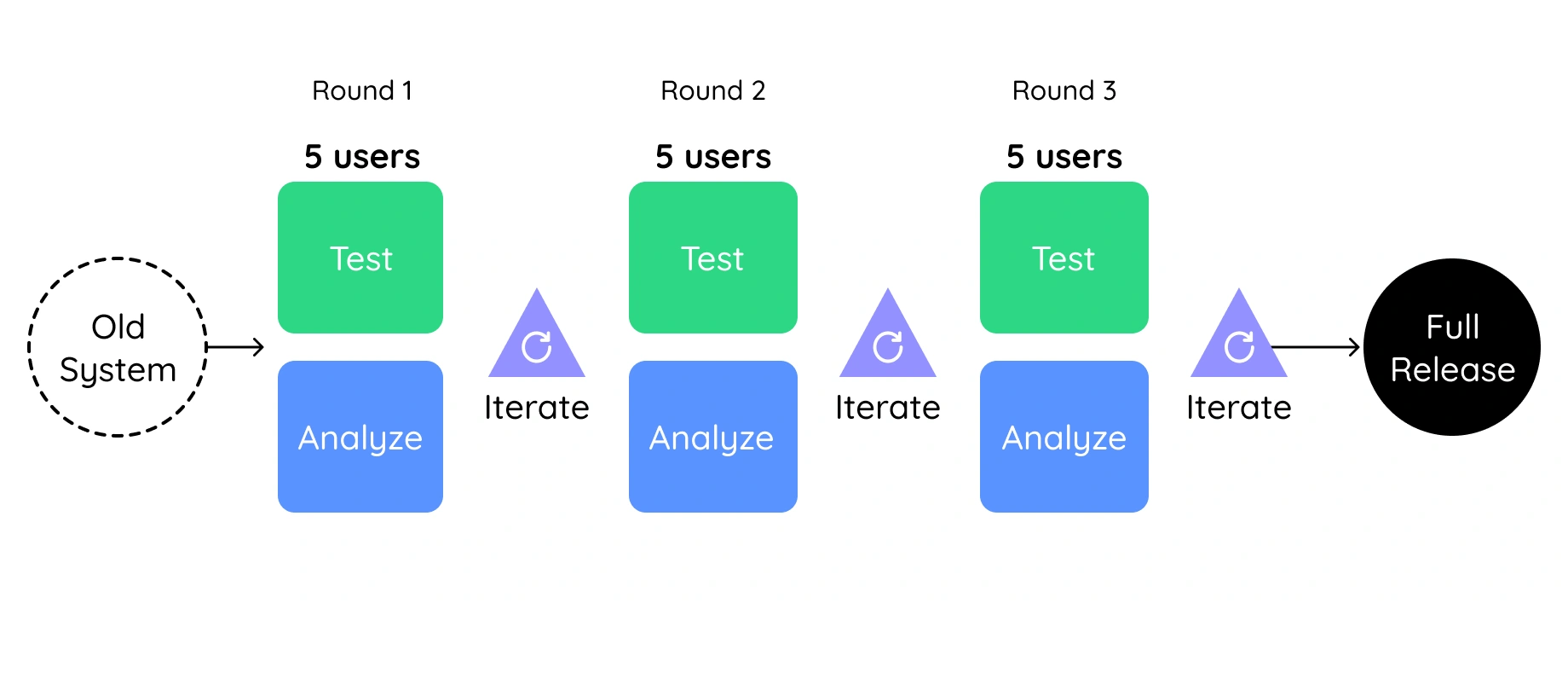
This is key to measuring the impact of the UX changes. Track key metrics relevant to the addressed UX issues, such as how well users can complete tasks, time spent on specific features, and how many errors they encounter.
Make sure to actively seek user feedback through surveys, in-app feedback mechanisms, or follow-up interviews to understand how users perceive the changes.

Iteration & Refinement: Always Getting Better
Once you've gathered data and user feedback analyze the results to see how effective the UX changes were. Did they fix the problems we identified? Did they improve the user experience and your business metrics?
Based on the analysis, you may need to further refine the UX design or functionality. This iterative approach ensures continuous improvement and a user experience that constantly evolves alongside user needs and your business goals.
Remember, transparency is key! Communicate the findings from the monitoring process to everyone involved. This transparency fosters trust in the UX process and demonstrates the value of investing in user experience improvements.
Nailing Your HealthTech UX Audit: Best Practices & Pro Tips
Nailing Your HealthTech UX Audit: Best Practices & Pro Tips
A well-executed UX audit is the secret weapon for transforming your healthtech product into a user experience powerhouse. But how do you ensure it's a success?
Here are some best practices and expert tips to lead the way.
 Leave the fictional users behind and involve the actual ones - healthcare providers, nurses, caregivers, patients, and administrators from day one. Collaborate with them to understand their workflows and specific needs. Their feedback and perspectives are gold – they'll give you a clear picture of the real-world user experience.
 Talk, talk, talk, and talk sense. Open communication is key with all stakeholders involved. Regularly update them on progress, findings, and recommendations. This transparency fosters collaboration and ensures everyone is on the same page.
 We’ve given you a minefield of ideas to make the whole UX audit fun and consumable. So make the most of it by organize fun workshops to share your audit findings and recommendations. Encourage active participation and discussion - use gamification tactics (you know what they are, so make it fun).
Continuous Review and Improvement
 You know your stakeholders’ memories are fleeting, so keep your foot on the accelerator by laying a system to collect ongoing user and stakeholder feedback after implementing UX improvements. Make it a habit of collecting inputs and iterate based on user insights.
Remember, a great UX experience is never finished, it is always evolving. And so is the healthcare UX landscape! Let your product team evolve with the times by staying on top of the latest trends, research, and best practices by attending conferences, webinars, and workshops.
A UX audit isn’t a one-and-done thing. To maintain your product’s tip top shape, keep it on its toes, don’t let complacency set in. Schedule follow-up audits at regular intervals. These check-ups help assess the effectiveness of implemented changes and identify any new UX issues that may have emerged.
Glossary of UX Audit Terminology
Glossary of UX Audit Terminology
1.
UX Audit (User Experience Audit) A comprehensive evaluation of a digital product’s user experience to identify usability issues, inefficiencies, and areas for improvement based on research, heuristics, and user behavior data. In the healthcare context, it involves evaluating a product’s interface and workflows, such as electronic health records (EHRs), patient portals, or care coordination tools, to identify usability issues that may impact patient safety, clinician efficiency, or regulatory compliance.
2.
Heuristic Evaluation A method where UX experts assess a product against a set of usability principles (heuristics), such as Nielsen’s 10 Usability Heuristics, to uncover design flaws. UX professionals assess a healthcare product against usability best practices, like consistency, error prevention, and efficiency, to uncover issues such as alert fatigue, poor data entry design, or misaligned information hierarchy.
3.
Usability Testing A user research method that involves observing real users as they interact with a product to uncover friction points, confusion, and usability challenges. Real clinicians, patients, or administrative staff are observed using the software in simulated or real workflows to reveal critical friction points—e.g., during medication entry, appointment scheduling, or documentation.
4.
User Journey Mapping A visualization of the steps a user takes to achieve a goal within a product. Helps identify pain points and moments of delight across touchpoints.
5.
Cognitive Load The mental effort required to use a product. A high cognitive load often indicates poor UX design that overwhelms users. High cognitive load in EHRs or diagnostic tools can lead to user fatigue, documentation errors, or missed clinical cues.
6.
Accessibility Audit An evaluation to ensure the product is usable by people with disabilities, aligned with standards like WCAG (Web Content Accessibility Guidelines).
7.
Information Architecture (IA) The organization and structure of content within a product that helps users find information easily and understand where they are in the system.
8.
Clickstream Analysis A technique that tracks and analyzes the path users take through a digital product, revealing behavior patterns and drop-off points.
9.
Conversion Rate Optimization (CRO) The practice of improving the UX to increase the percentage of users who complete a desired action (e.g., sign up, purchase, submit a form).
10.
Heatmaps Visual representations that show where users click, scroll, or hover most often, offering insights into attention and interaction zones.
11.
Friction Point Any element or interaction that causes confusion, delay, or frustration for the user, reducing the overall usability of the product.
12.
UX Metrics Quantitative indicators such as task success rate, time on task, and Net Promoter Score (NPS) used to assess the effectiveness of the user experience.
13.
Wireframes Low-fidelity visual layouts used during audits to propose UX improvements or illustrate existing flows before redesigning the interface.
14.
Persona A fictional representation of a typical user based on real data and research, used to guide design decisions during the audit.
15.
Audit Report A detailed document that summarizes findings from the UX audit, often including screenshots, evidence, severity ratings, and actionable recommendations.
It’s Payoff Time: Outcomes of the UX Audit
It’s Payoff Time: Outcomes of the UX Audit
All said and done, let's talk results.
A well-executed UX audit isn't just about reports and recommendations – it's about seeing transformational results in real-time. Mind you, we’re not ones to use the word ‘transformational’ lightly.
Here are the changes you can expect, once you have carefully applied the recommendations of the UX Audit
 Your user adoption skyrockets as you have addressed the pain points and smoothened out workflows. Users will love using your software, leading to more active users and a healthy ROI.
 With the UX frustrations eliminated, using your product is a breeze which translates to higher satisfaction, and less churn.
 Catching usability issues early saves big time (and money) during development. To drive the point, we quote the great Frank Lloyd Wright -
- That’s all!
 And lastly, don’t mistake a UX audit as a one-shot deal. Instead, consider it as a valuable source of data and insights that fuels your future product development. By understanding user needs and behavior, you can make data-driven decisions about future features, functionalities, and your overall product roadmap.

So, what are you waiting for? If this hasn’t convinced you to get started on a UX audit for your product, nothing else will.

Table of Content
UX Audit FAQ
A UX audit is a holistic evaluation that examines your entire product using multiple methodologies, while usability testing focuses on observing users complete specific tasks. UX audits include heuristic evaluation, analytics review, stakeholder interviews and competitive analysis, whereas usability testing primarily involves direct user observation and task completion.
A design review typically focuses on visual aesthetics and brand consistency, while a UX audit examines the complete user journey, functionality, and user satisfaction. UX audits evaluate how well your product meets user needs and business objectives, not just how it looks.
For qualitative research within a UX audit, 5-8 users per user segment typically reveal 80% of usability issues. For quantitative validation, aim for 30+ participants. Healthcare UX audits often require additional participants due to diverse user roles (clinicians, patients, administrators).
UX audit ROI varies significantly depending on your starting point and the quality of findings. Products with severe usability issues often see dramatic improvements, while already well-designed products may see more modest gains. Potential benefits include:
-
Conversion rate improvements (results vary widely based on current performance)
-
Support cost reductions (most noticeable when users frequently struggle)
-
User retention gains (depends on existing satisfaction levels)
-
Task completion efficiency (varies by workflow complexity)
The most substantial returns typically come from products with clear usability problems or those serving user groups with unmet needs.
The value of a UX audit depends heavily on your current situation. If users are already satisfied and metrics are strong, improvements may be incremental. However, if you’re experiencing user complaints, high support costs or competitive pressure, a UX audit often uncovers issues that significantly impact business performance.
Consider that addressing problems early through a UX audit is typically more cost-effective than fixing them after they’ve affected user adoption or required major redesigns. For healthcare products, audits can also identify compliance gaps before they become costly regulatory issues.
Of course. Internal teams can perform basic UX audits. External UX audit specialists bring:
-
Objective perspective without internal bias
-
Proven methodologies and tools
-
Experience across multiple products and industries
-
Ability to challenge assumptions and ask difficult questions
Choose a UX audit consultant for:
-
Specialised expertise in your industry
-
Objective evaluation
-
Proven methodologies
Internal teams work best for:
-
Ongoing UX audit activities
-
Deep product knowledge requirements
-
Budget constraints
-
Long-term relationship building
Choose a UX audit when you need:
-
Comprehensive product evaluation
-
Multiple methodology insights
-
Strategic recommendations and roadmap
-
Holistic user experience assessment
Choose user testing when you need:
-
Specific task validation
-
Direct user feedback on prototypes
-
Quick validation of design concepts
-
Observational insights for particular features
A UX audit evaluates your own product’s user experience against established principles and user needs. Competitive analysis compares your product against competitors’ offerings. A comprehensive UX audit often includes competitive analysis as one component.
Analytics reviews provide quantitative data about user behaviour but don’t explain why issues occur. UX audits combine analytics insights with qualitative research to understand the root causes of user experience problems and provide actionable solutions.
An accessibility audit specifically focuses on compliance with standards like WCAG and evaluates how well your product serves users with disabilities. A UX audit takes a broader view of the entire user experience, though it may include accessibility as one component.
CRO focuses specifically on improving conversion metrics through testing and optimization. A UX audit takes a holistic view of user experience that may identify conversion barriers but also addresses broader usability, satisfaction, and workflow efficiency issues.
User-Centric, Scalable Solutions
That Are Secure & Compliant
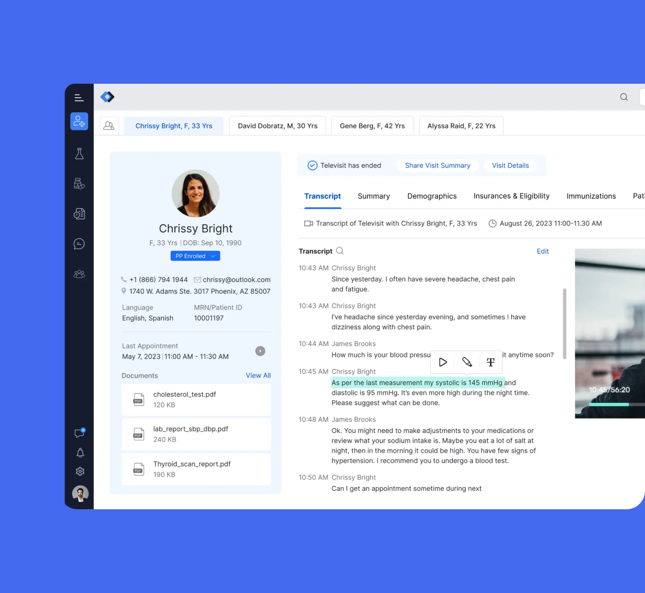
Telehealth Integration in EHR to Assist Overburdened Providers
Improved patient care by merging safety, communication, and real-time tools for providers:appointment alerts, pre-visit patient review, and live translation/transcription.
Ready to Build a Scalable UX Practice?
Our embedded team model empowers you to transition from tactical UX fixes to a fully scalable, strategic UX practice - aligned with your business goals and built for healthcare's unique challenges.

QUICK LINKS
VERTICALS
FIND US AT
INDIA
6/8, Kumar City, Wadgaon Sheri, Pune 411014

© 2026 Koru UX Design LLP


